Your favorite handcrafted
goodies, delivered
How we built online presence for BakeNFreeze
UX Research | UX Design | Visual Design | Development
Tools : Figma, Pen and Paper, Webflow
BakeNFreeze: Ecommerce Website | Product Design Case Study
About the Project
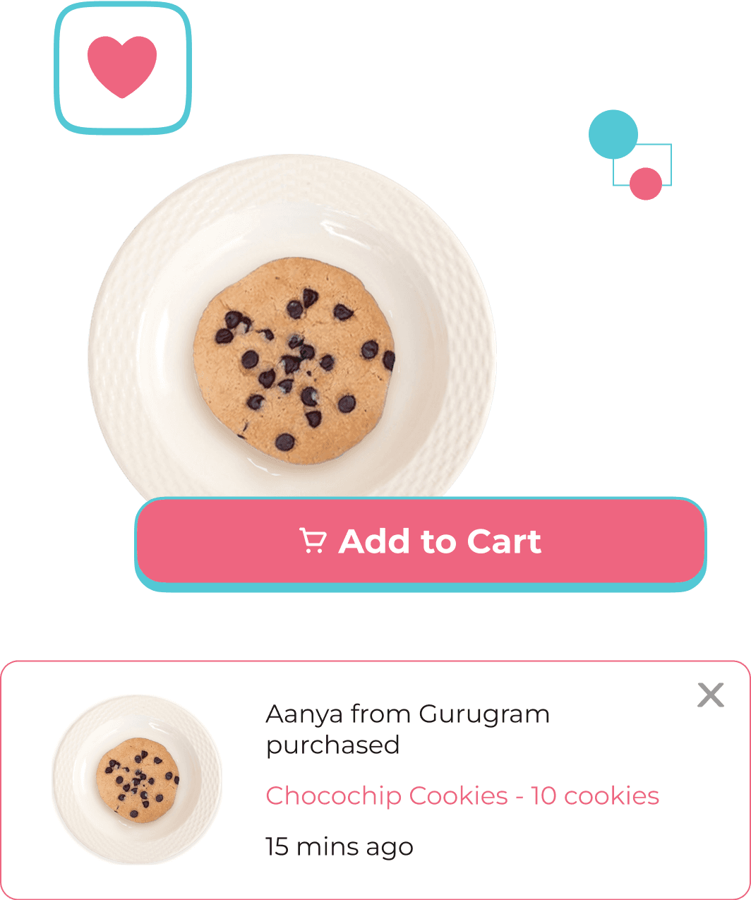
BakeNFreeze is a homegrown brand in Ghaziabad, India as well as I can call it my lockdown 2020 side hustle.
As I co-founded the venture with my friend, I wore all kinds of hats for the project as and when required. Here I’m going to discuss the UX Design journey for the project.
When we started BNF, there was a fear mindset regarding the purchase of food items.
People were skeptical regarding the safety of the food available but on the other side, online purchases/transaction for goods was increasing as that was the only means left.
And when we started operations right before Raksha Bandhan 2020 where we helped people surprise their loved ones with homemade handcrafted customized cookies, portrait cards, and chocolates for the festival.
End users loved the gifts and then we decided to broaden the venture's reach to the whole country via eCommerce and introducing corporate orders.
The site also needed to be welcoming to the visitors, and convey a feeling of warmth and love by emphasizing our handcrafted fresh goodies and sustainable packaging. Convey that each package is made with love on order, a perfect way to surprise one’s loved ones.
Competitor Analysis
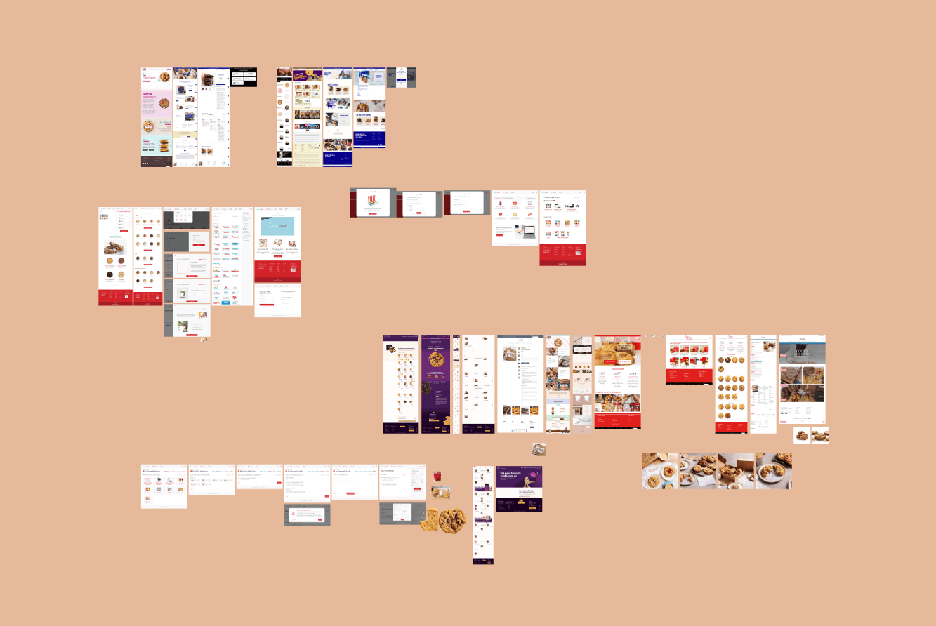
Figma File View: Different competitor website screenshots for analysis
Before starting the project, initially, we understood the project scope and then laid out the requirements.
Competitive analysis was done to understand the design paradigms, user flows, page content, navigational flows, CTA’s, etc.
#FFFFFF
0, 0, 100
#EE6580
348, 58, 93
#53C8D5
186, 61, 84
Aa
Bb
Cc
a b c d e f g h i j k l m n o p q r s t u v w x y z
1 2 3 4 5 6 7 8 9 0 ! @ # $ % ^ & * ( )
Visual Design
Persona
A pseudo persona was created to define the critical tasks of the website to be performed by the user.
Easy access of the products
Find the product that she likes
Place an order
Priyanka’s critical tasks:
Priyanka is a software engineer, working from home in the lockdown. She likes to shop and order online and is familiar with the online ecosystem.
As she is not able to travel and staying inside due to the covid regulations, she wants to surprise her loved ones with yummy goodies and order delicious cookies and chocolates for herself.
Bio
Priyanka Sood
25 years old
Software Engineer
Lives in Gurugram, India

Homepage

Stripe: Depicting contact
information for corporate orders
(Serves as a direct call to action +
informative that corporate orders
are available)
Navigation Bar
Hero Image
showing cookies
Headline: Focusing on the USP
Clear Call to action (CTA1)
Hero section
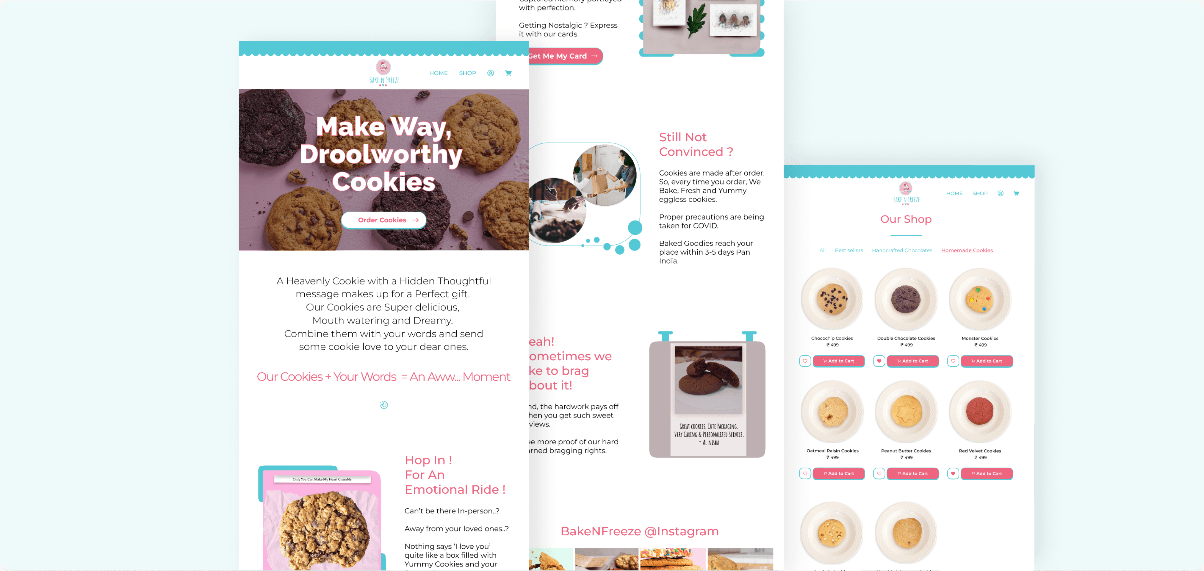
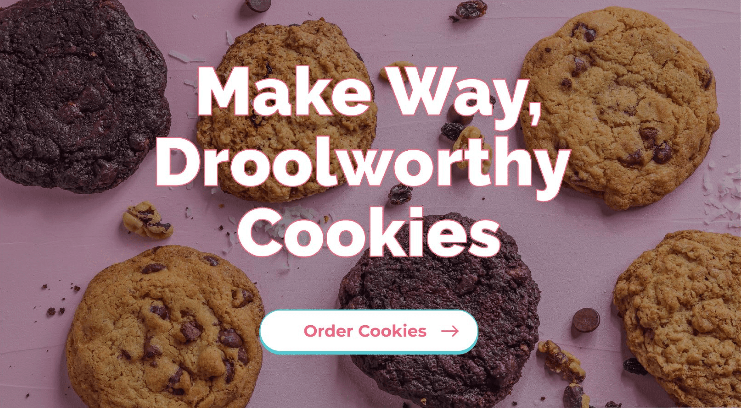
As BNF wanted to introduce corporate orders, contact information for corporate orders was incorporated above the Navigation bar. It made it easily accessible for the users.
Apart from this, the Hero section displayed the value proposition and a clear CTA for the visitors which can direct users to the cookies.
Product Offering:
Heading
Supporting copy
encouraging to buy
Product Categories
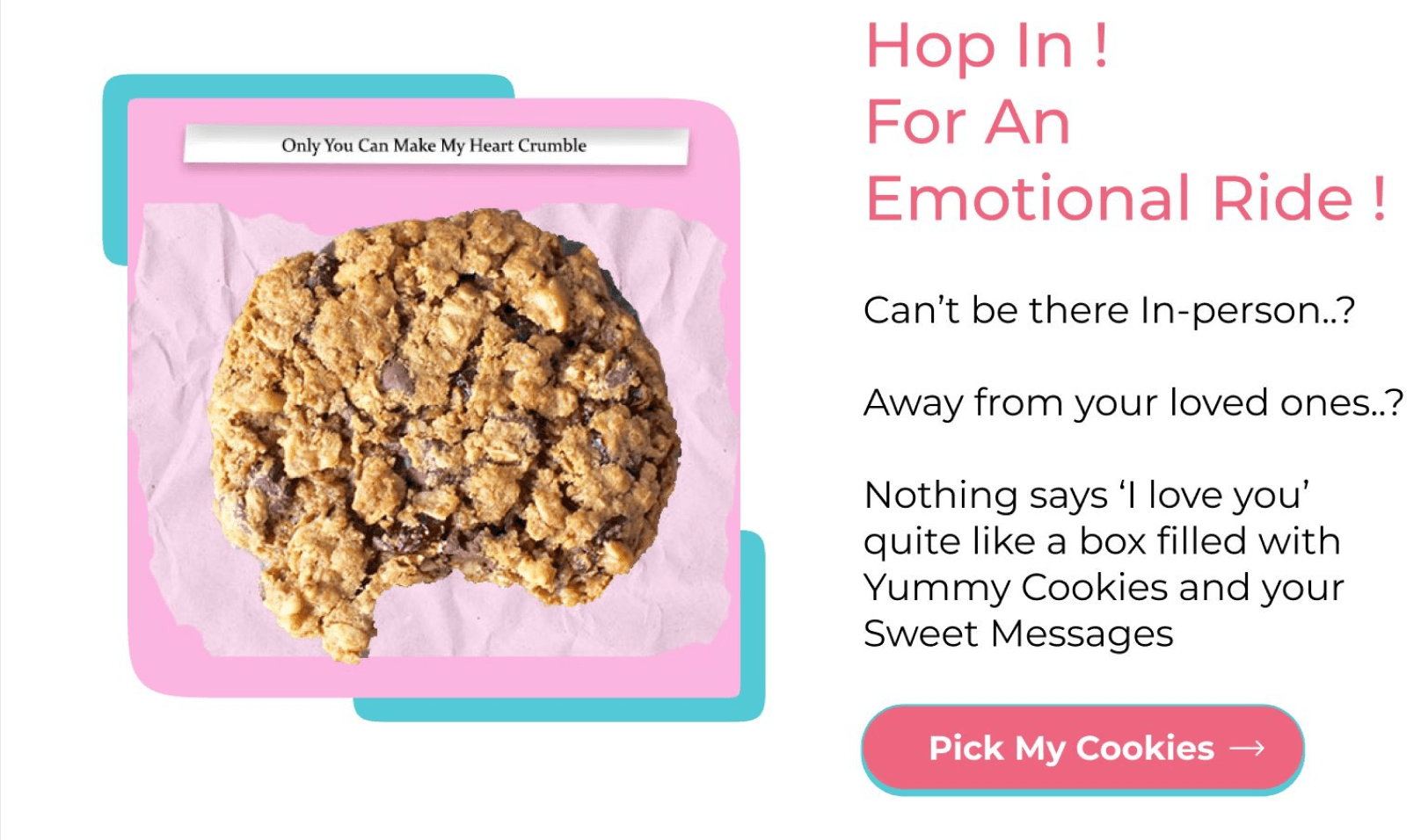
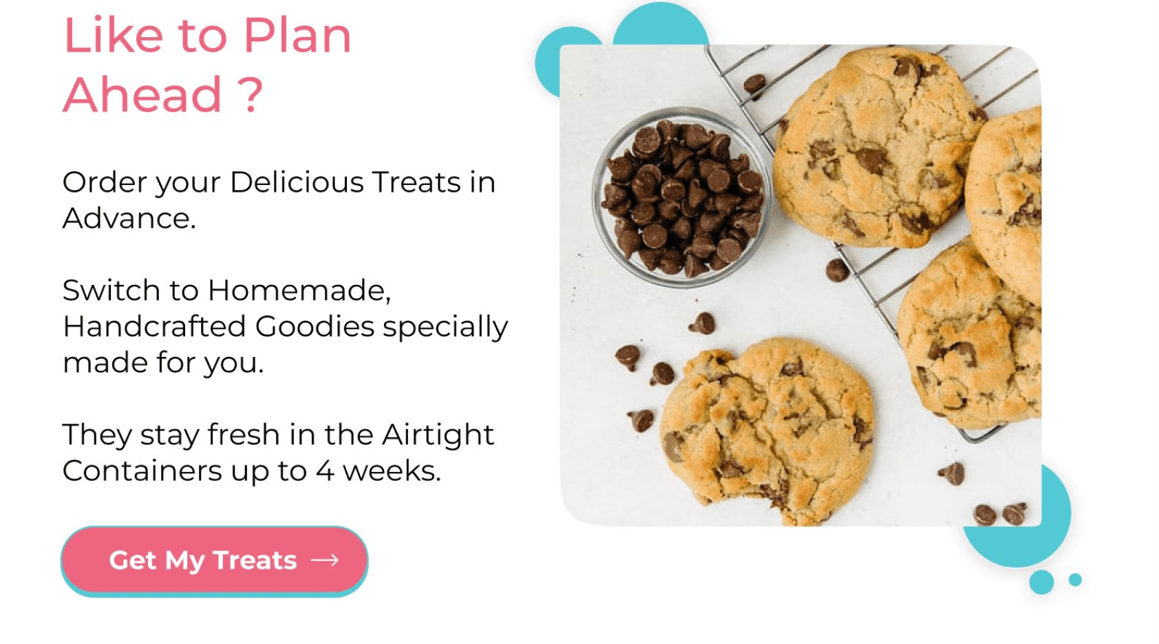
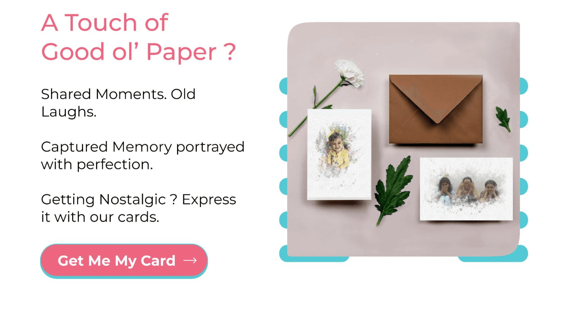
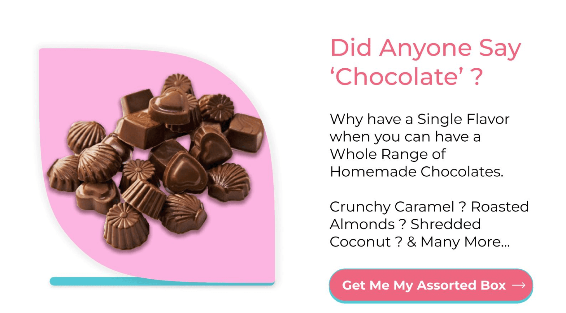
Next, The page had different cards for product categories available at BNF so that the user can browse and get to the required products by the given information and CTA’s.
CTA to Shop
Image in support of text
Safety Measures and Delivery Information
This section discusses the freshness of the cookies as they are made to order, the delivery time, and covid precautions.
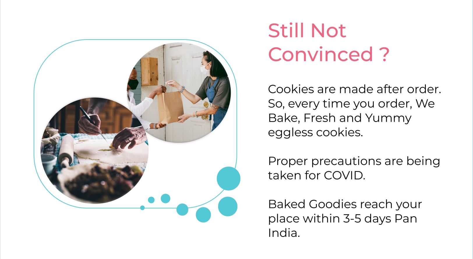
Informative section talking about the delivery time, product freshness and safety
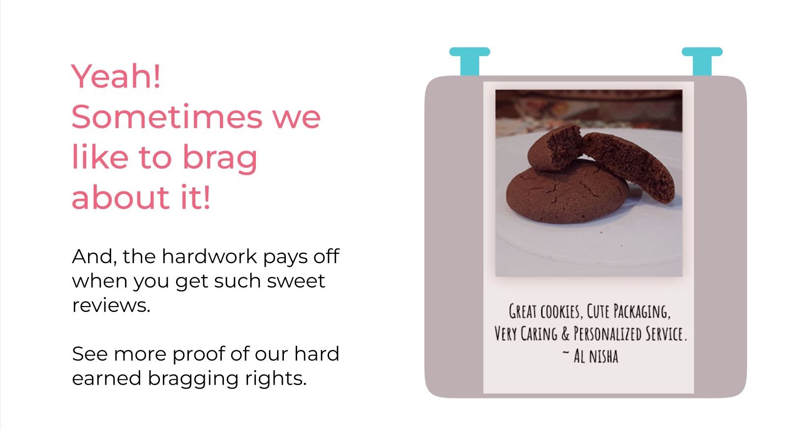
Social proof
Social Proof
This section talked about the experiences of the people who have purchased from BNF to drive more assurance and trust among the buyers.
Social Media
Next, The page had different cards for product categories available at BNF so that the user can browse and get to the required products by the given information and CTA’s.
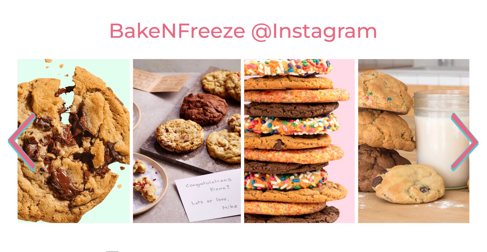
Social media
Feed
Best Sellers
Section displaying the top selling, popular products among the past visitors. This section helps the new visitors with the purchse recommendations.
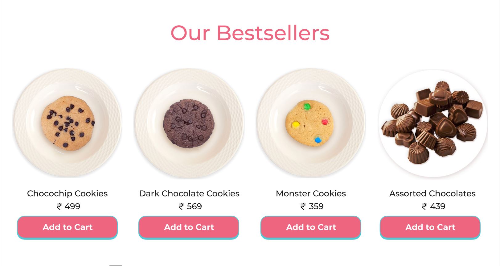
Product cards


Email Subscription
Footer
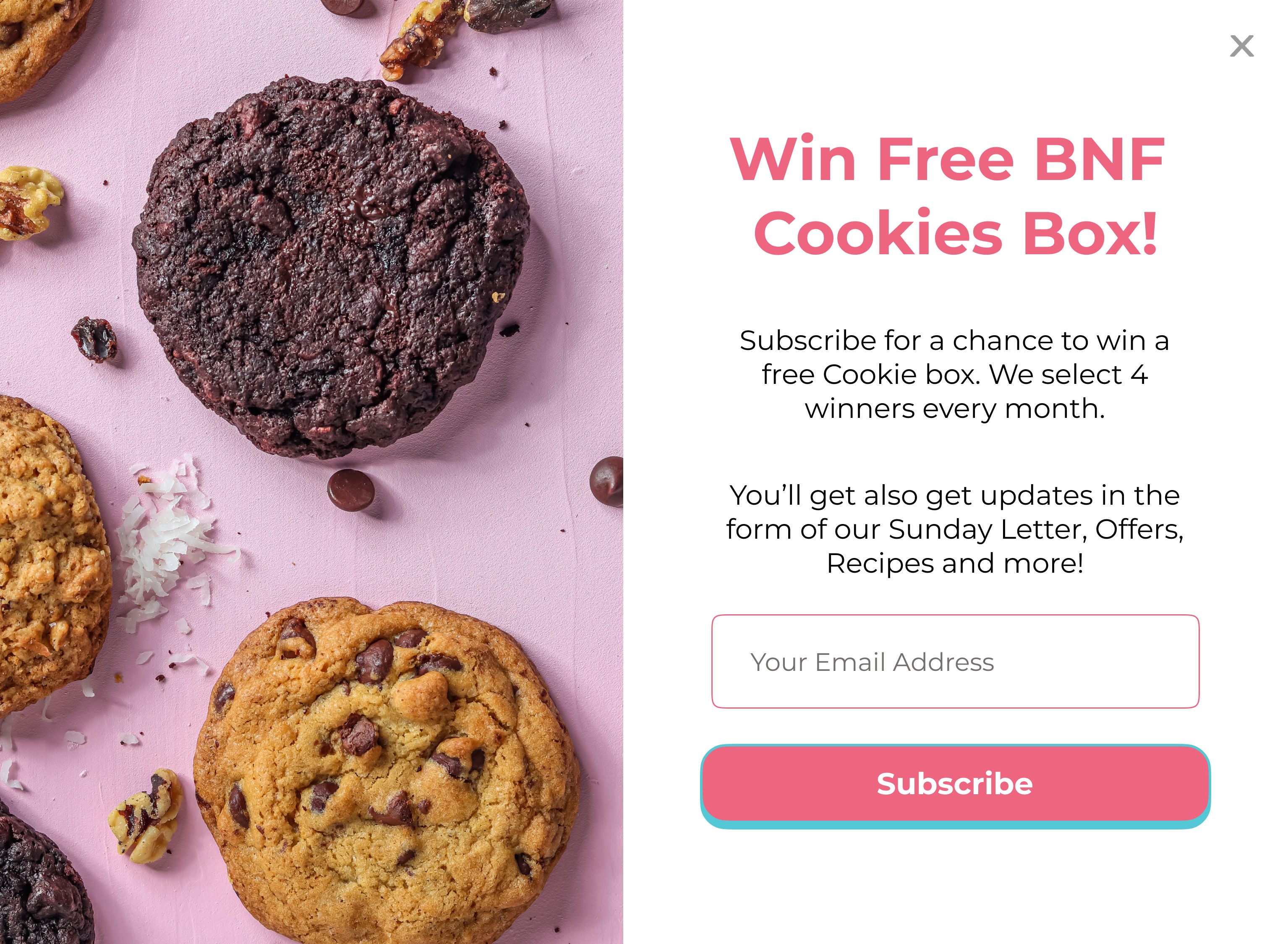
Email subscription popup
Why they should subscribe?
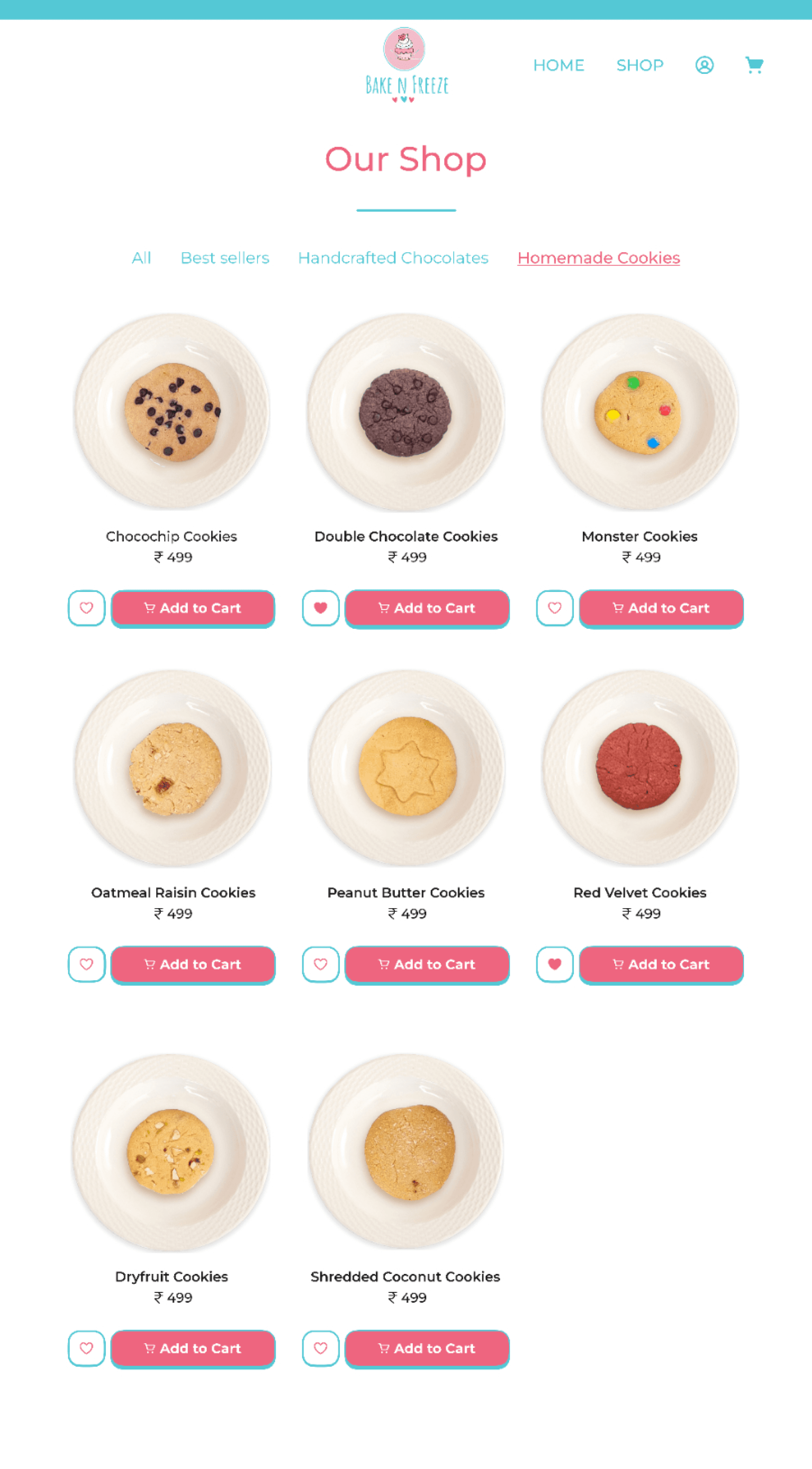

2. Shop
Product Categories
Product Cards
Product Image
Product Name
Product Cost
CTA
Add to Favourites
As there were limited product categories, a top display of all categories made sense so that the user could know about all the deliverables at once.


Breadcrumbs
Reviews
Product Name
Product Description
Testimonials
Product reviews
Best sellers (For Cross selling)
For upselling products
Image Gallery
Cost
Quantity
CTA
The page has all the details of the product, images, add-on section, social proof, product reviews, and sections for upselling and cross-selling other products.
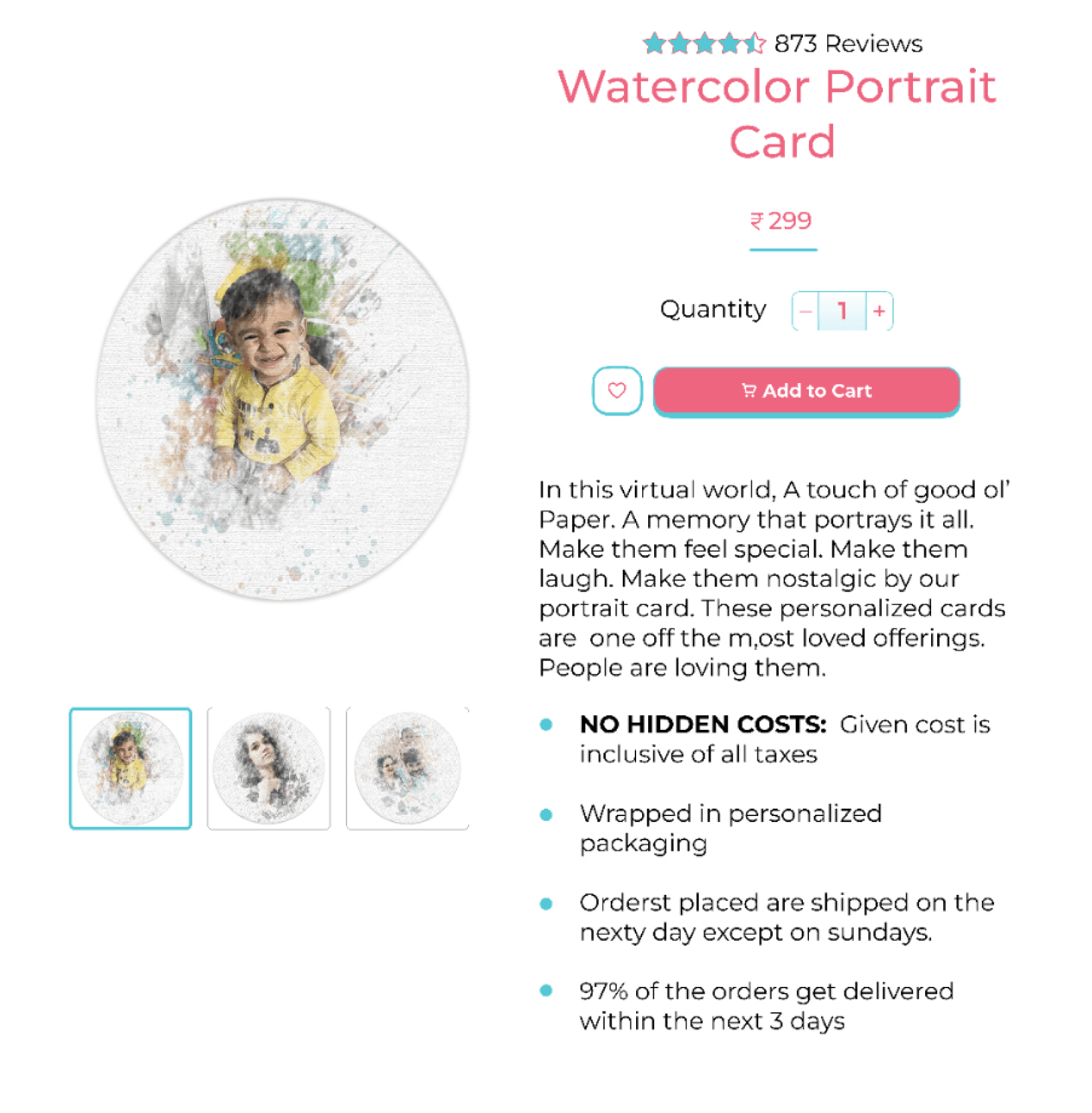
3. Product Page
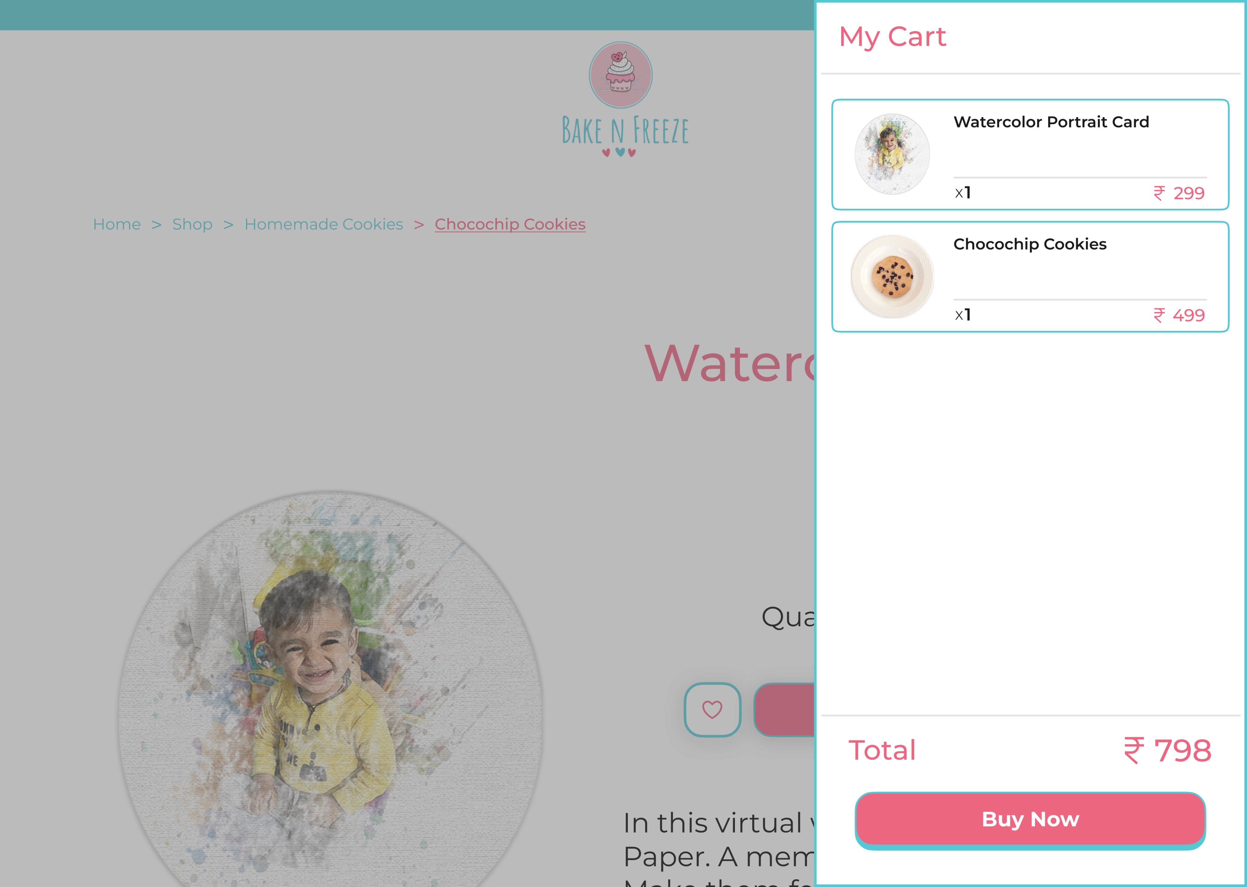
Shopping Cart displaying the added products and total cost. This cart doesn’t show the applied taxes because product prices are inclusive of taxes.

Product Name
Cost
Sliding Cart
Total Cost
CTA
Product Image
Quantity
4. Shopping Cart
Time to conclude!
So these were my learnings after working on this project:
It was the first time I was working on designing an e-commerce product and there were a lot of things that were new to me in terms of domain knowledge and design aesthetics for this specific domain.
The project had tons of iterations before the final design so I got a chance to explore a lot.
The BNF team was very happy with my design work and was very excited to see the designs every time I wanted their feedback.
Conclusion
____ . ____
Logo
Logo depicting the delightful spirit of BakeNFreeze. The images below show the different explorations and the finalized one.
Iterations
Final Logo
