Say Hello to healthy and happy plant babies!
Easy plant care.
No more forgetting or overwatering hazards.
Resources that keep plant parents well informed.
A community to share your plant family with.
UX Research | UI/UX Design | Prototype
Tools : Figma, Pen and Paper
Bloomy Mobile App | Product Design Case Study
Plant Tribe
Home
Diagnose
Explore
Add plant
Why Bloomy?
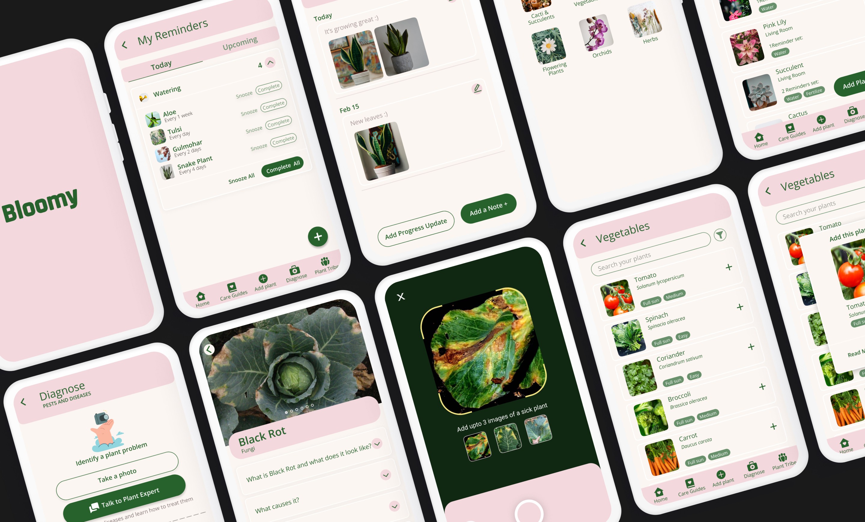
Bloomy is an app focused on encouraging easy plant care and helping beginners to get started with correct knowledge and provide content for plant care, community sharing their achievements and failures, diagnosing the disease, get recommendations as per the sunlight and plants that are easy to grow in the surrounding environments.
It allows the user to set reminders and create customized schedule for watering, fertilizing and other such tasks for specific plants and also share the schedules with others so that the plant can easily be taken care of in their absence.
The app resource library is useful for the plant parents at various stages of their plant journeys like keep track of their various experiments by minute tracking of potting mixtures and journaling.
For this project, I conducted interviews with 6 plant parents ranging from beginners to experts, shadowed an expert gardener to understand plant care, organized data by affinity mapping, created personas and moodboard, as well as created app user flow, wireframes and prototype.
Design Thinking was applied to create a user centric product that could help in every step of a plant parent’s journey.

Process
Empathize
Define
Ideate
Prototype

Test

Problem Statement
To create an application that can help plant parents learn plant care as well as grow, manage and keep track of their plants babies with ease.
User Persona

Customer Journey Map

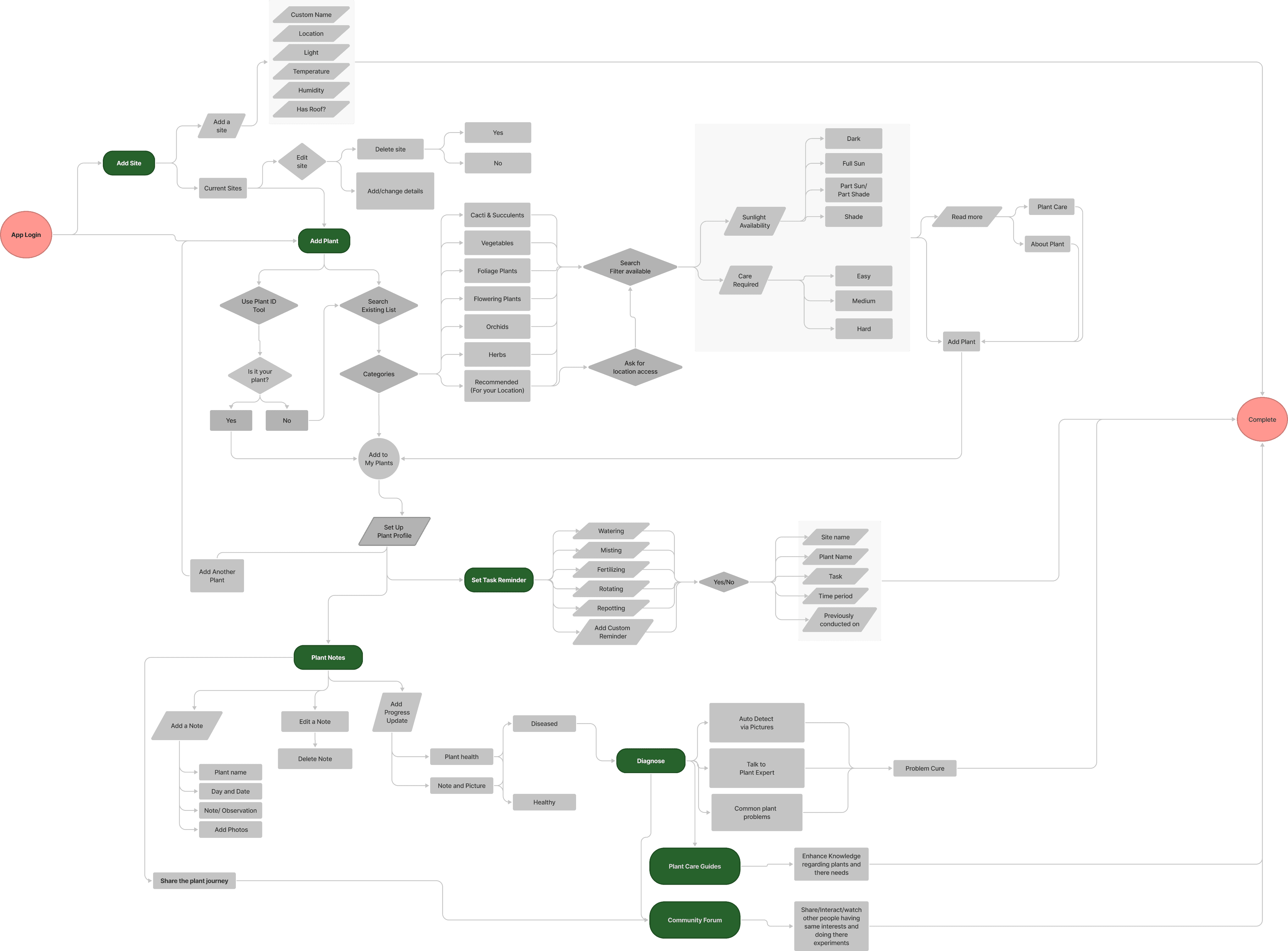
User Flow: Adding Plants and Plant Sites | Setting up Plant Profile | Diagnosing Plant Problems |
Searching Plants | Care Resouces | Plant Community
User Flow
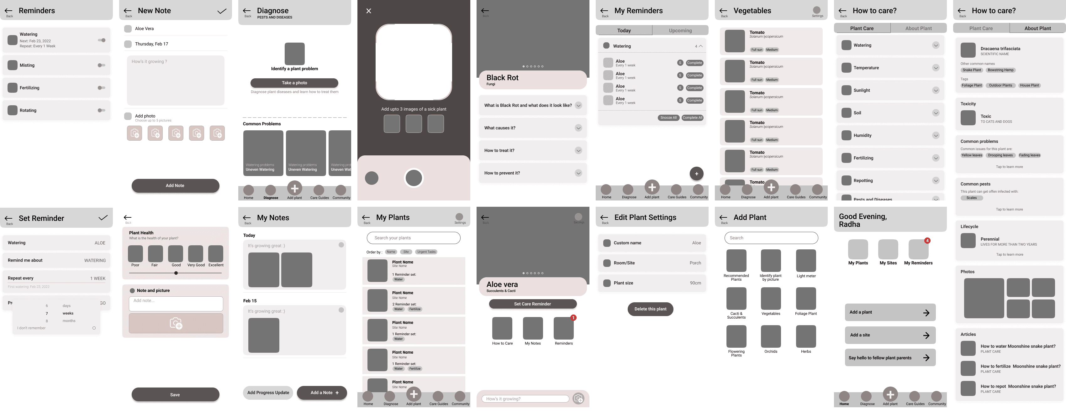
Let’s Design! : Wireframes
Visual Design
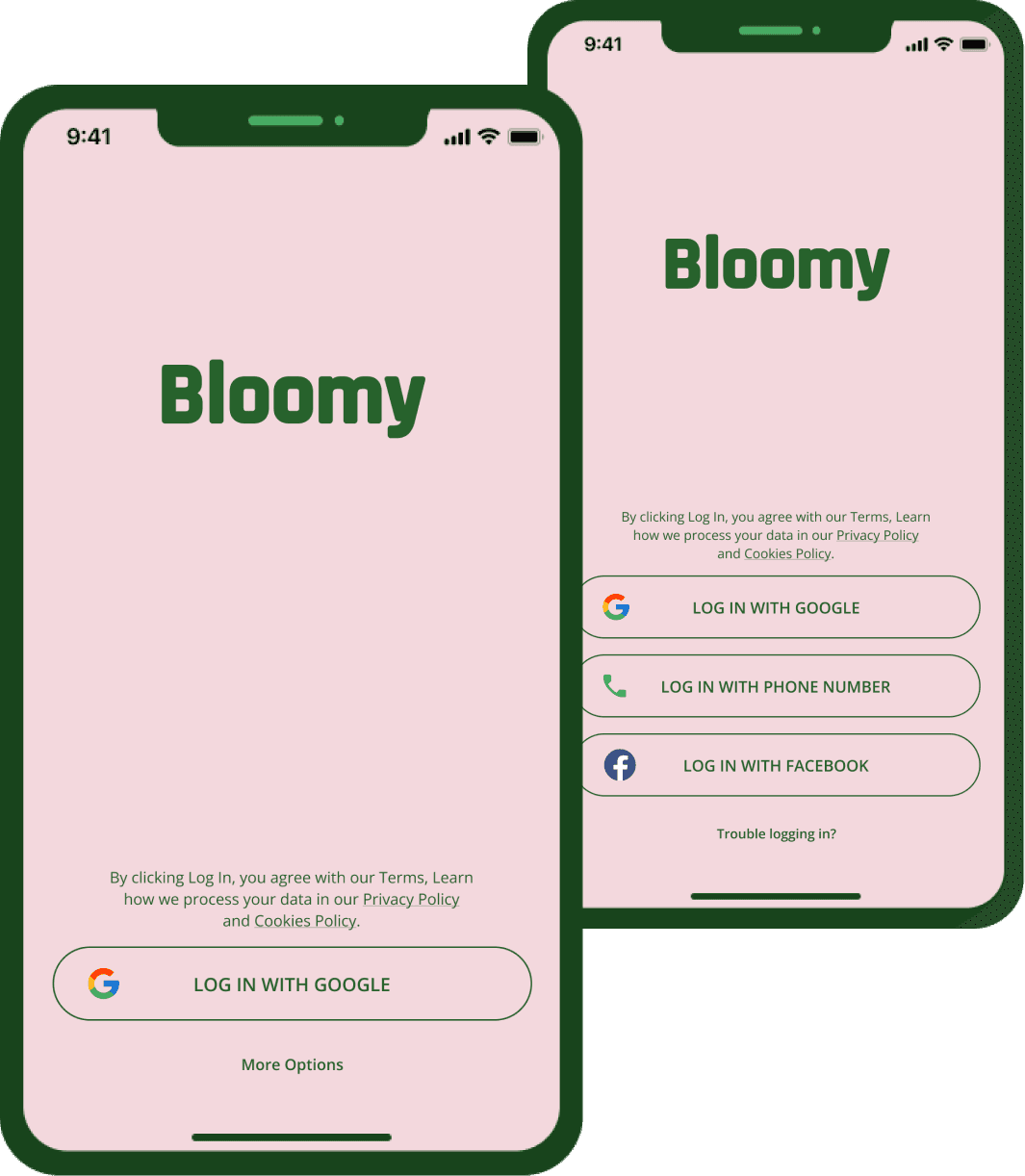
Onboarding
Quick Sign in options to save time and minimize user input
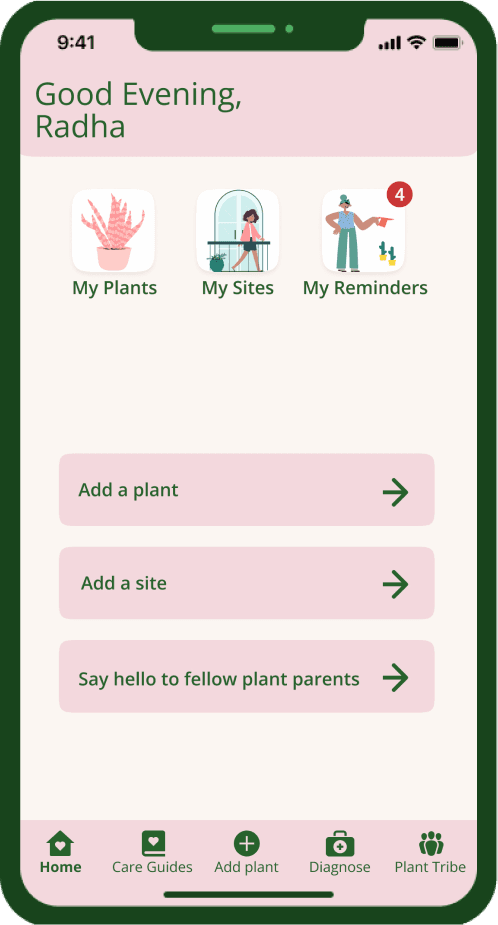
2. Home Screen | Care Guides | Community
HOME:
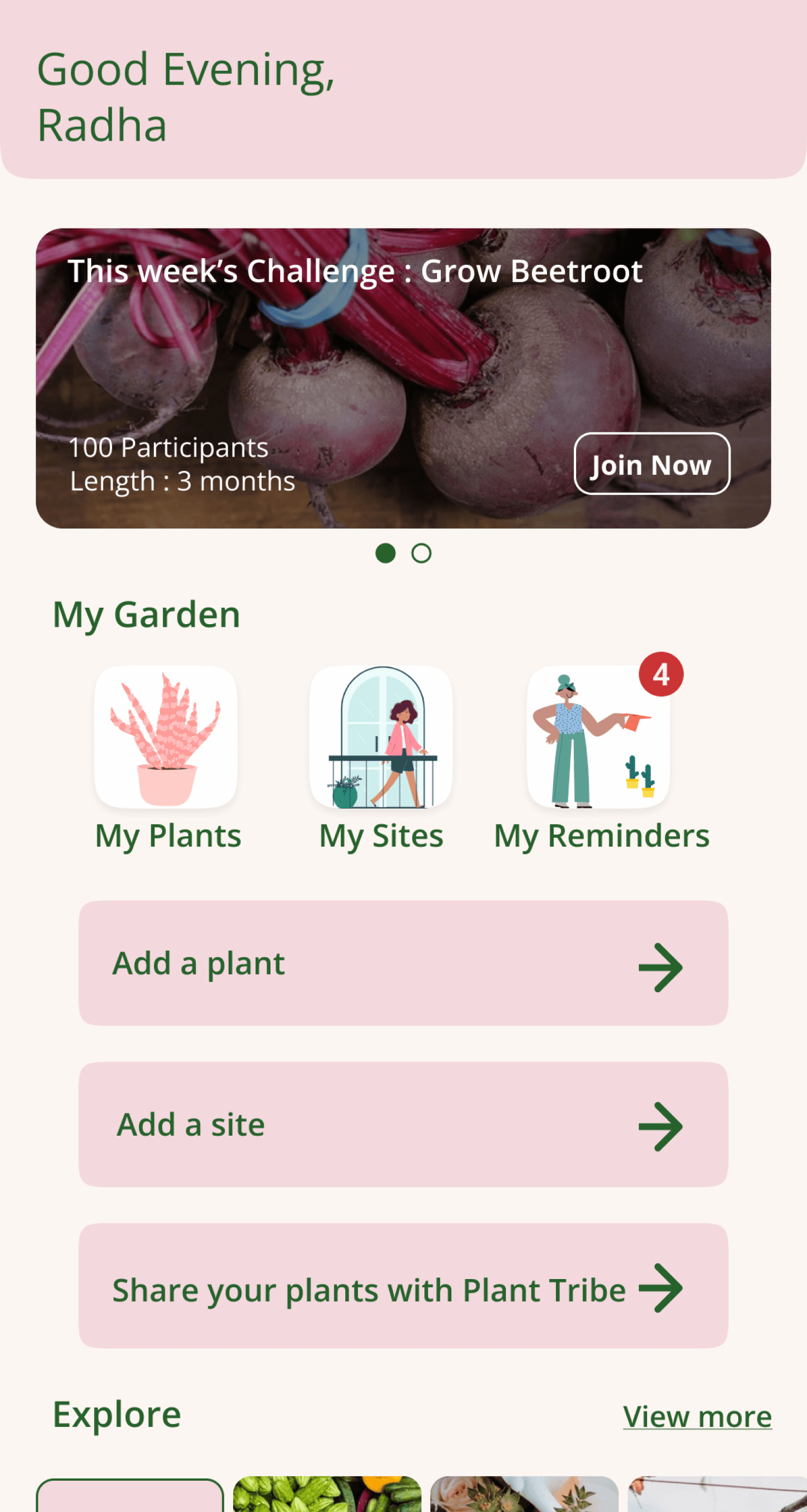
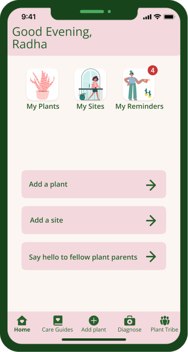
Providing quick access to the user’s plants, different plant sites and plant care reminders for repeat users
Quick access to the plant community, adding a plant/site - These options allow the users to interact with the app and add/record/journal about their existing plants
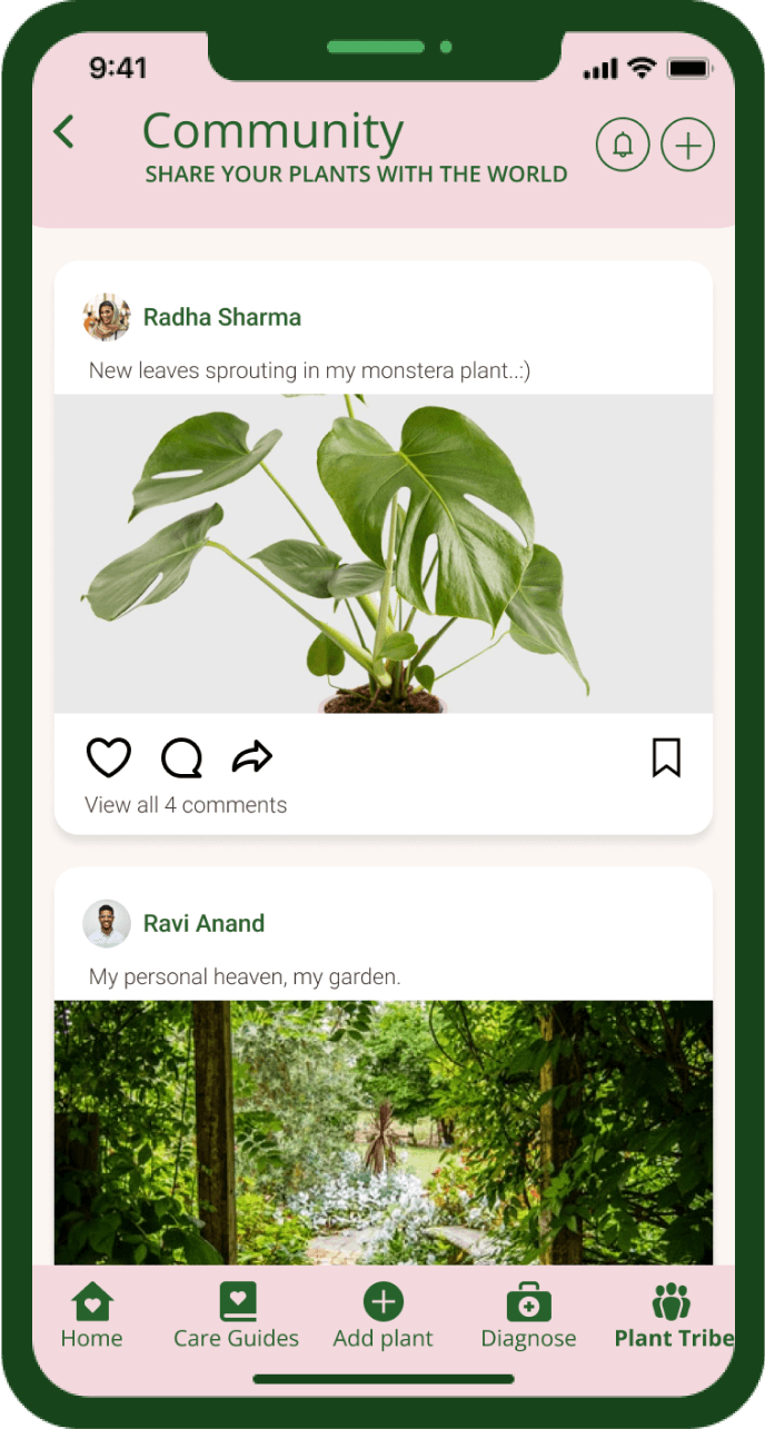
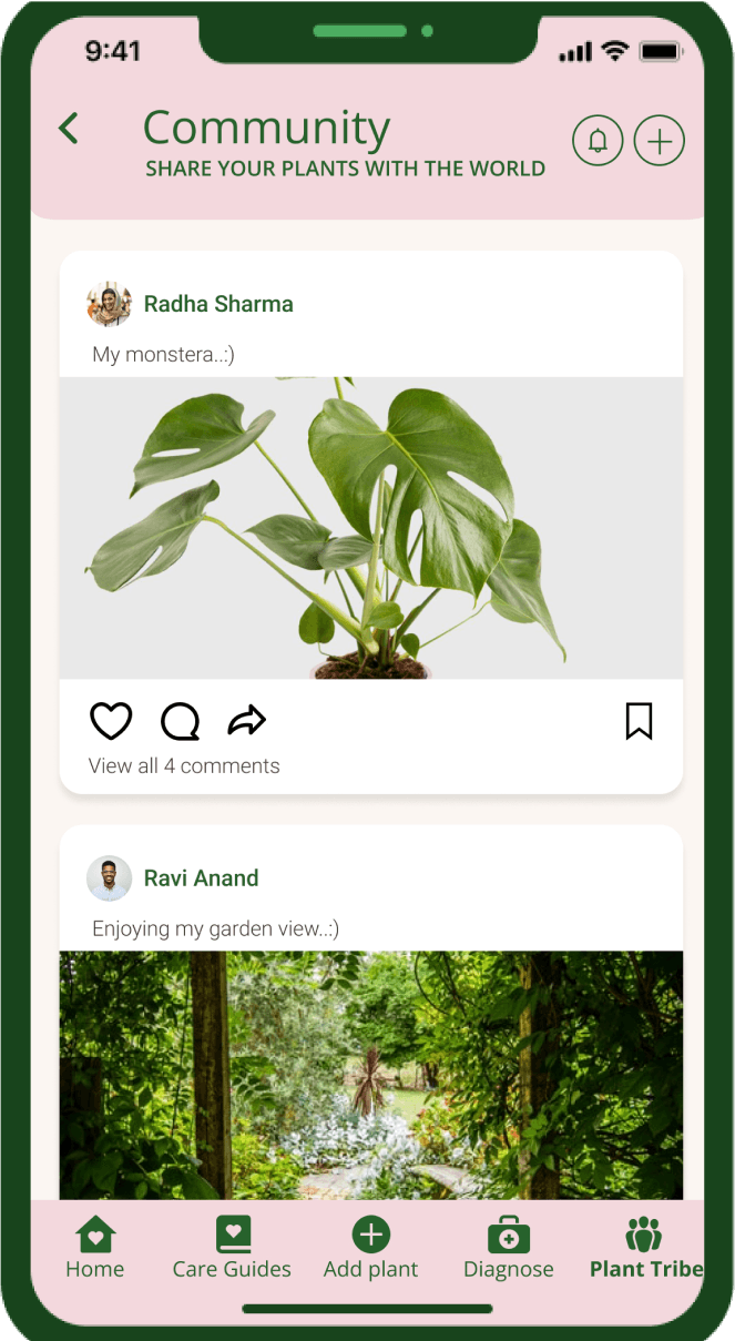
COMMUNITY:
To interact with other plant parents, share their plant journeys, and ask questions
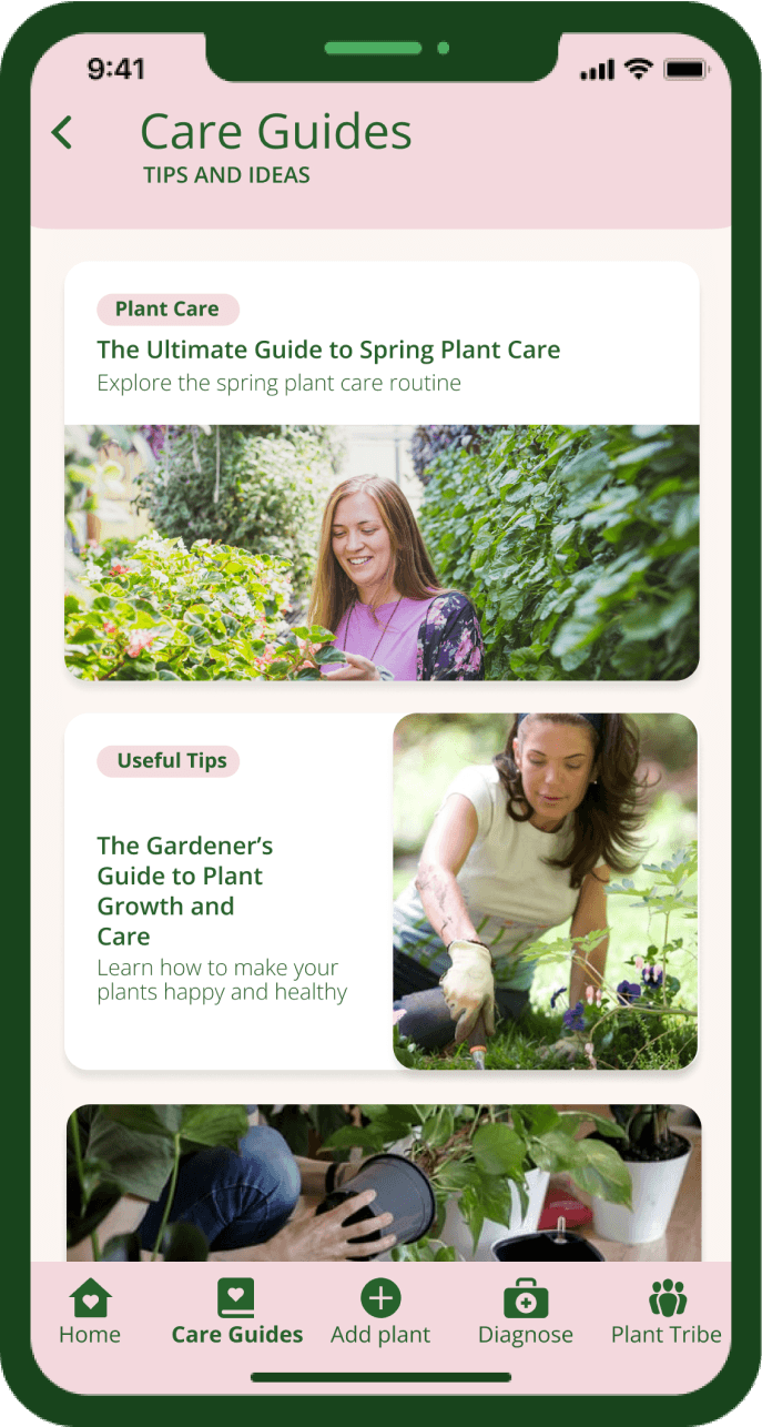
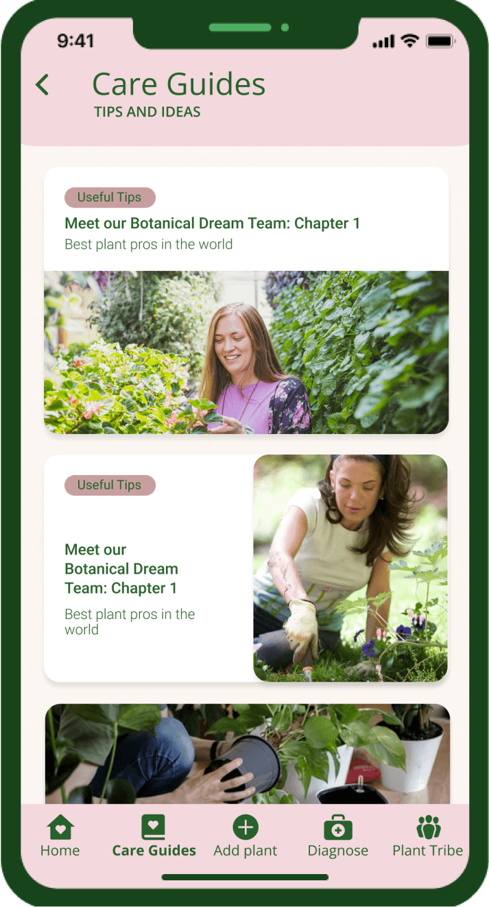
CARE GUIDES:
For helpful tips on plant care
3. Diagnose
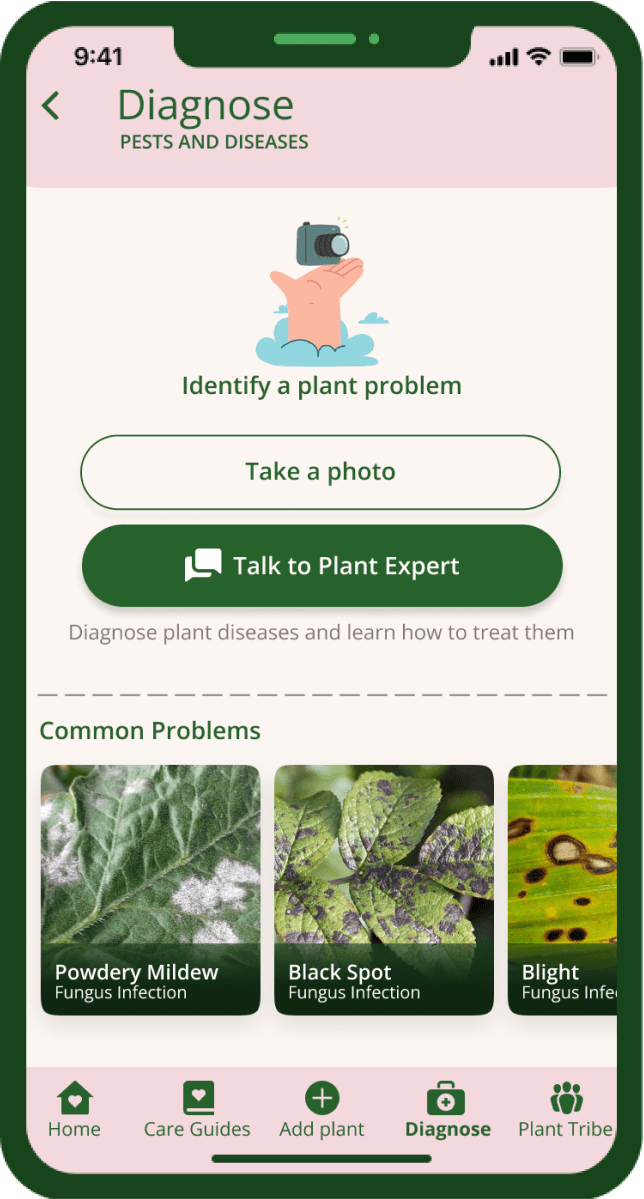
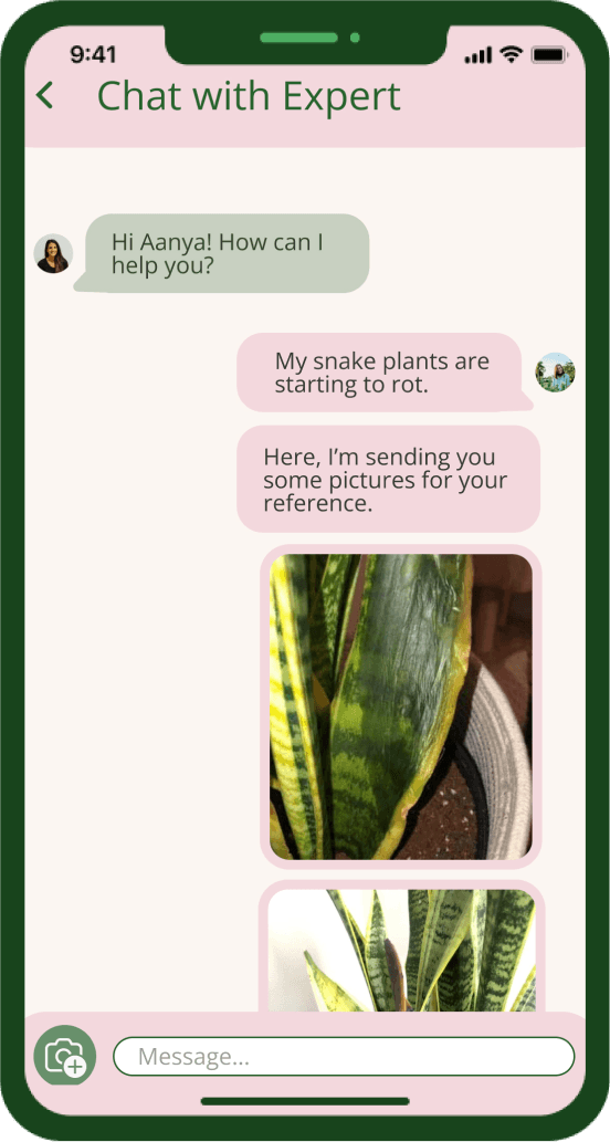
DIAGNOSE:
To help diagnose the plant problems/diseases
Can identify problems via photos and provide solutions or the person can talk to plant experts to discuss the issues
There is a common problem library present in the app where the user can scroll and learn about the general infections
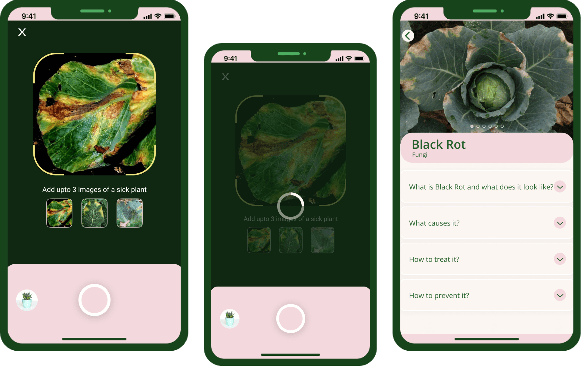
Identifying the plant problem via Image Analysis
4. My Plants
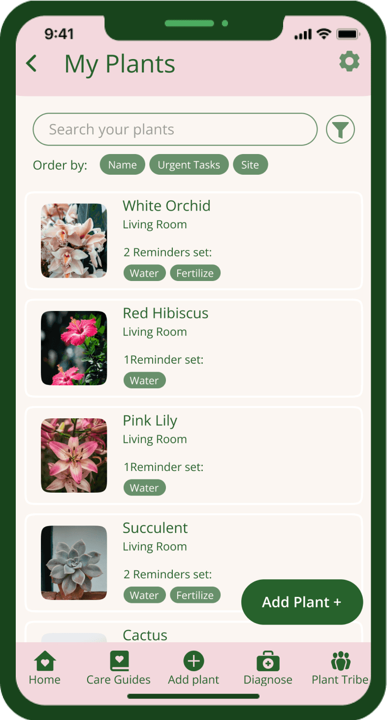
My Plants:
Individual plant list as per their sites and showing the set reminders
Add plant option available to add more plants
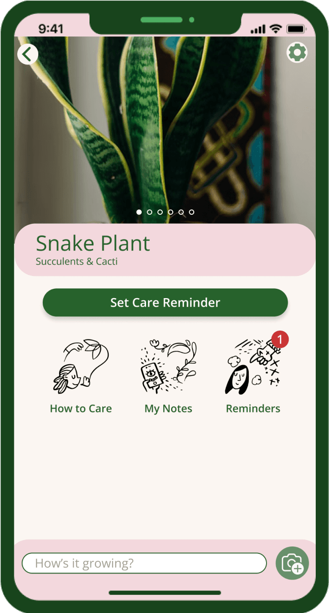
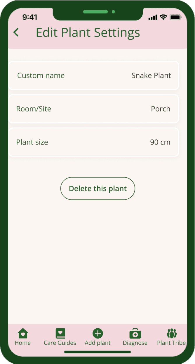
On the plant page, how to care, notes, set care reminder available so that the plant cycle can be recorded.
Making notes makes the tracking process for the plant parent
5. Add Plants
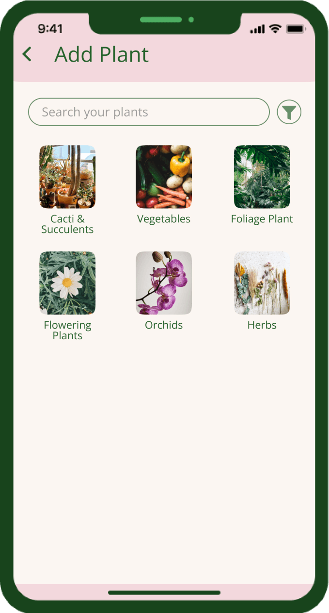
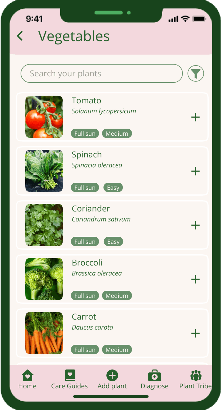
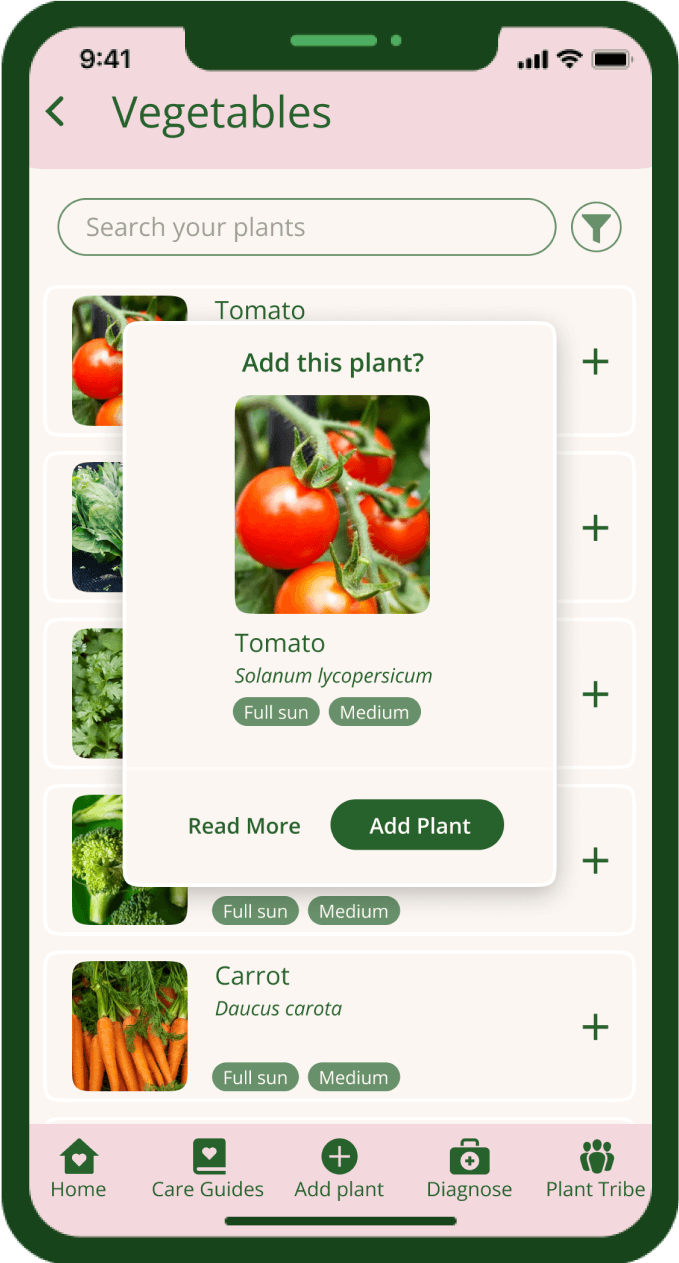
While adding plants, search option is available.
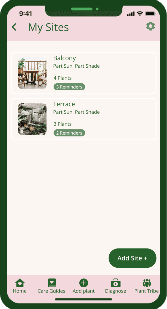
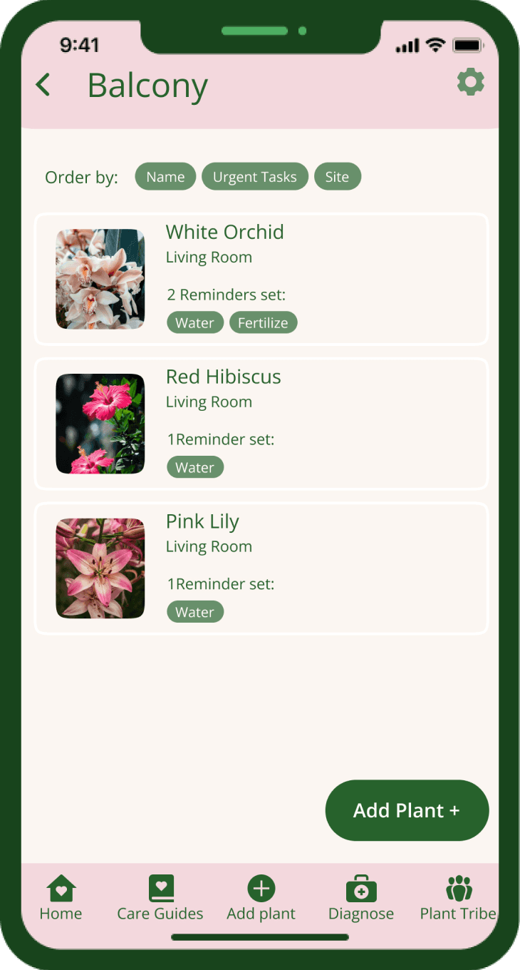
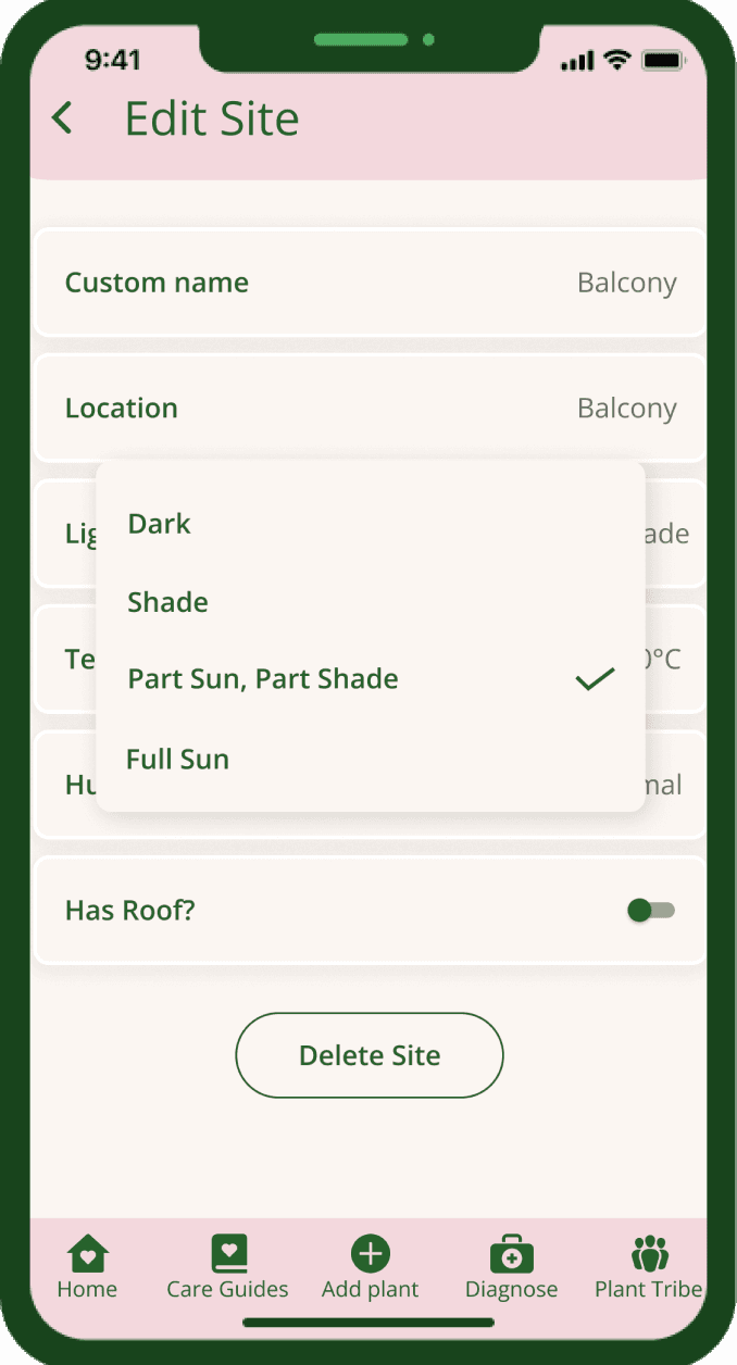
6. My Sites
Different sites can be added to keep track of the plants as per the availability of sunlight, temperature, humidity and other factors of the place as they in turn define the watering cycle
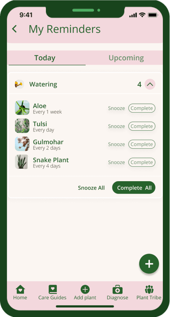
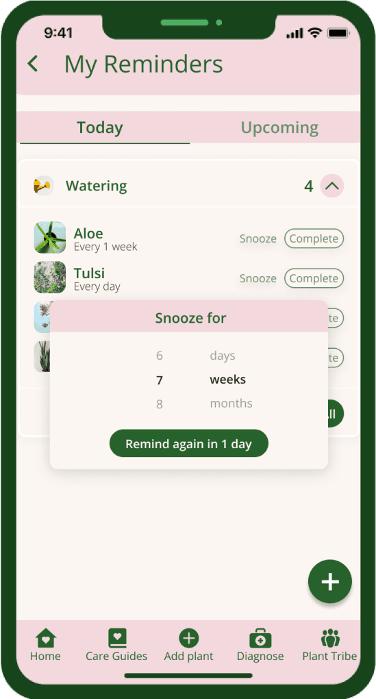
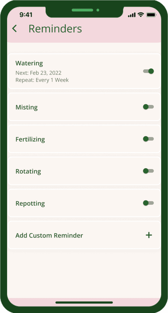
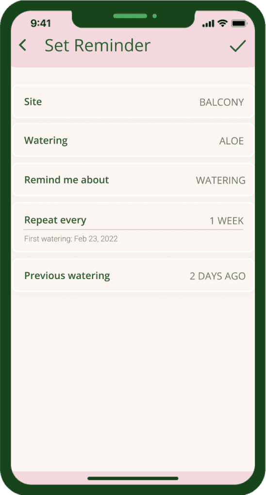
7. My Reminders
Reminders can be set for individual plant care
Watering, misting, fertilizing, rotating, repotting and other custom reminders can be set.
They make the plant care process easier
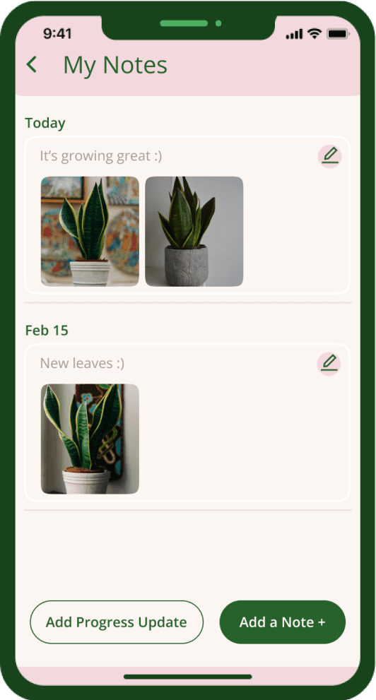
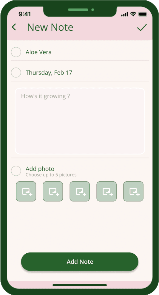
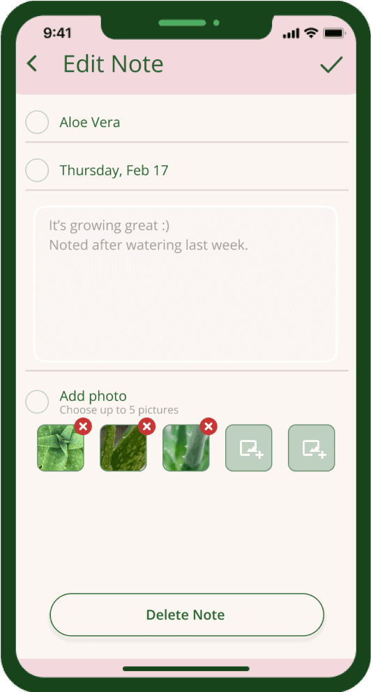
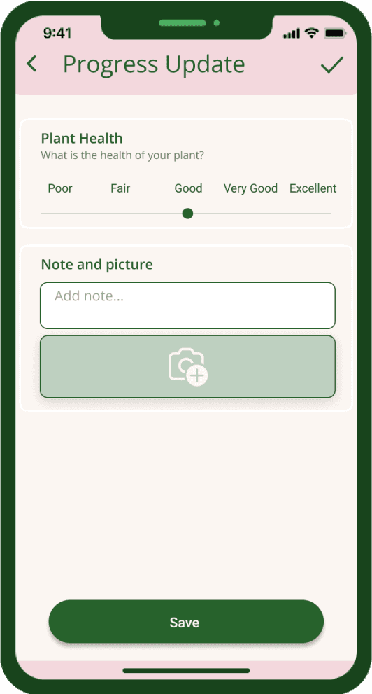
8. My Notes
Progress update and note making to track the plant growth via text and images. This helps alot when the plant parents are trying different soil mixtures or medicines on plants and tracking the plant health or recording different stages of the plant life cycle
9. My Plants : How to Care?
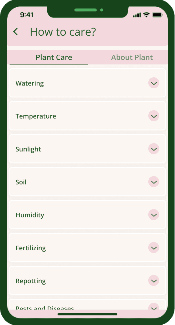
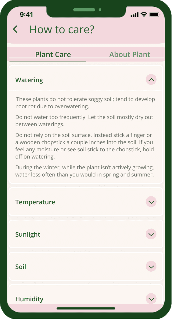

How to Care section:
All the information is in expandable format so that the user doesn’t get overwhelmed by information overload
About plant section with all the plant details and related care articles
Time for User Testing!
The main feedbacks after user testing were:
To make the app more interactive for the users
How to motivate the user to use the app/ to have more touch points
How it can be more useful to the beginners/ encourage them to add plants to their surroundings
More elaborate content on plant care
Interactive community forums
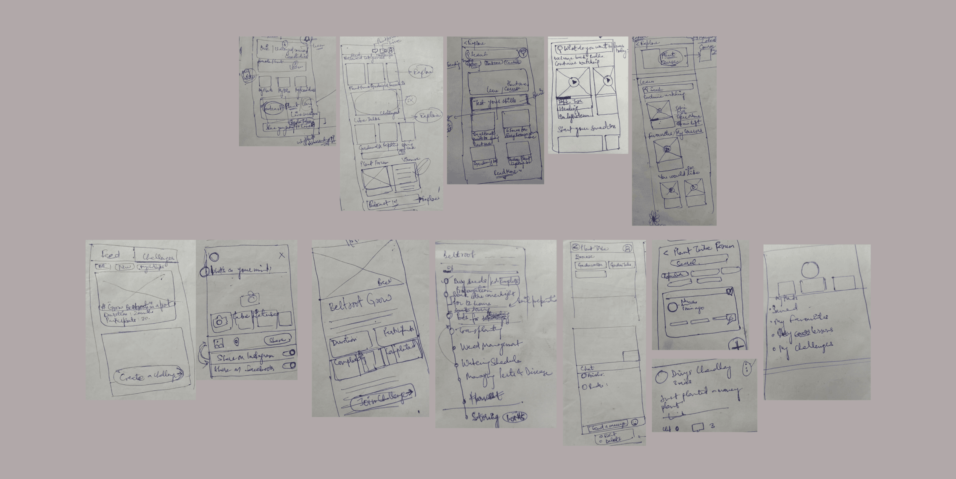
Iterations in Explore Section | Community Section to Increase User Interaction
Iterations to make the app more interactive,have more touch points for the end user
More Interactive HomeScreen
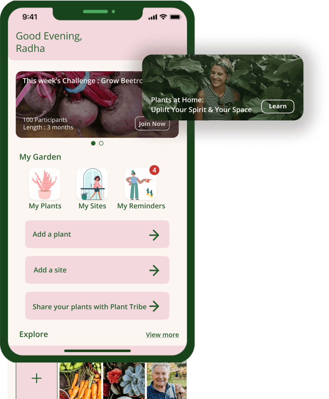
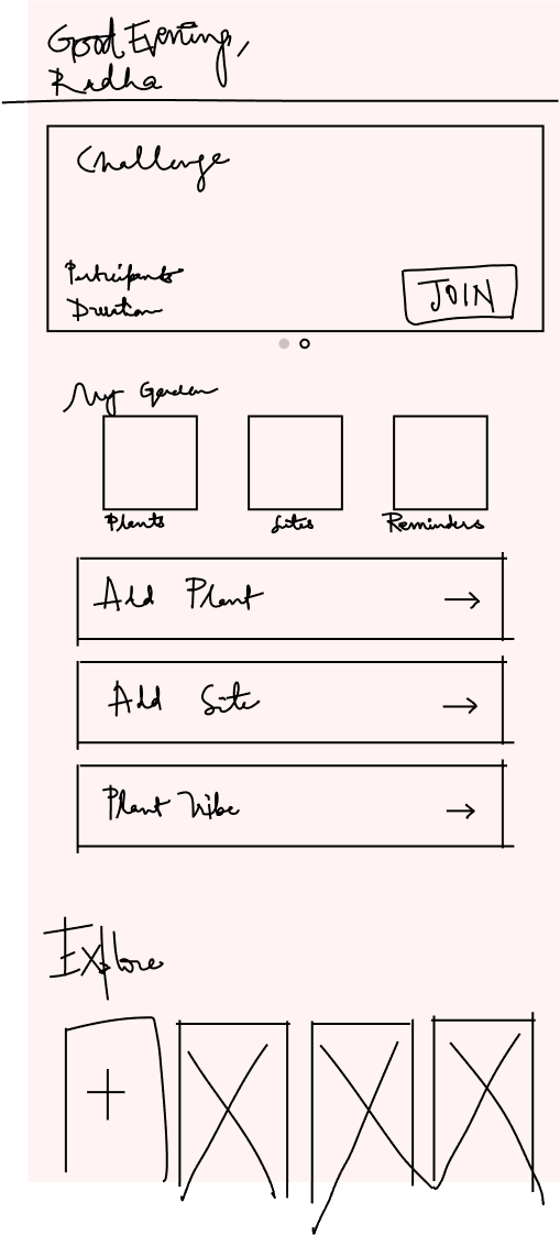


To make the app more interactive following things were added:
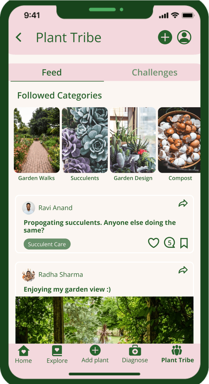
Weekly challenges
Courses on Plant Care
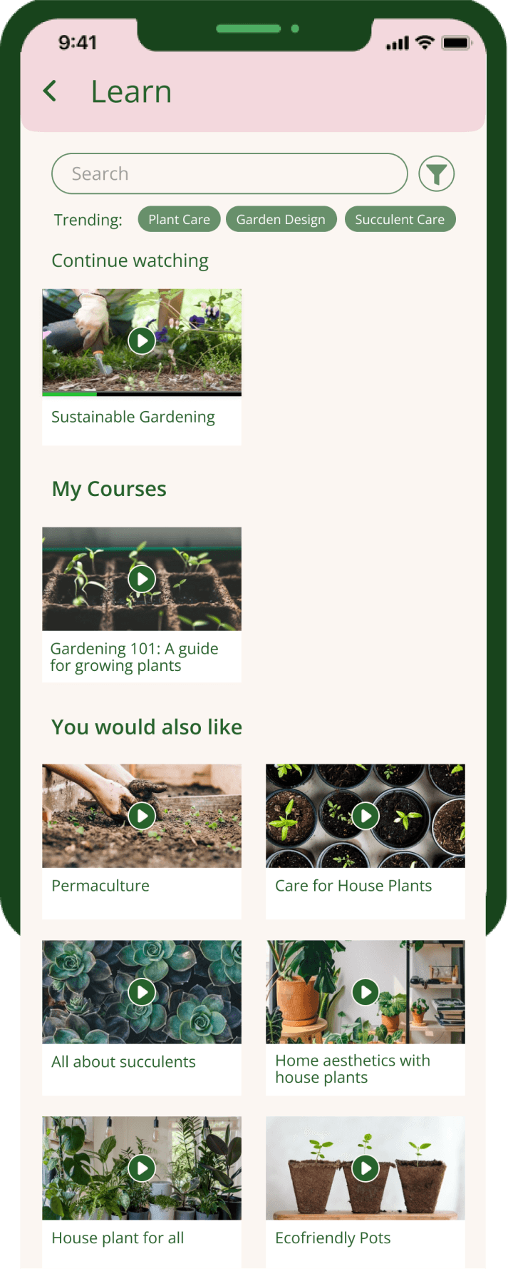
Explore section
2. Elaborate Plant care guides | Courses to enhance user interaction and motivate them to add plants in their surroundings

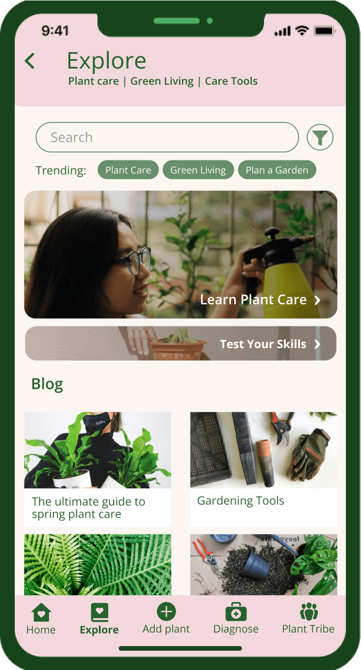
3.
2.
New explore section has:
Plant care courses
Quiz to test plant skills
Blog
Search for searching relevant topics
Trending topics for suggestion
Learn Page:
Trending content suggestion and search
Continue watching section
You would also like section as per the user preferences
My Course Page:
Option to continue the course where they off previously
Course content
About the course section
Ratings and reviews
3. Plant Forum to discuss plant journeys | Challenges to grow plants in the Plant Tribe (Community section)
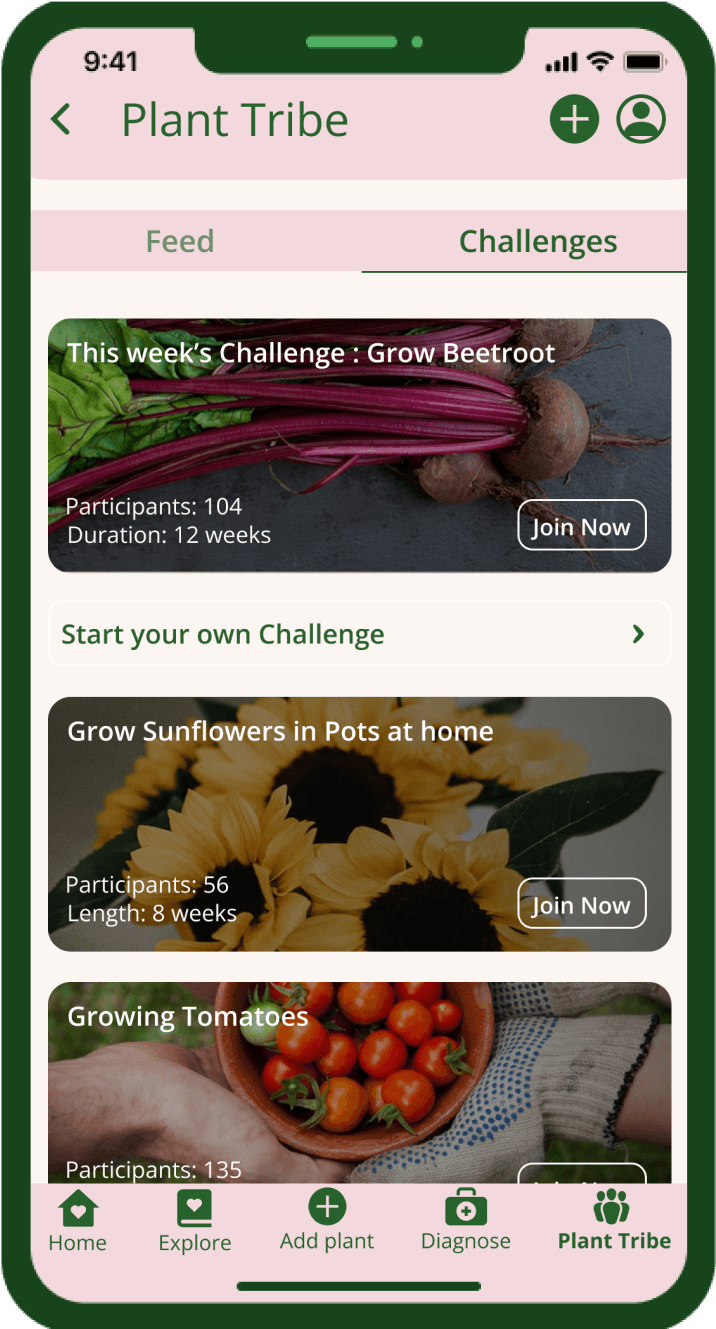

3.
2.
4. My Profile section to keep track of all activities
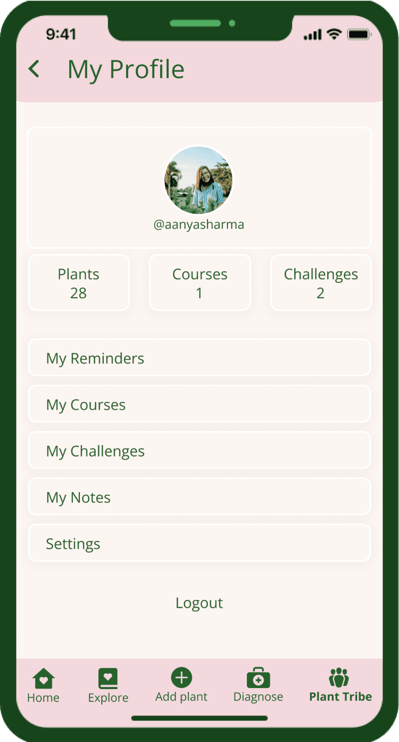
To keep track of all the activities on the app like no of plants, courses joined, challenges accepted
Access Notes
Reminders
Time to Retrospect!
My takeaways from the project:
Arriving at the solution required alot of iterations and it was fun to explore the different possibilities
Getting to know how the plant world works was new to me. How a little overwatering/underwatering can kill the plant, the amount of work and care they require.
Spent more time wireframing the app then the visual design. This saved me from alot of reworks.
And, that’s the end! Hope you enjoyed going through the case study.