CONTEXT
Dzylo is a B2B Saas platform, committed to digitize, enhance the operational efficiency and client engagement through a modern, user friendly experience for interior design firms, help reduce wastage, manage leads effectively and increase profit margins.

Seamless
Client Management
for Interior Design Firms
UX Audit and Redesign

VISUAL DESIGN
Home: OLD
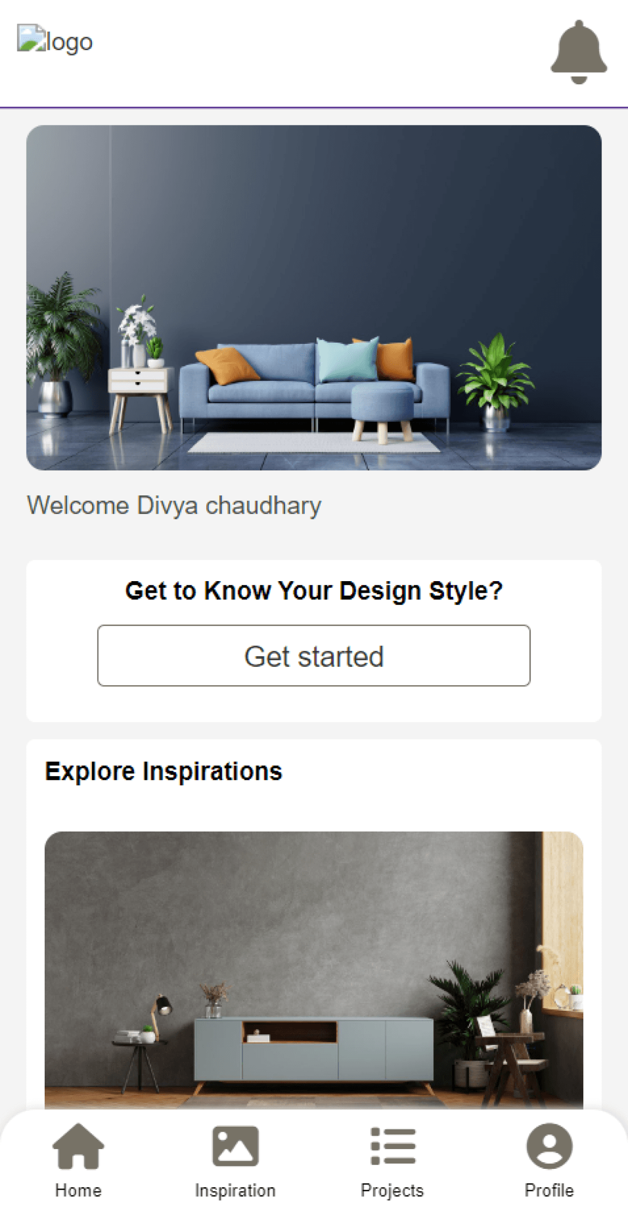
No indication of which tab is selected in the Nav bar
Vaugness: No clarity on how what the user is supposed to be doing here and why?
Logo: Only way to personalize the app for the firms
Home: NEW
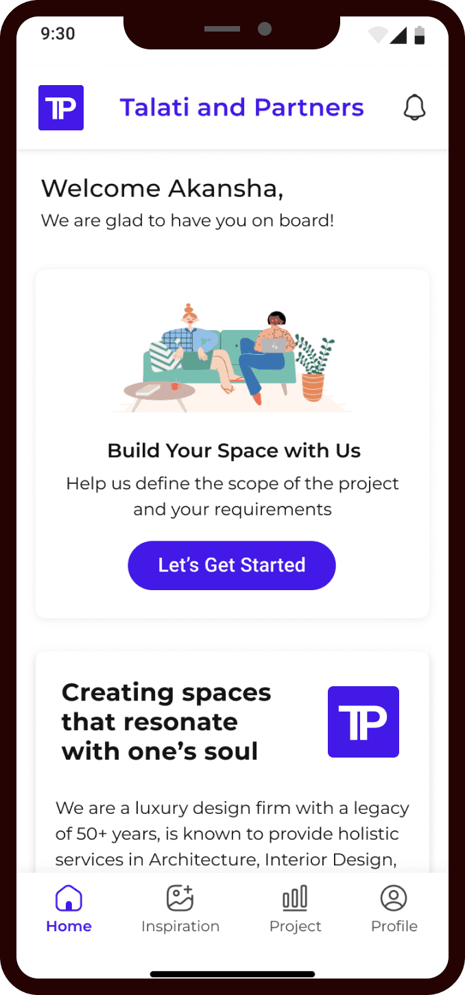
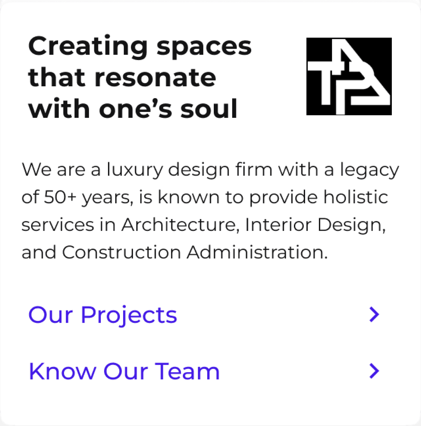


Personalized Experience: Color scheme, Logo, Company Name
Onboarding New Prospect: Getting to know why they are here
Company Portfolio: A card which can be customized for the company details/ Projects/Team
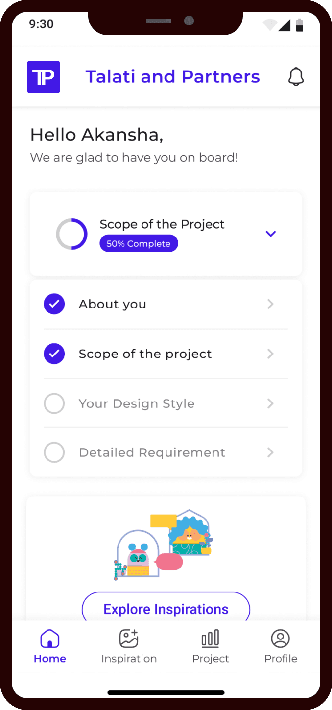
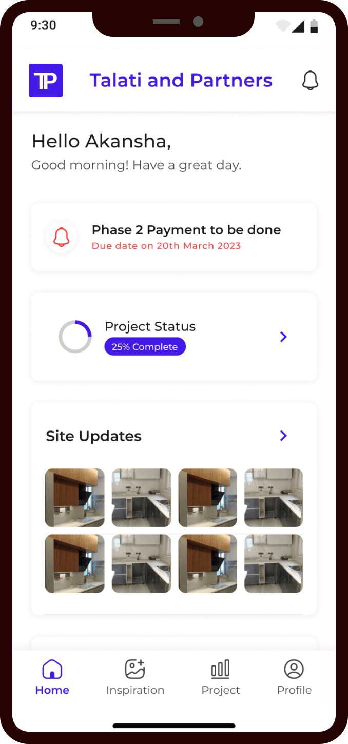
Once the project starts, for managing the project and sending client updates
The new onboarding allows the user to step by step ease into the process. The firms to customize their app as per their brand, team, projects, contact numbers.
The home screen changes as the customer gets converted and the project start. The user is able to track the on site progress via the app plus it becomes easier for the business to track the payments and project plus team progress.
Quiz for clients: OLD
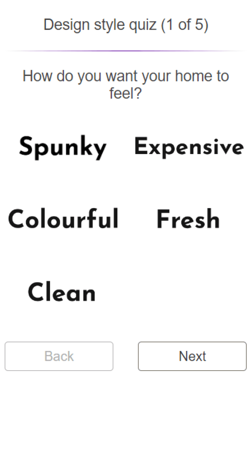
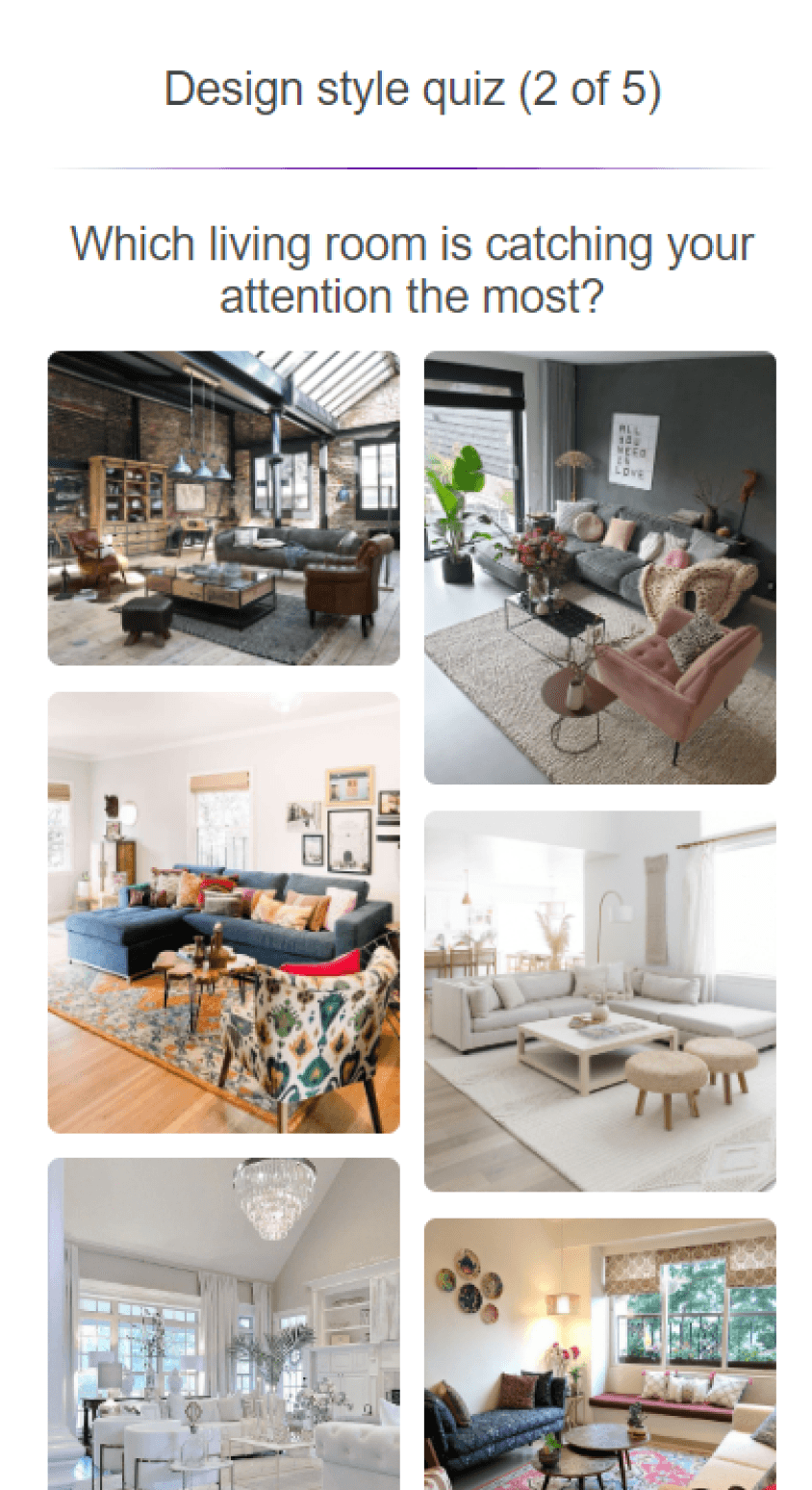
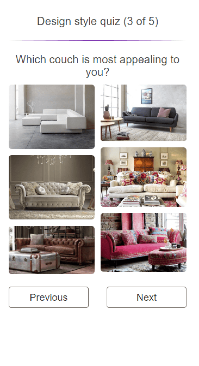
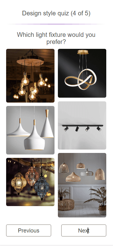
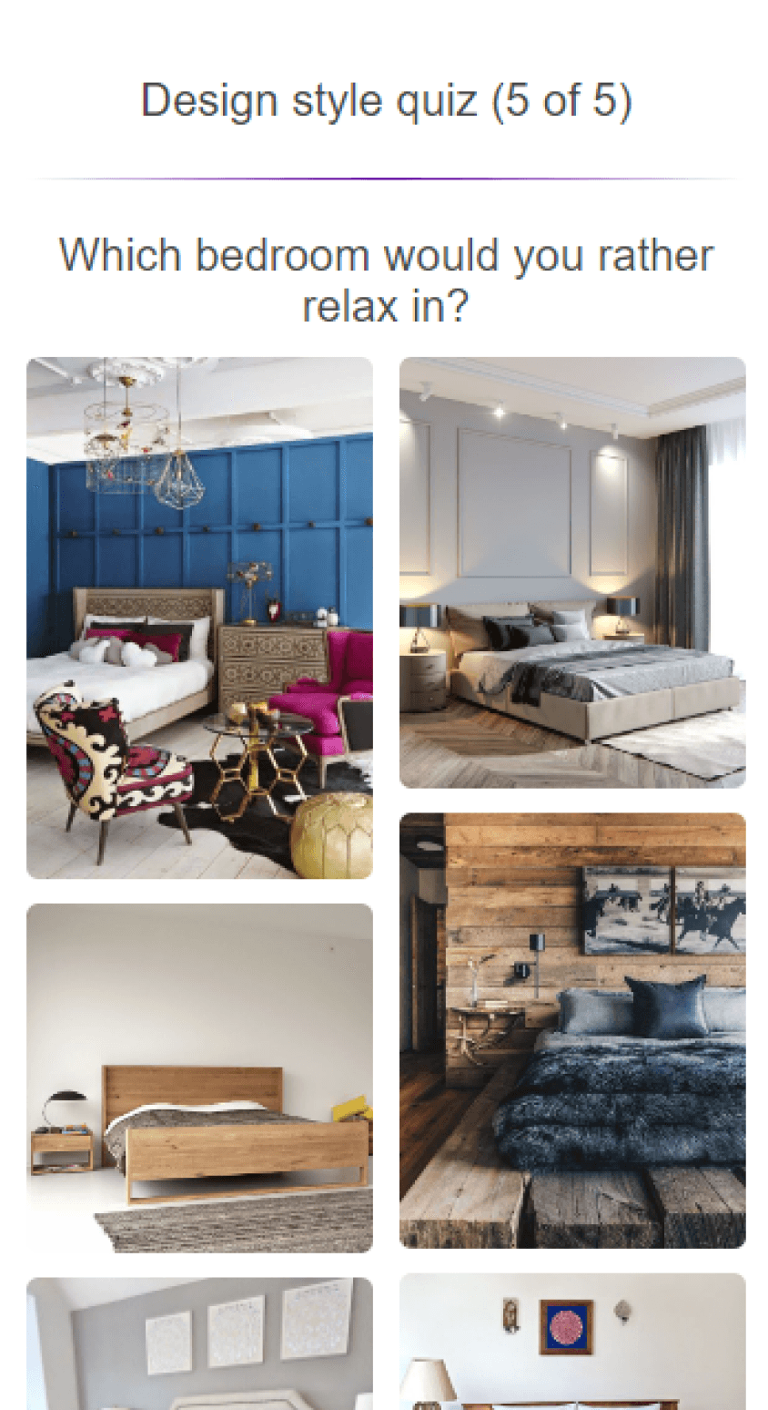
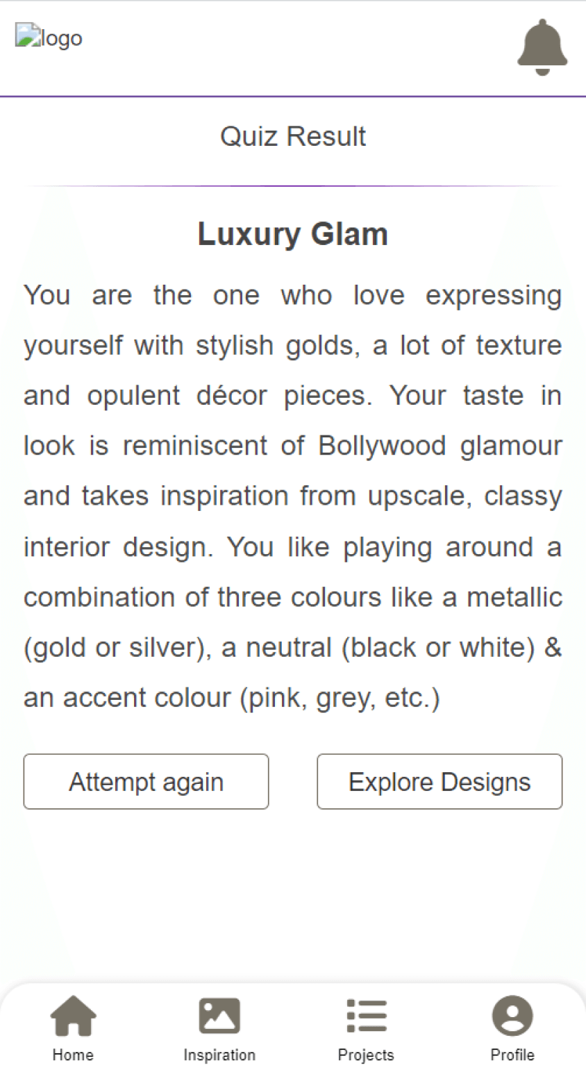
Generic questions
Not helping in defining the requirement of client
No details on client budget
No specifics on the area dimensions
Lacked details on the vibe that client wants from the place
No details on project progress
No track of site work progress
No track of client payments
Lacked document history shared and approval received
NEW
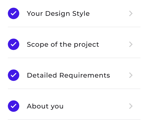
Four separate sections allowing the user to enter the information easily
Capturing the requirement in detail, making it easier to match the design aesthetics and predict cost


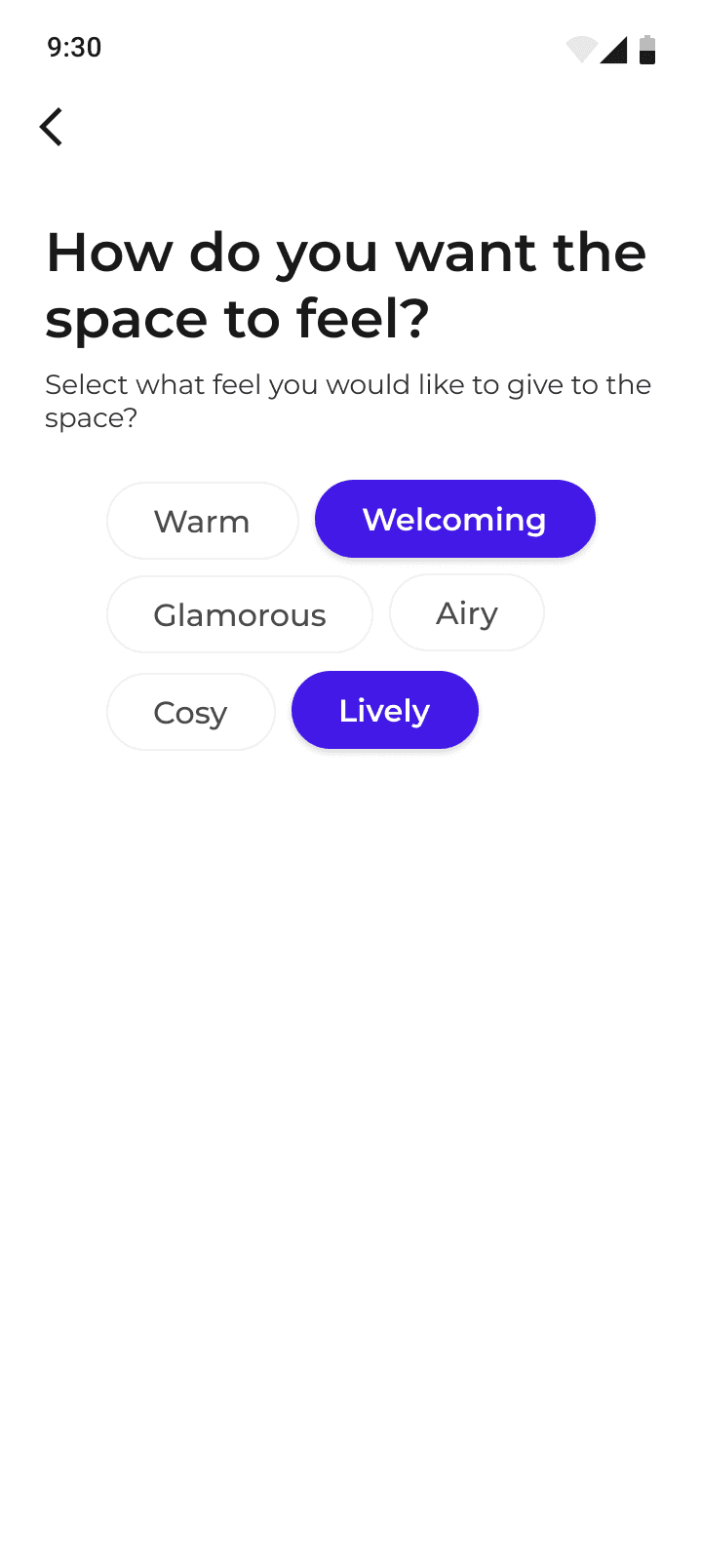
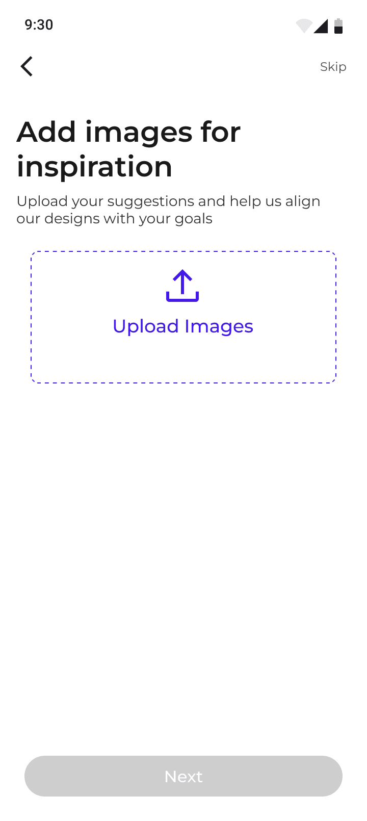
This section is for understanding the client’s design taste, what kind of colors, aesthetics, patterns they like, so that we can give them recommendations accordingly.
A lot of visuals are used here to make the user understand what kind of options they have.
If the client has some suggestions, they can upload them here so that it becomes easier to understand the exact requirement.
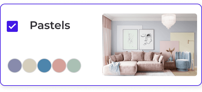
For selection of color palette, category name + the kind of colors it involves + a visual of how these colors will play out if applied to an interior setting
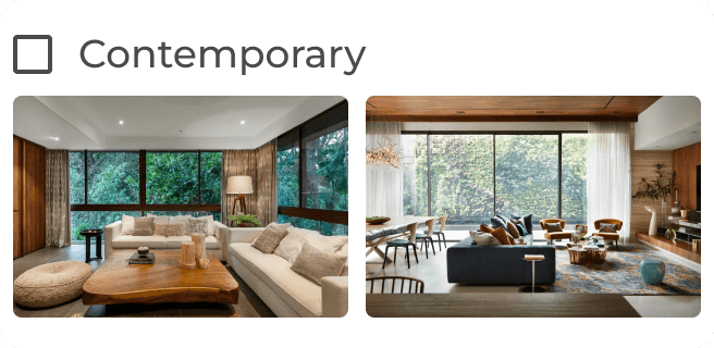
For the style of the interior setting, user gets style name along with the images depicting that style so that it becomes easier for them to choose
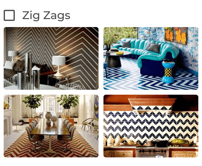
Here the user gets to select what kind of patterns he likes. He can see how these patterns can be applied on various surfaces and how they merge with the whole picture

Defining the scope of the project in terms of space, size, budget, timeframe.
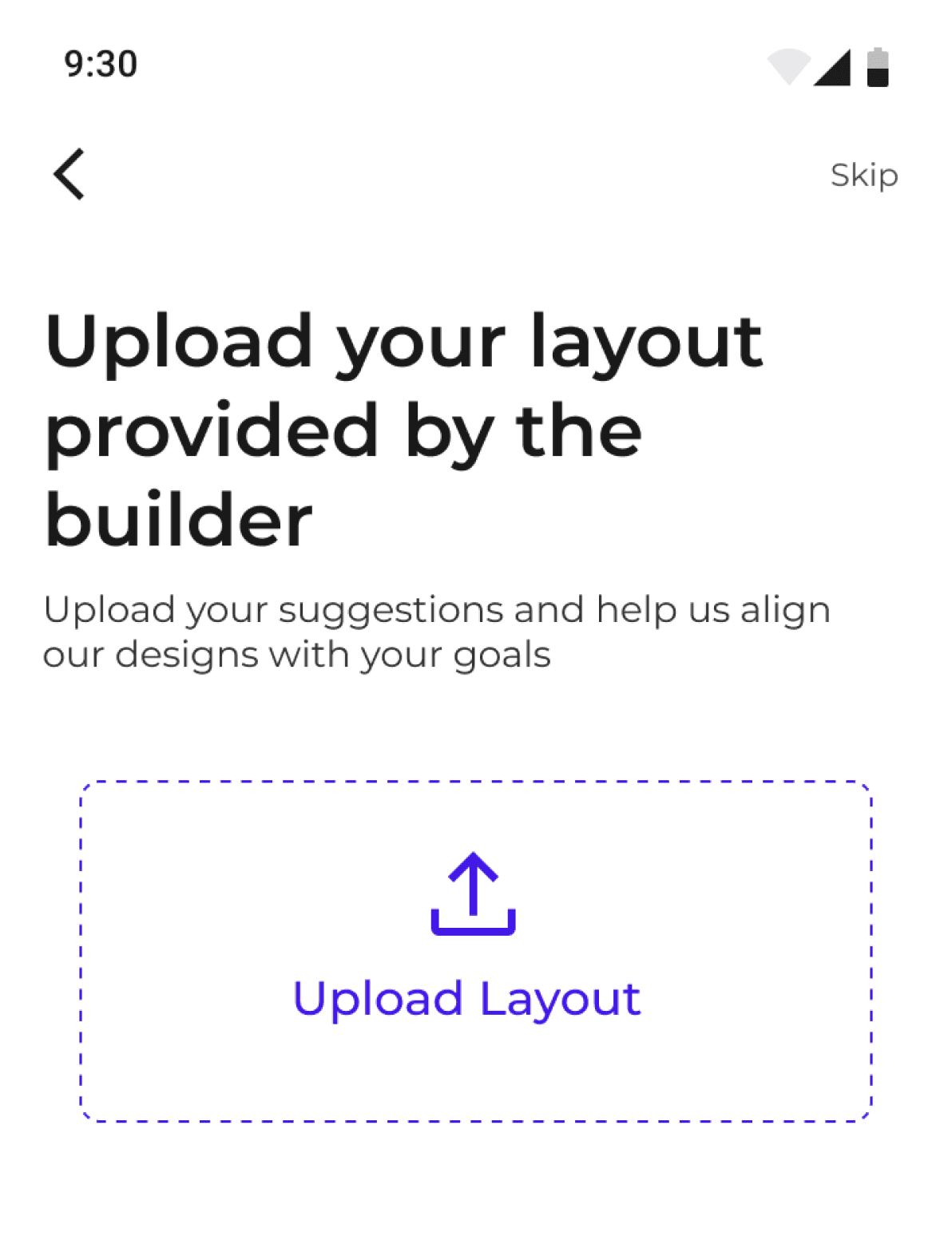
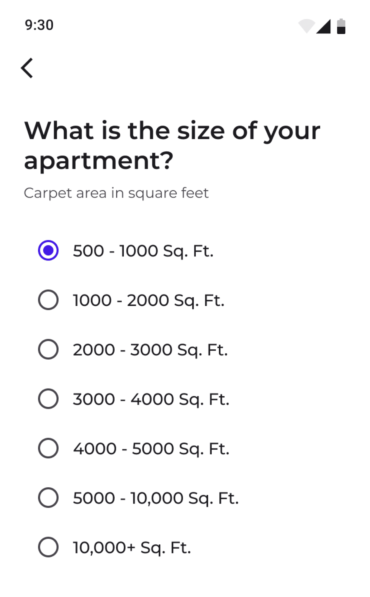
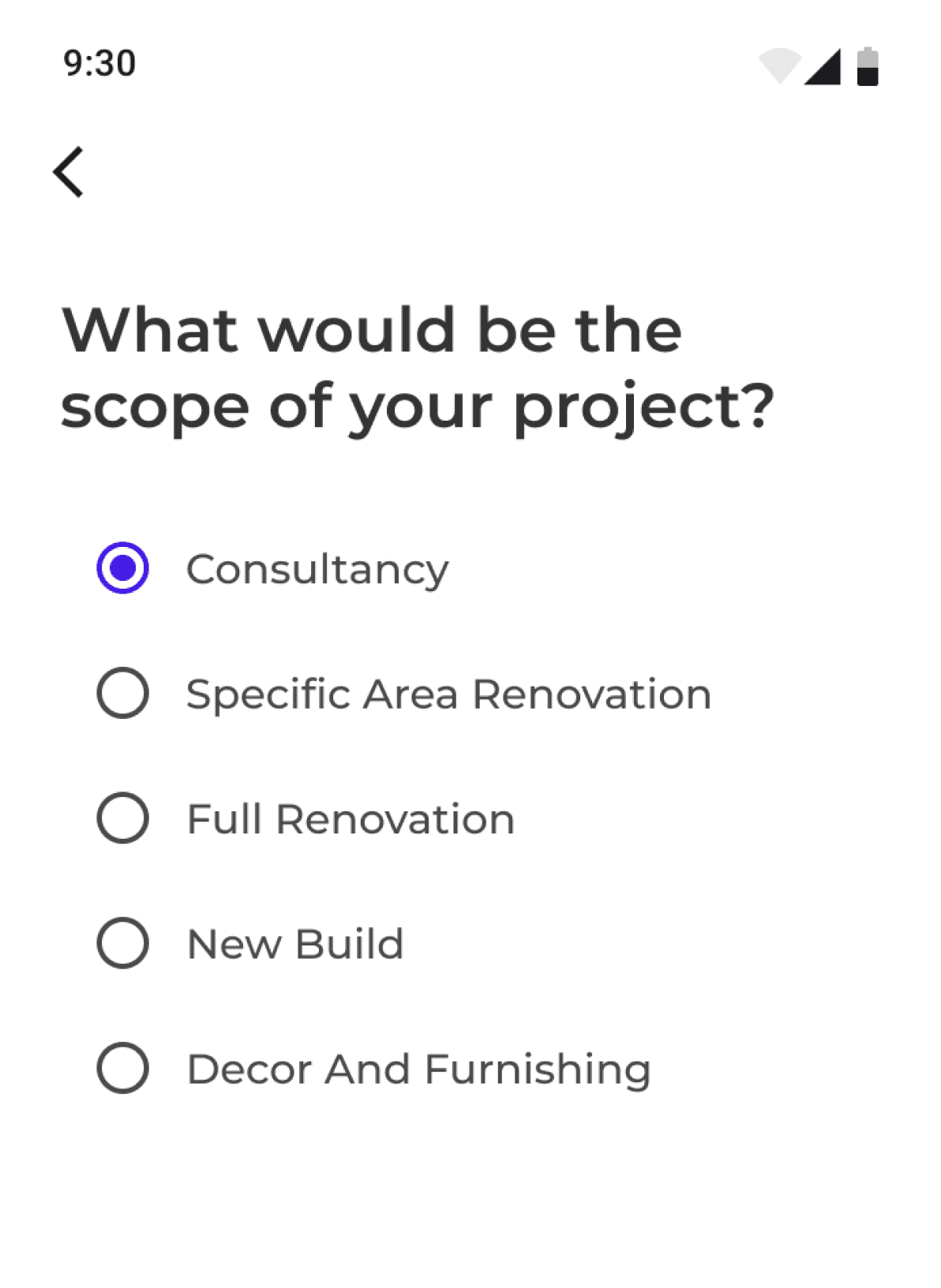
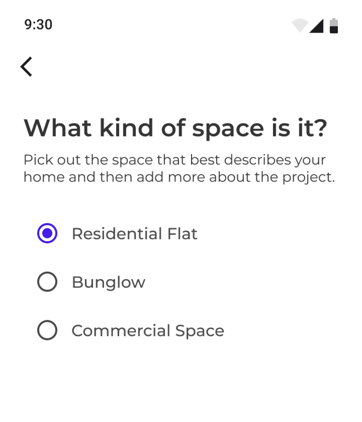
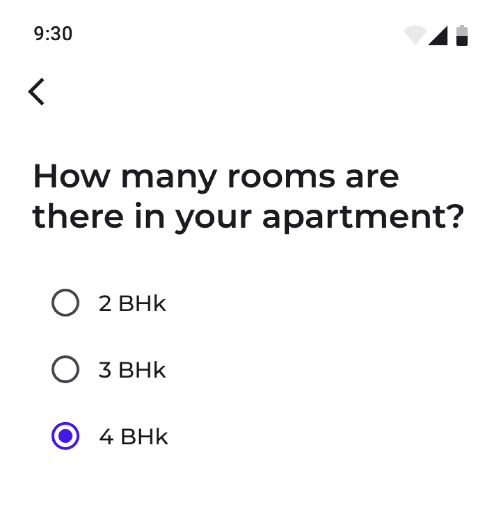
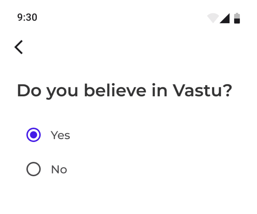
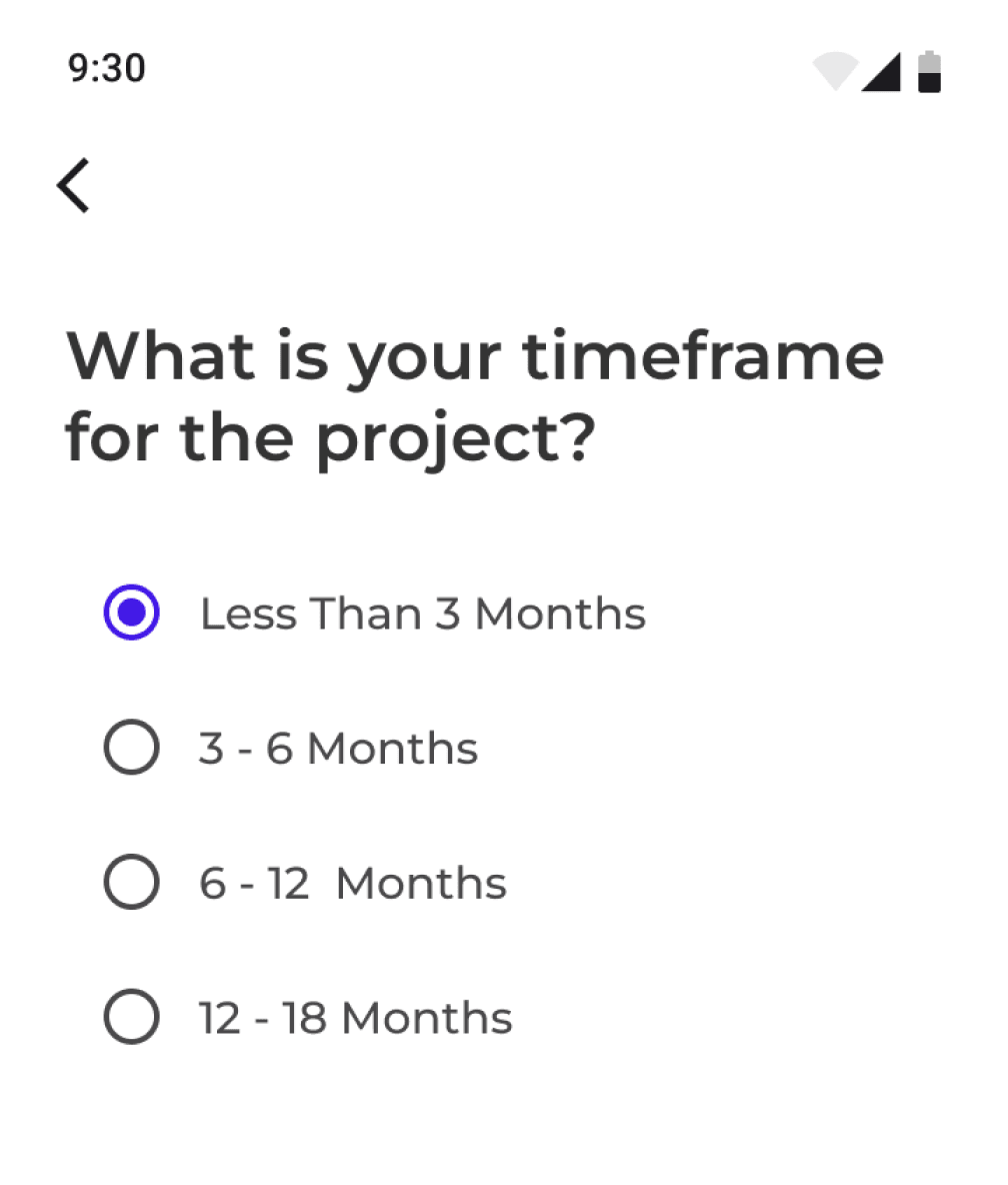
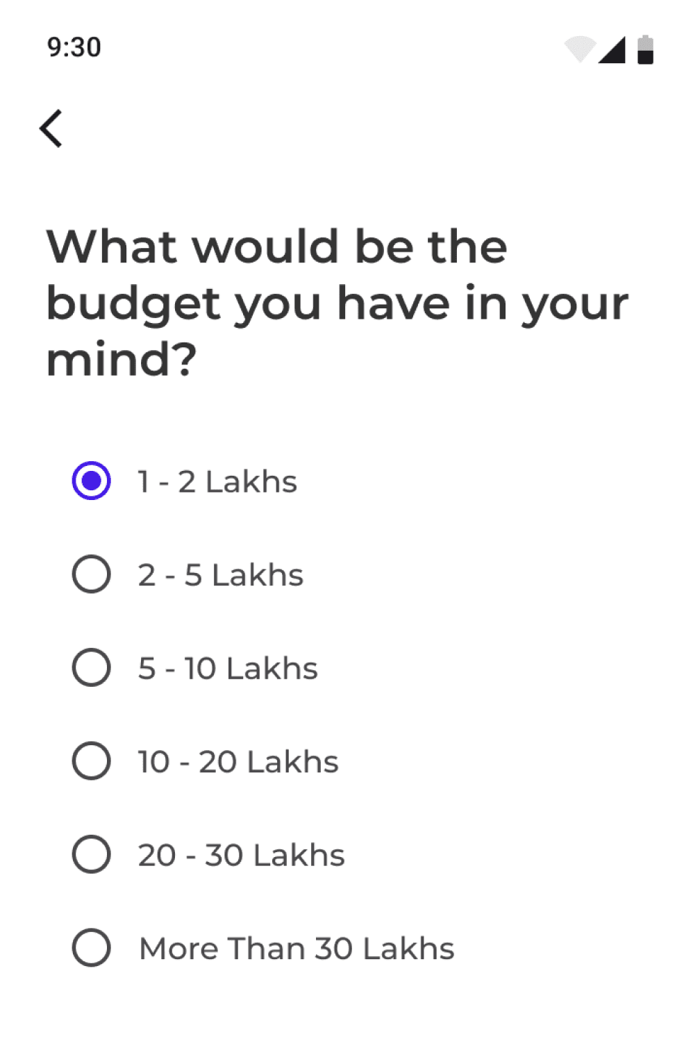

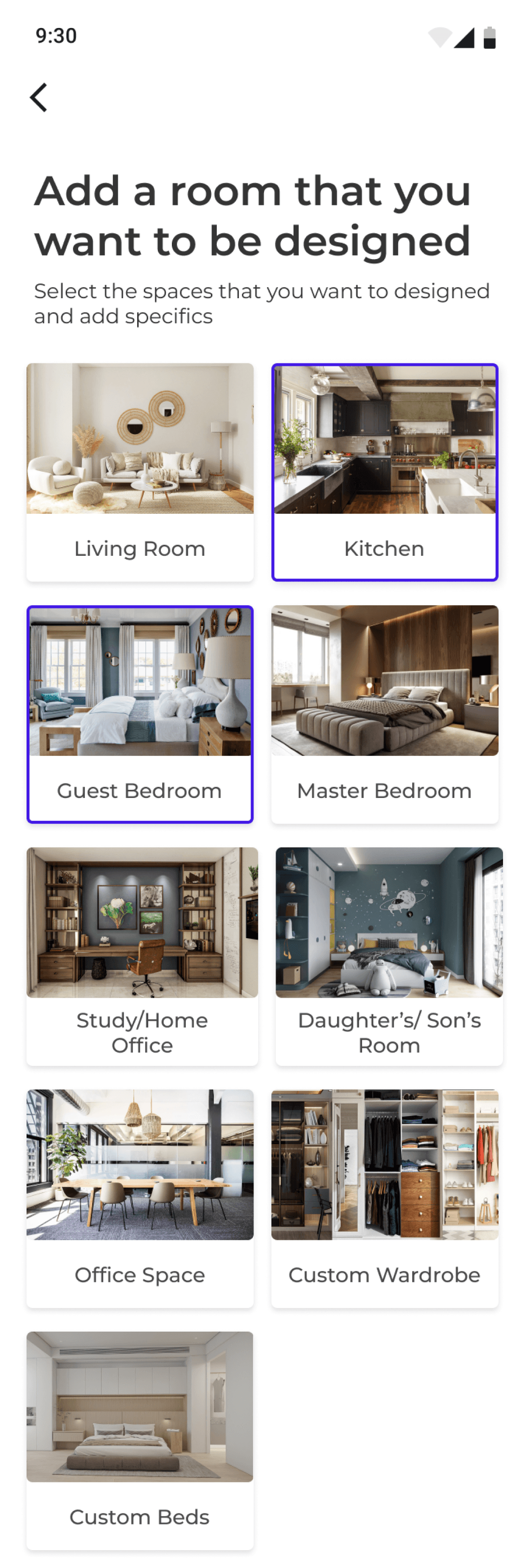
Here the user talks about the sections of the place they want designed. They select the area and provide required details which later help in the budgeting of the project.
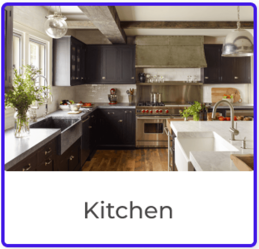
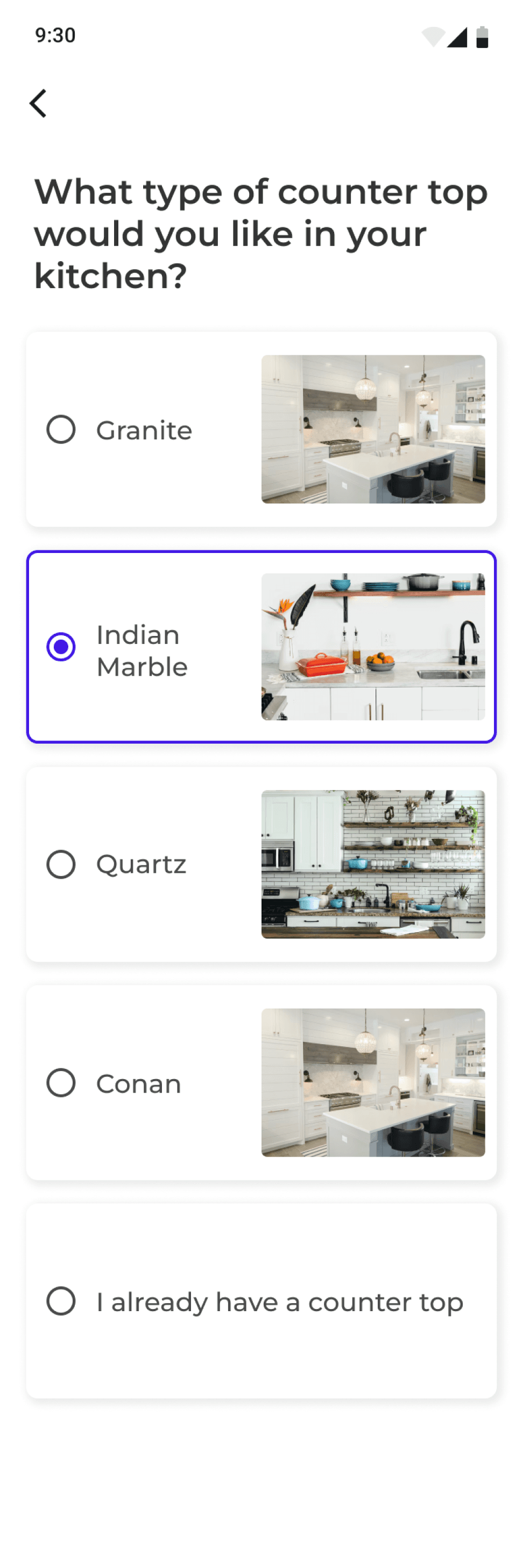
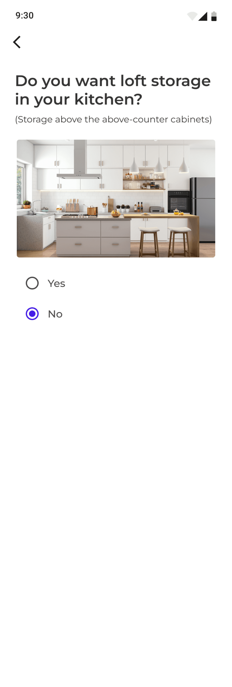
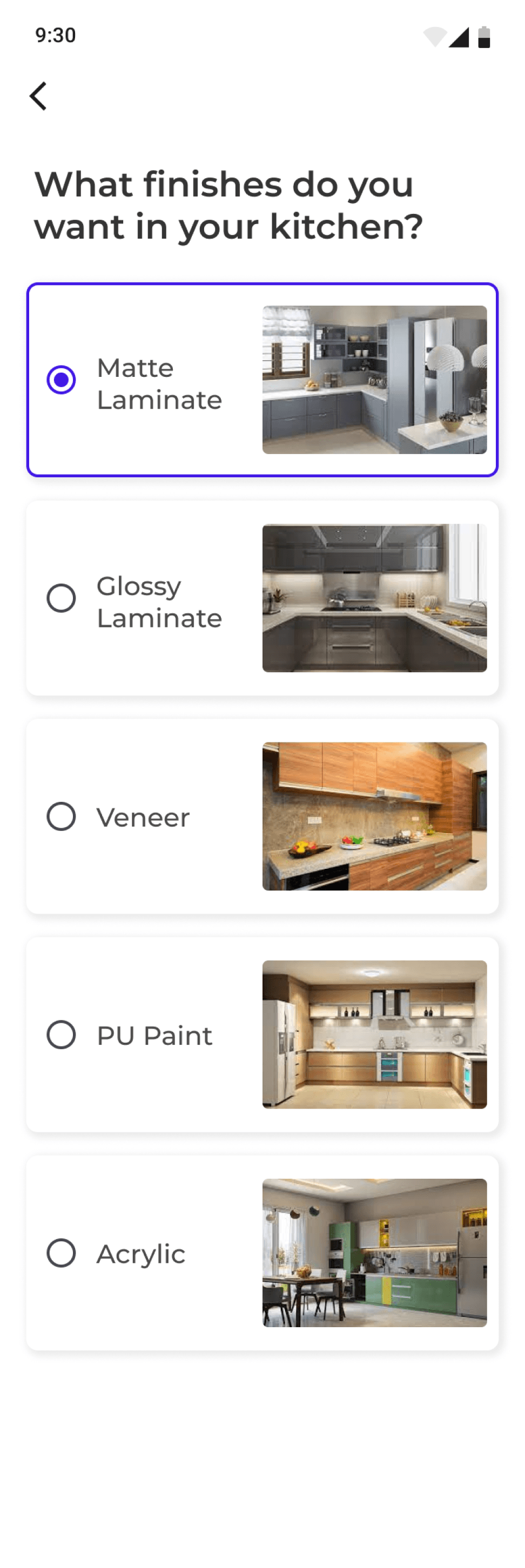
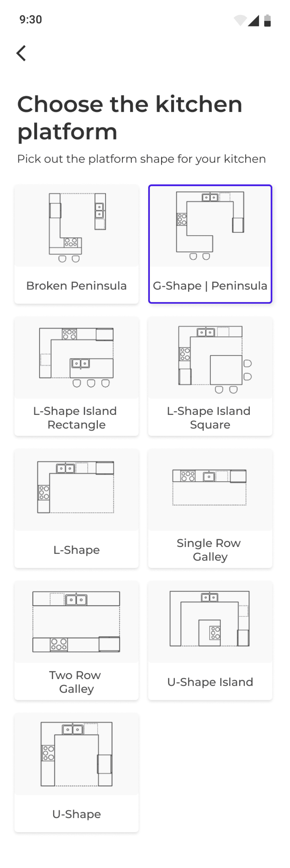
All these questions are for defining the scope of the kitchen work. Focus is kept on explaining the things visually for the user for making the decision making easier and avoid confusion



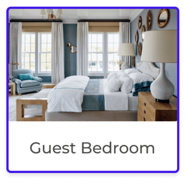
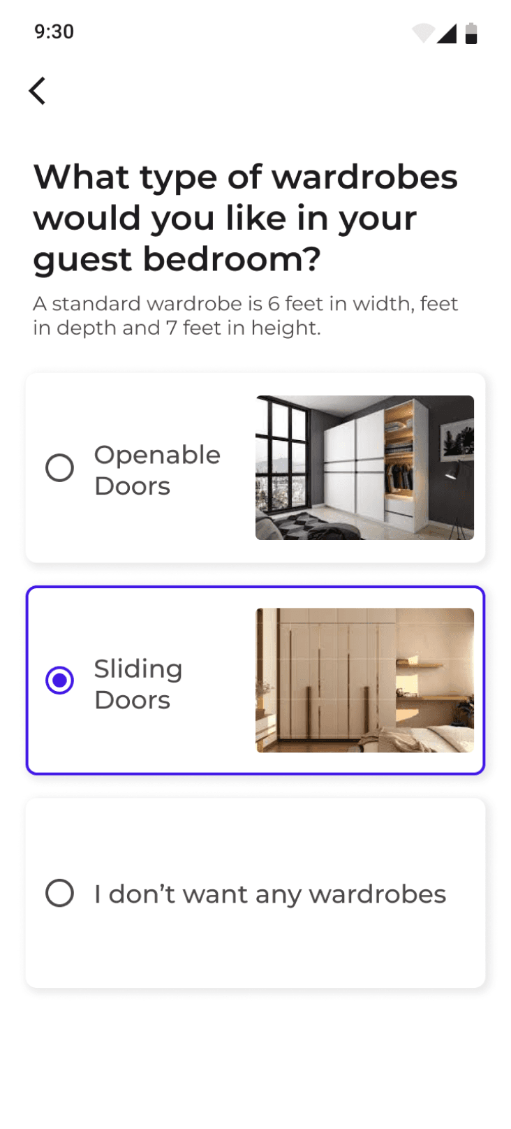
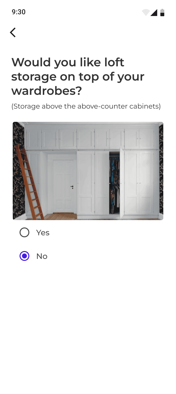
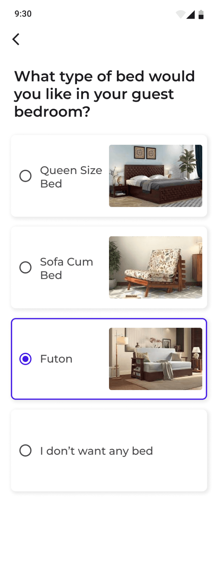
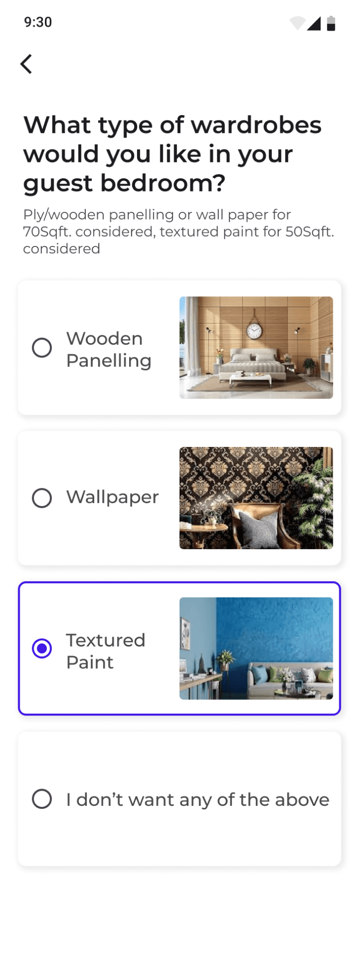
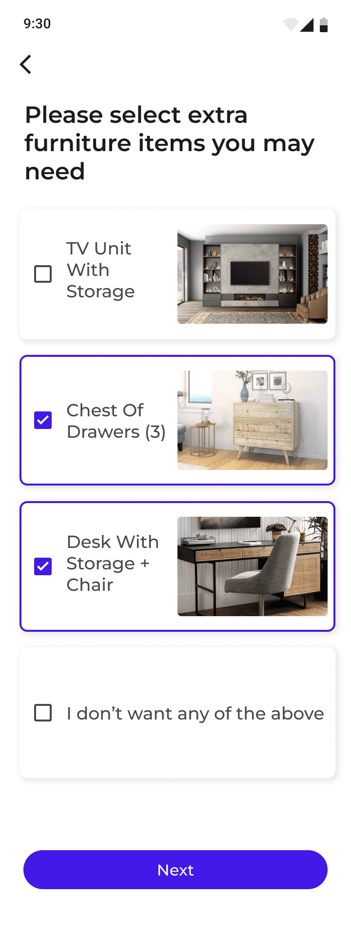
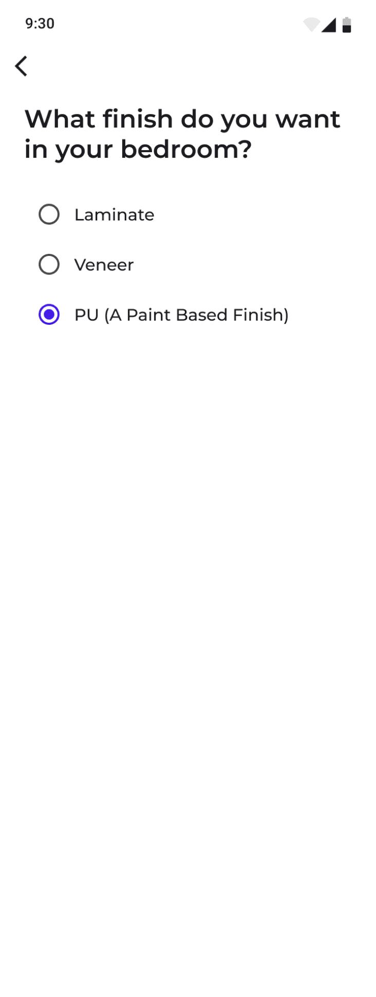
The below questionnaire is depicting the requirements for the bedroom.
Details like what kind of doors, wardrobes, paint, furniture are required
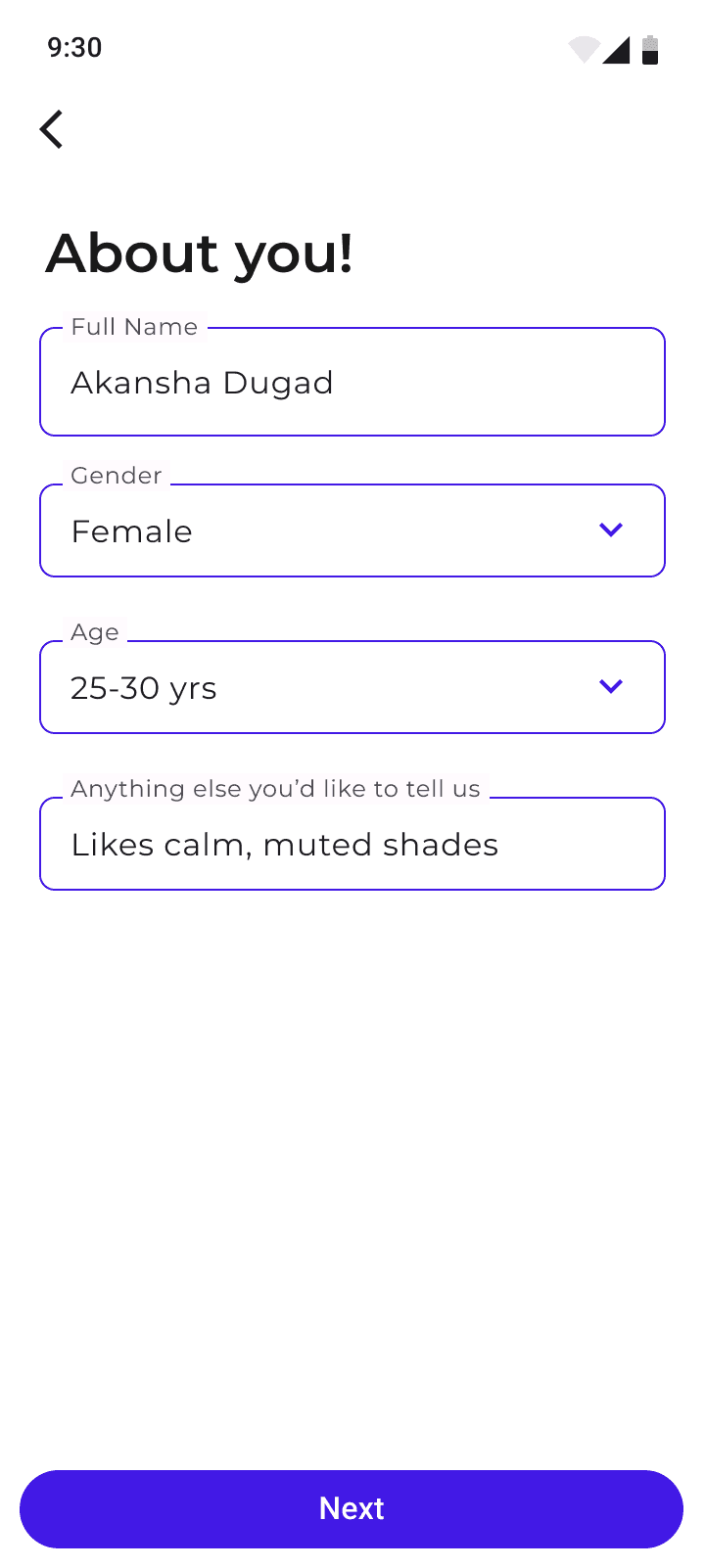
About you
This sections captures the interests, name, age, any additional requirements if the user would like to add for the project
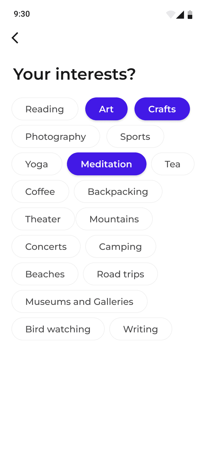
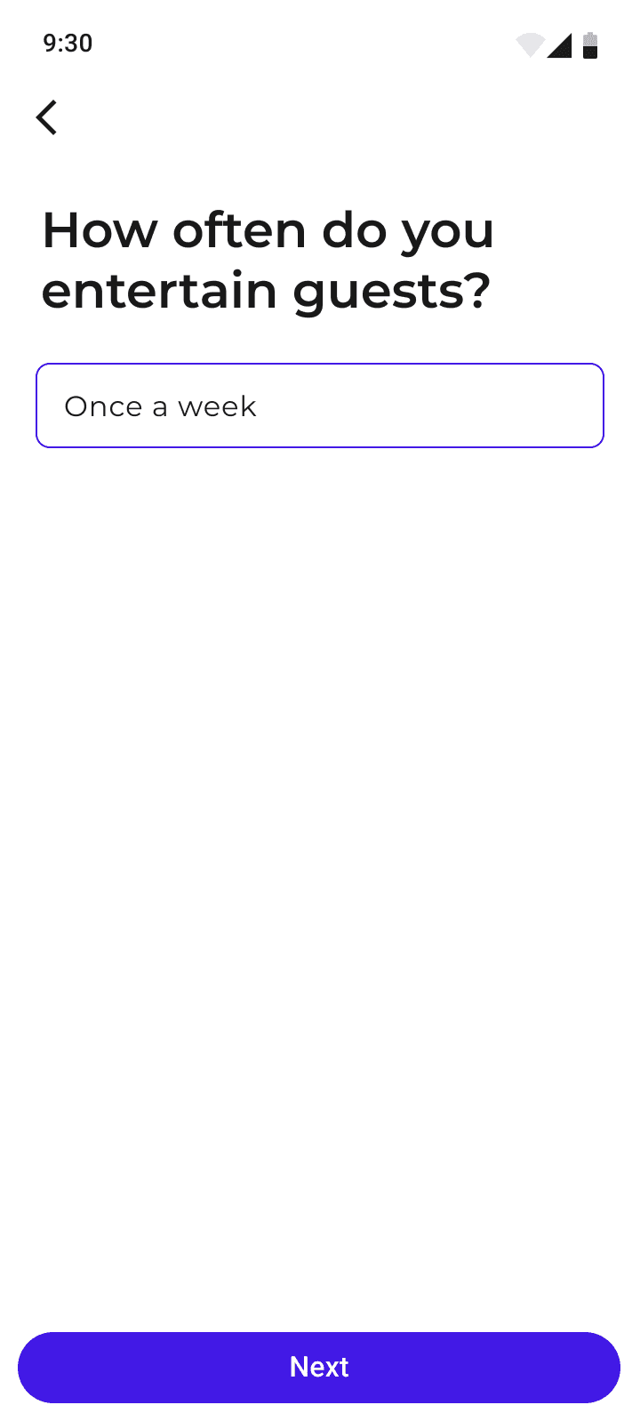
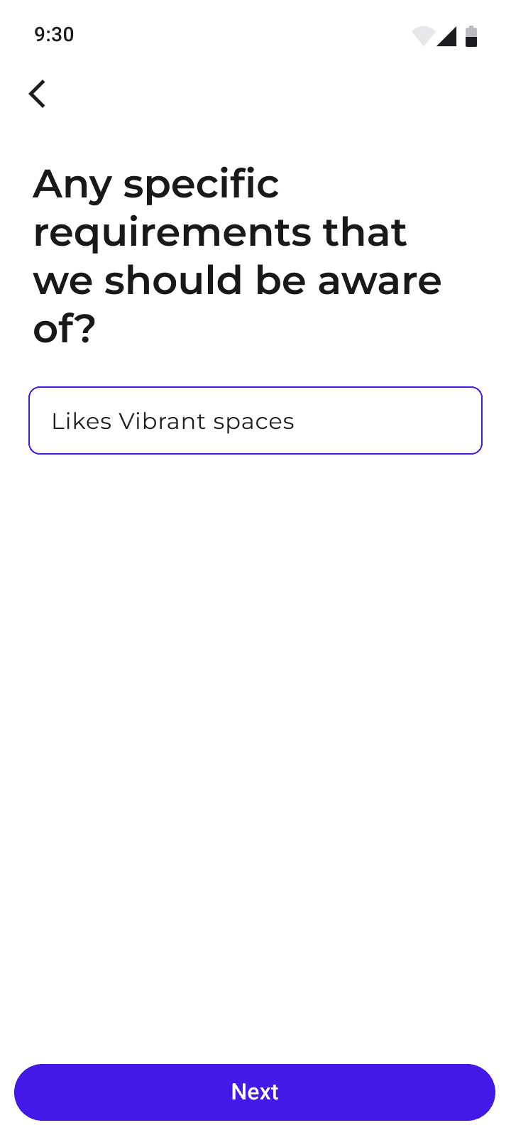
The user is provided a lot of options to select from, for defining the goals of the project. This makes it easy for the user to know what kind of possibilities are there and he gets to select from them instead of discussing random options.
Inspirations
Here, firms get to showcase the design possibilities for the client, making it easier to define the scope of the project.
Client can provide visual suggestions by adding pictures from their client app or give feedbacks on the suggestions
given by the firm’s team. This makes it easier for all the stakeholders to stay on the same page, makes the whole
process quick, efficient and trackable.
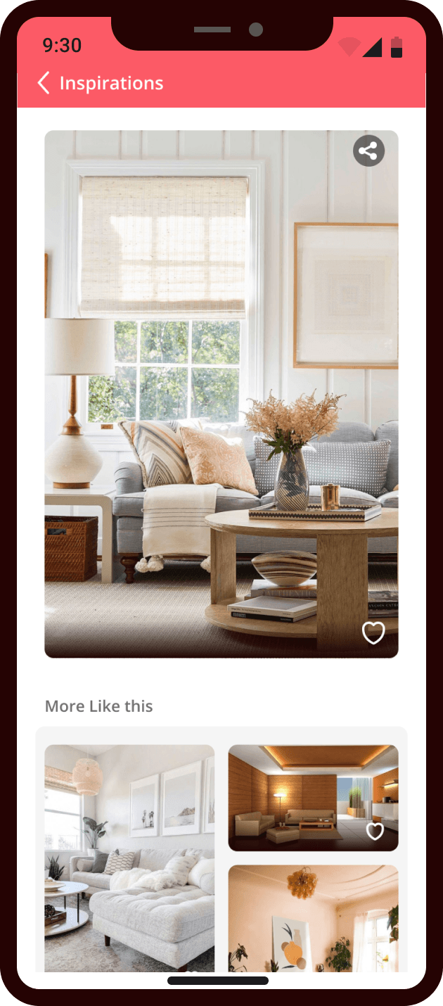
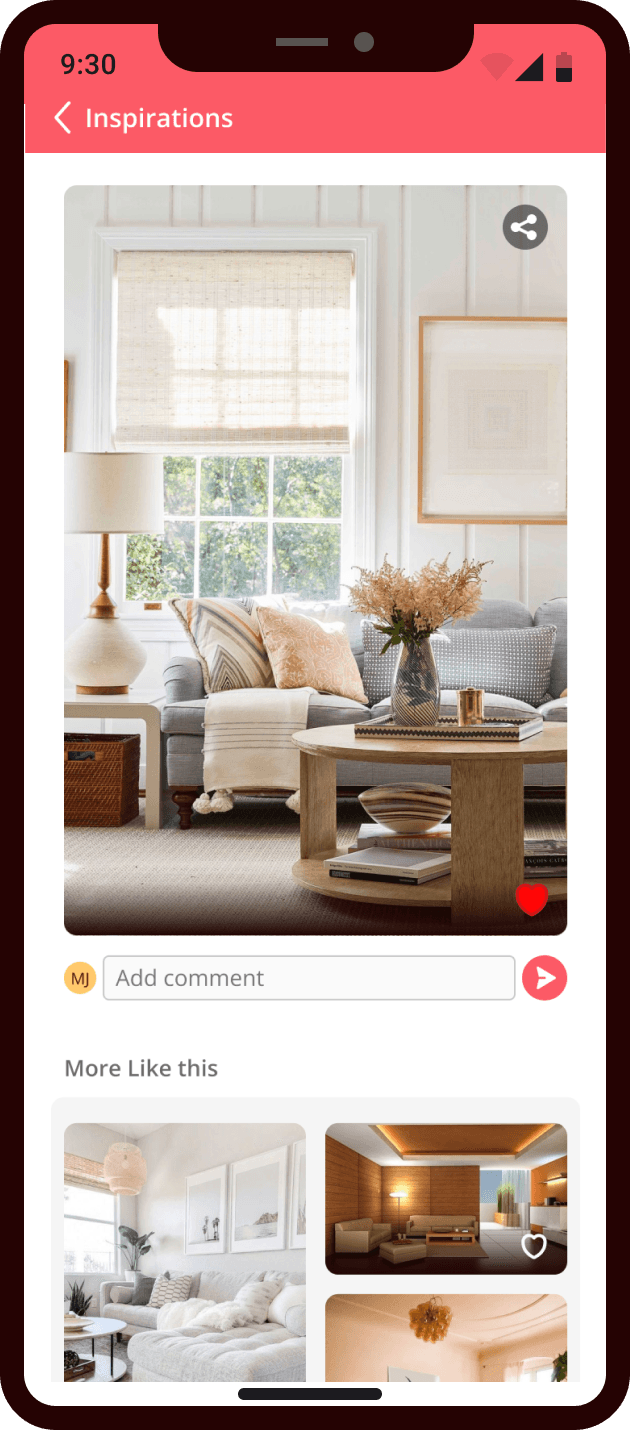
Shortlisting and
finalizing ideas
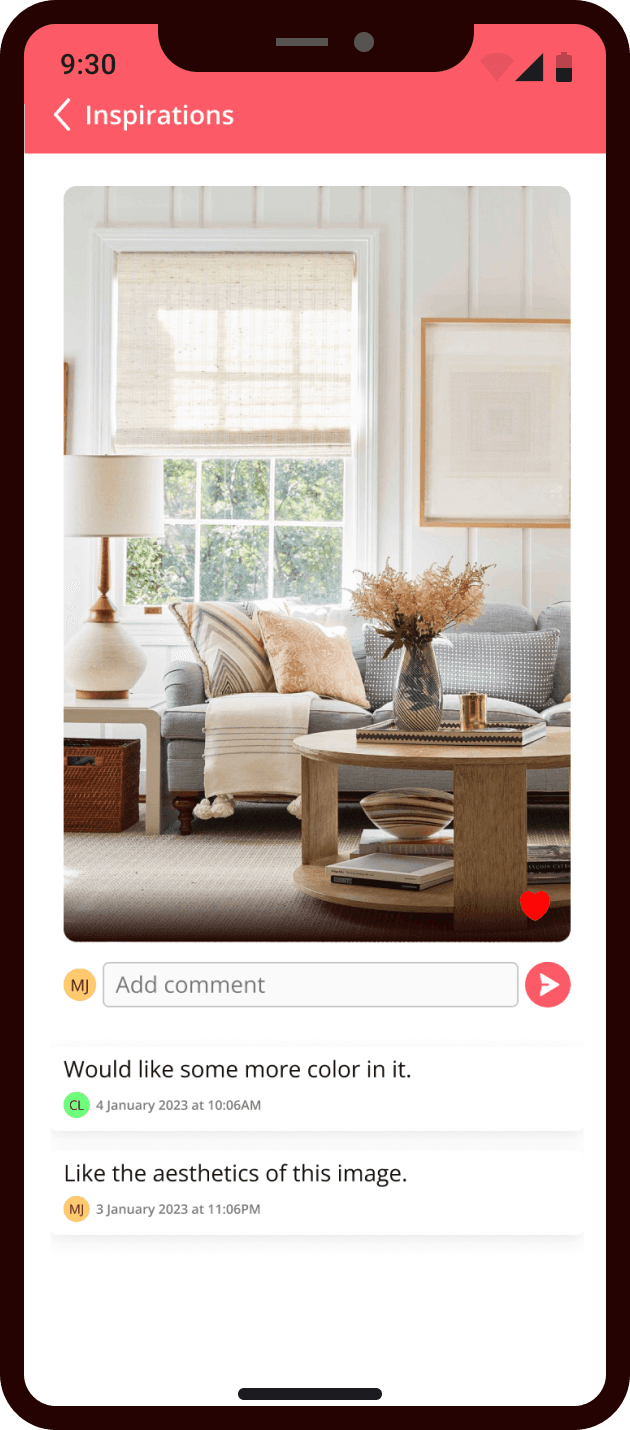
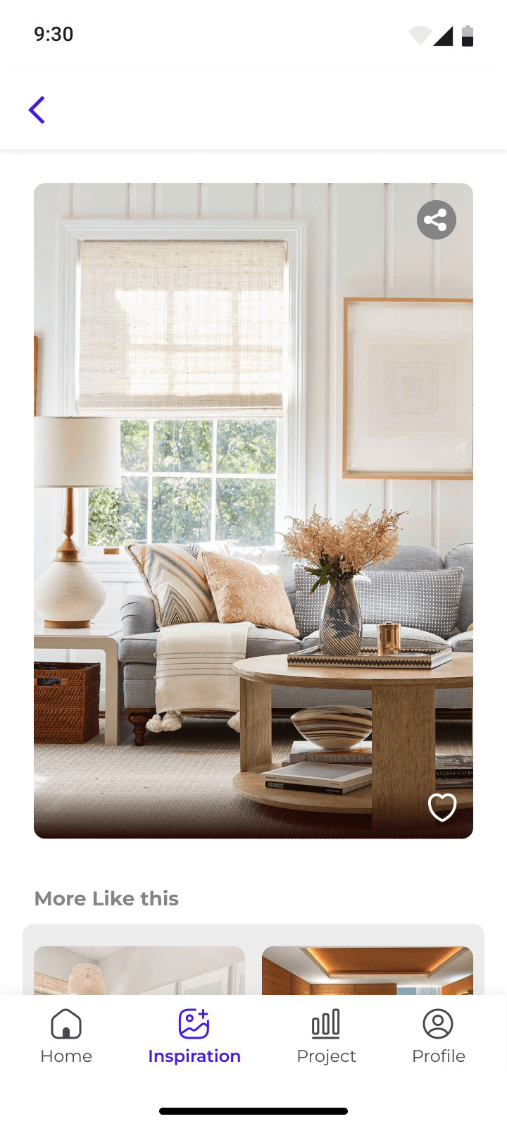
Option to add comments and discuss the possibilities for the design
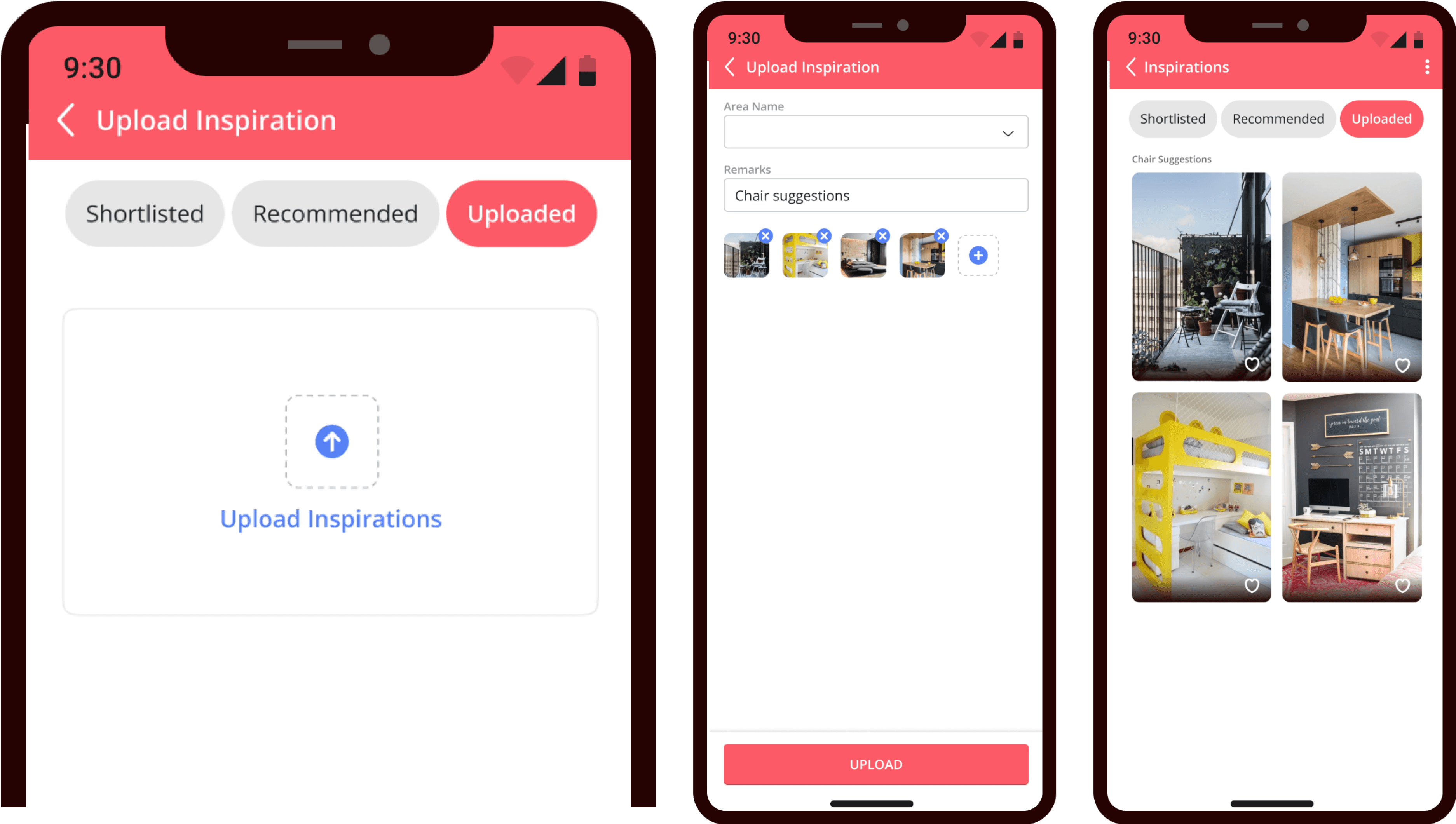
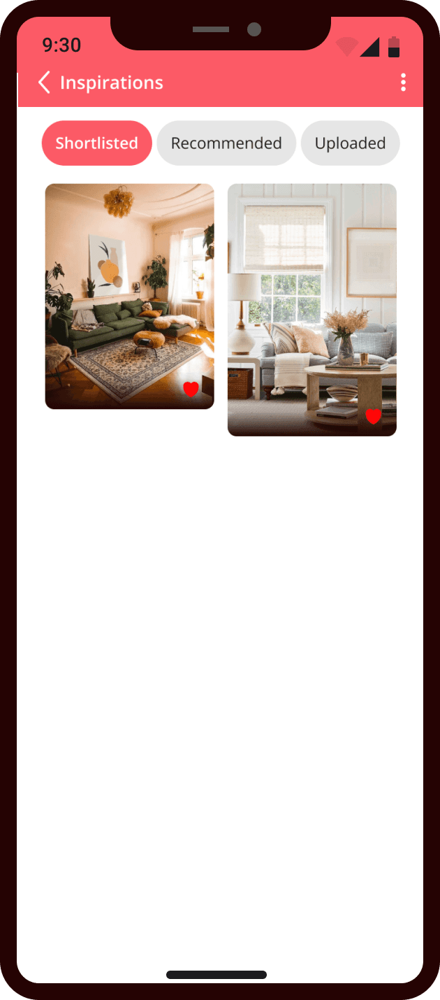
Shortlisted ideas
Discussion with date and time
Inspiration: OLD
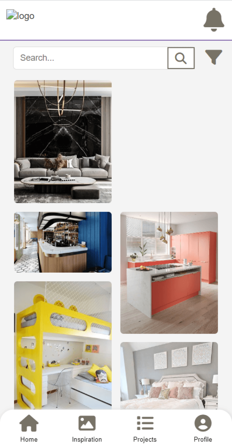
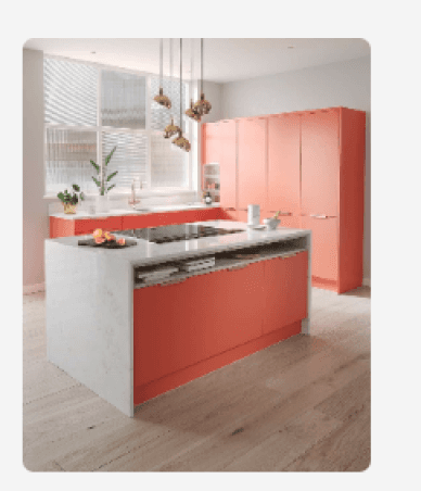
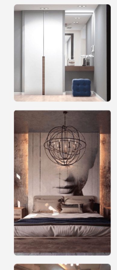
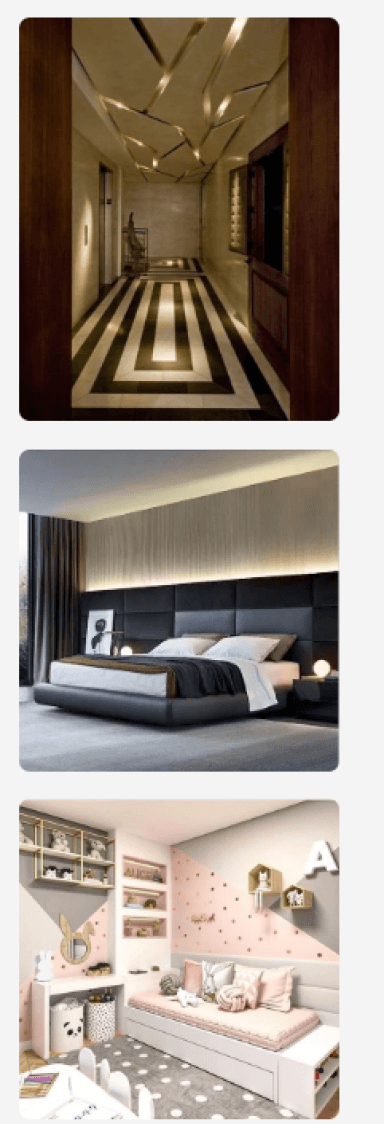
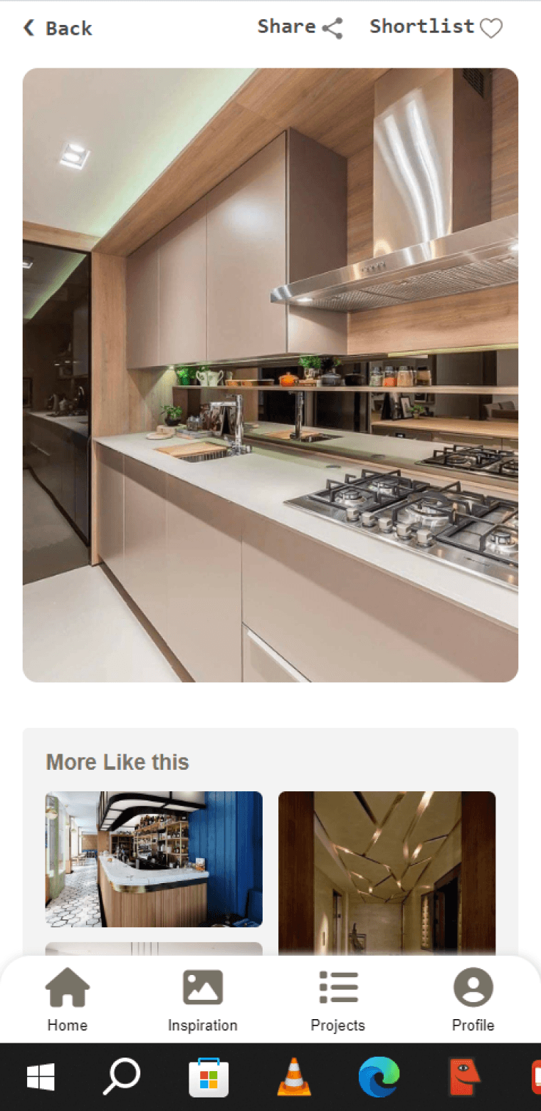
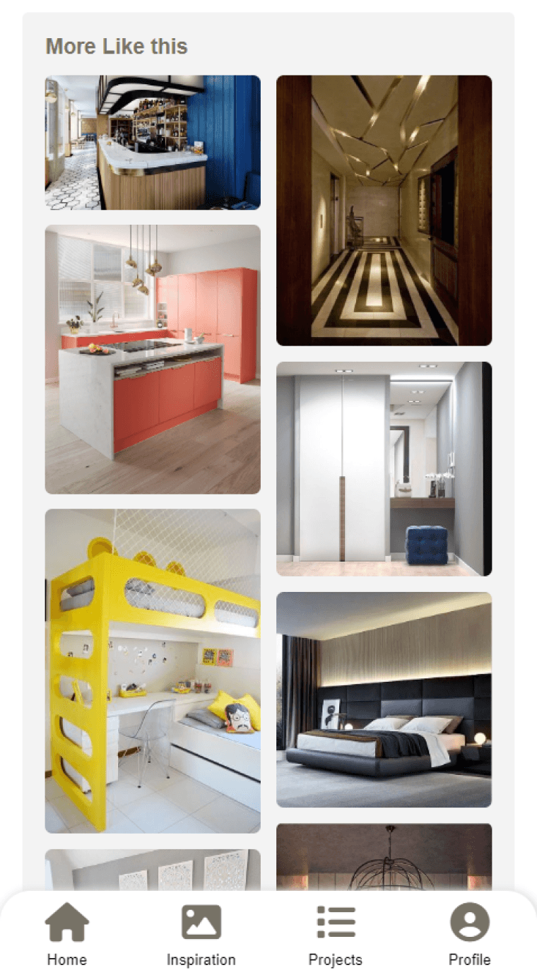
Random image suggestions without any segregation
Not helpful in defining the work scope of the project
No interaction options to discuss the design aspects
Inspiration: NEW
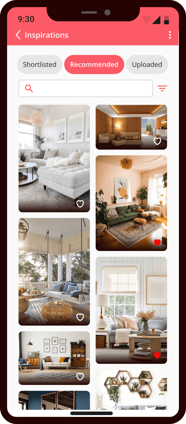
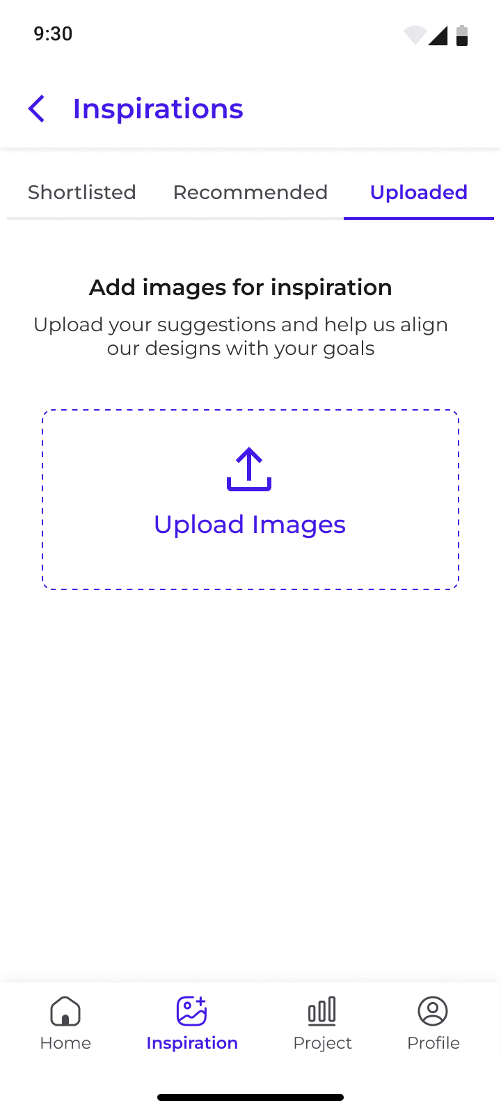
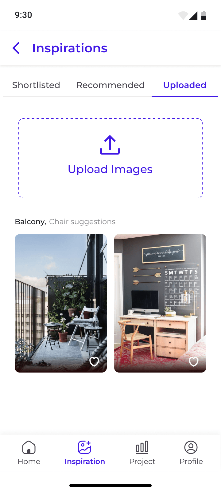
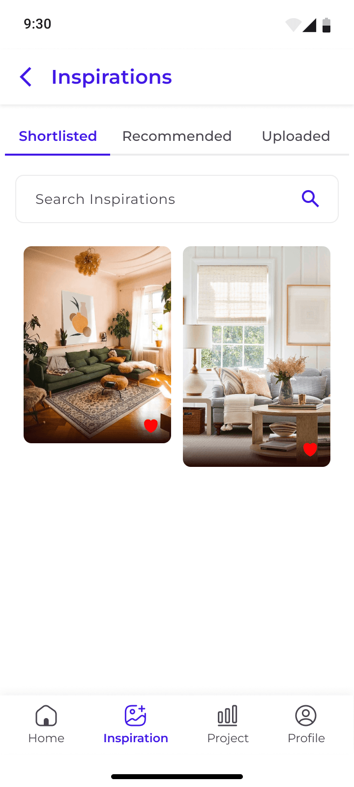
Here, firms get to showcase the design possibilities for the client, making it easier to define the scope of the project.
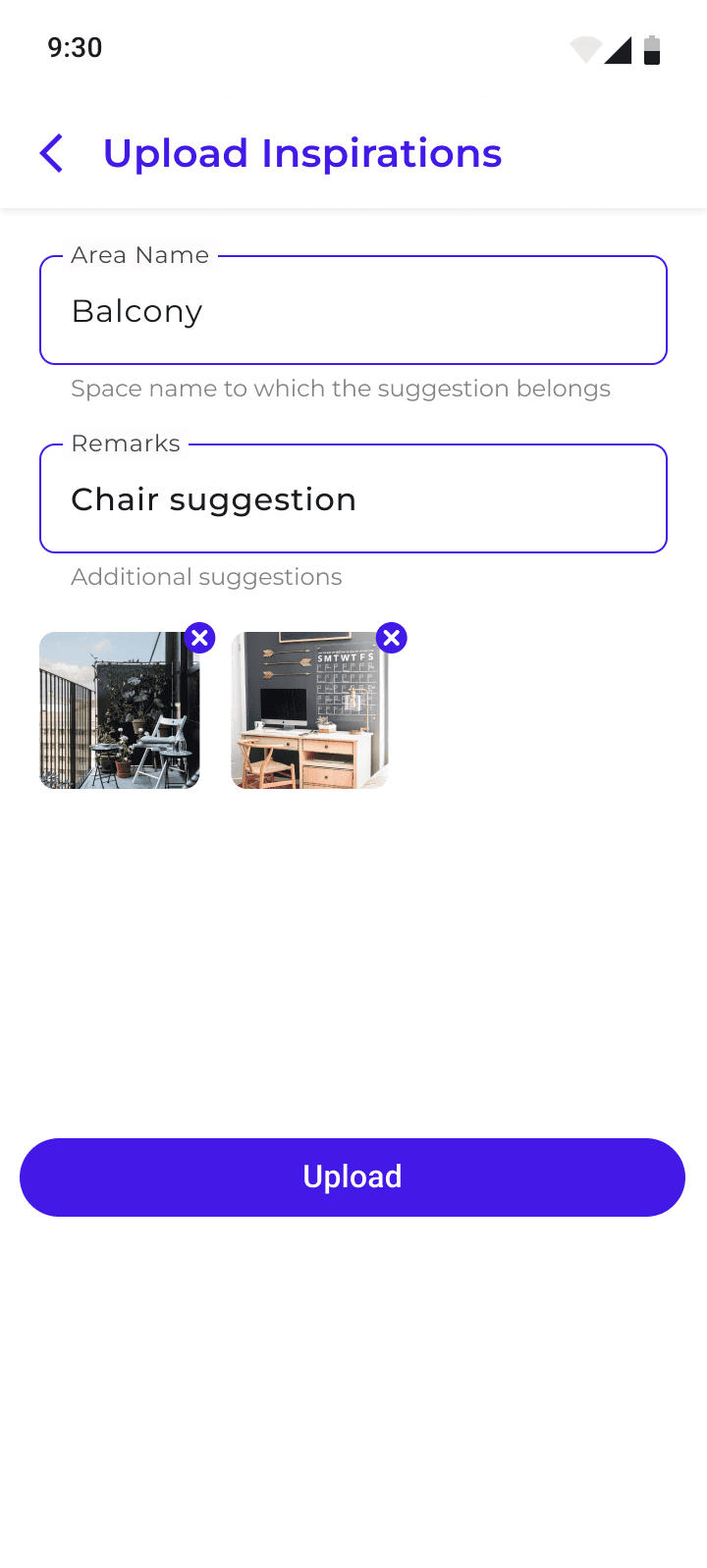
Client can provide visual suggestions by adding pictures from their client app or give feedbacks on the suggestions given by the firm’s team. This makes it easier for all the stakeholders to stay on the same page, makes the whole process quick, efficient and trackable.
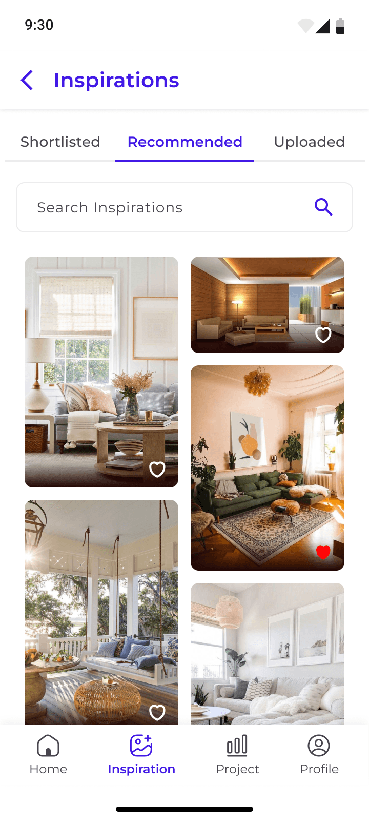
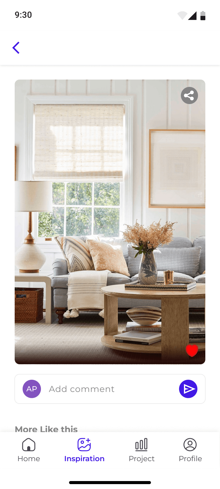
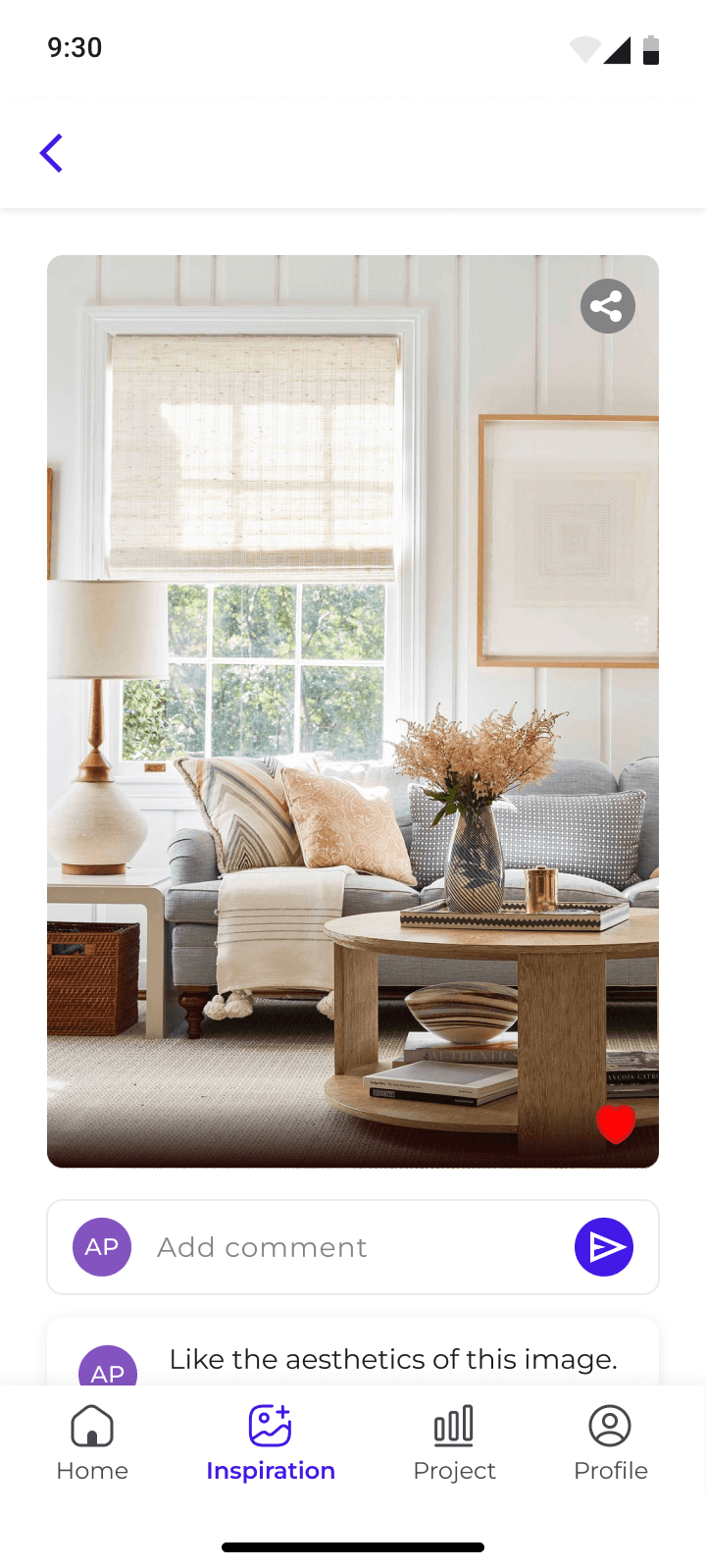
Recommended:
As per client’s preferences chosen in the questionnaire that they fill at the time of onboarding, recommendations are given automatically
Uploaded:
The team or the client can upload images to make recommendations as per the requirement of the project, they appear in this section
Shortlisted:
The selected and finalized ideas from the above two options appear here
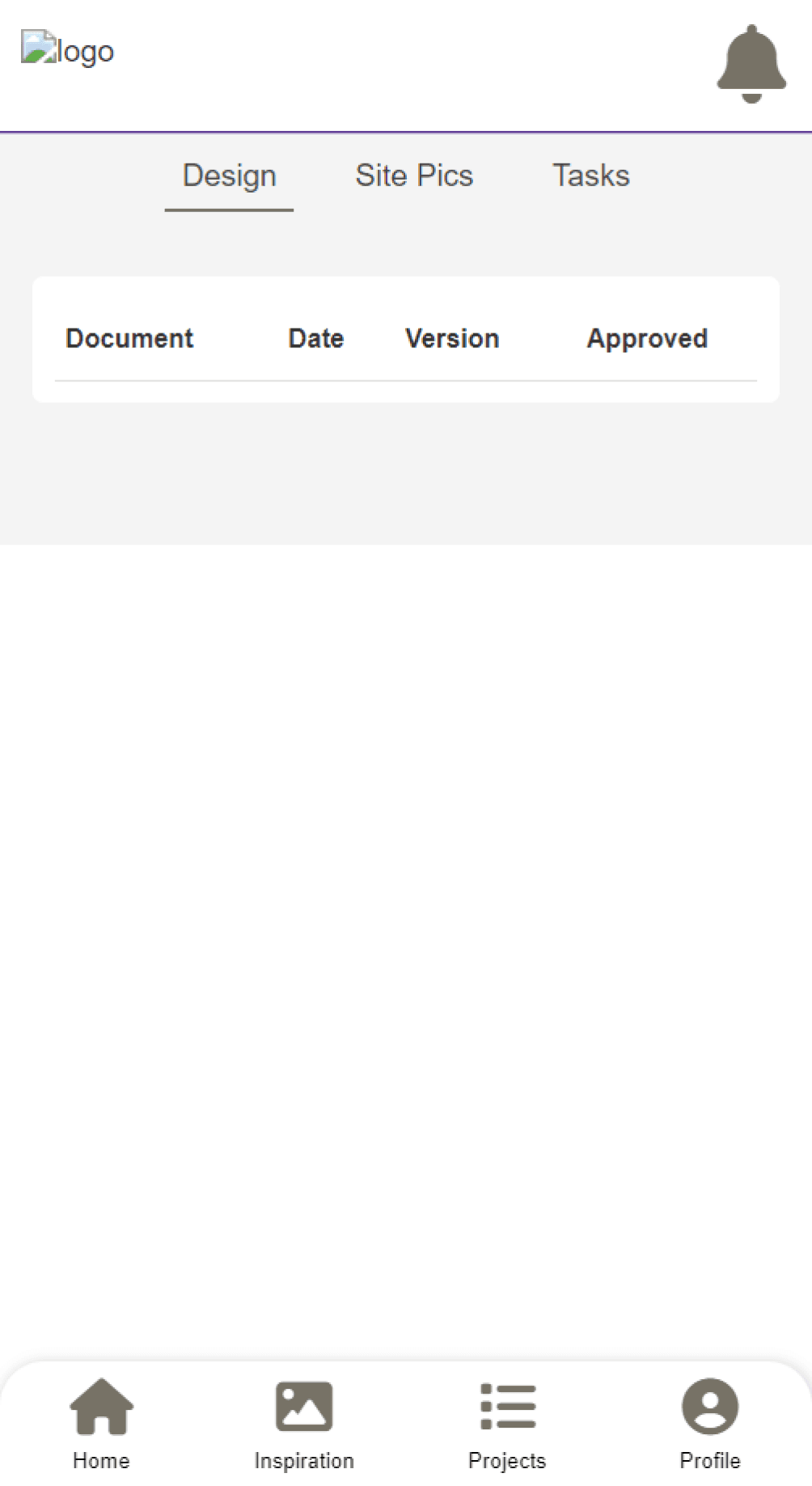
Project: OLD
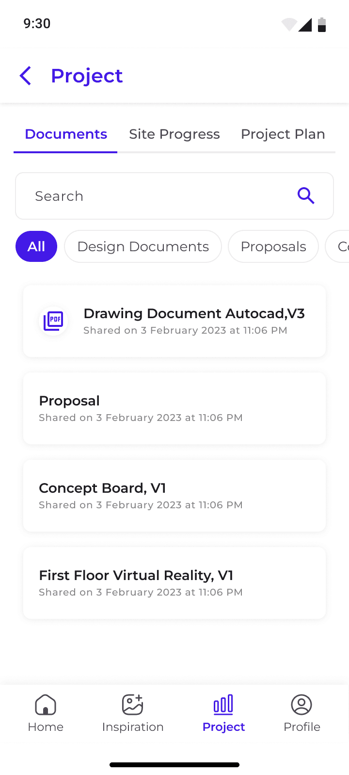
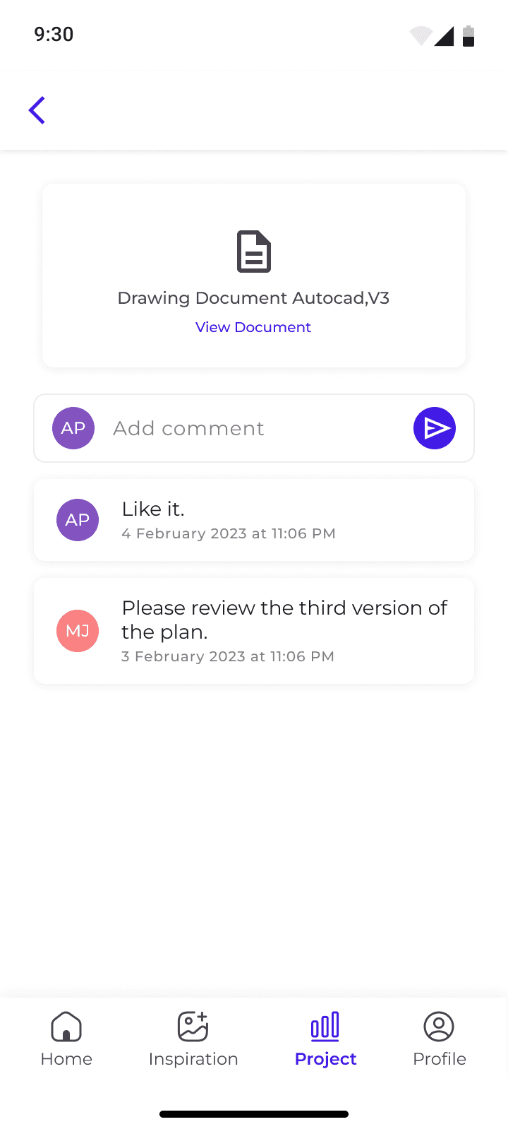

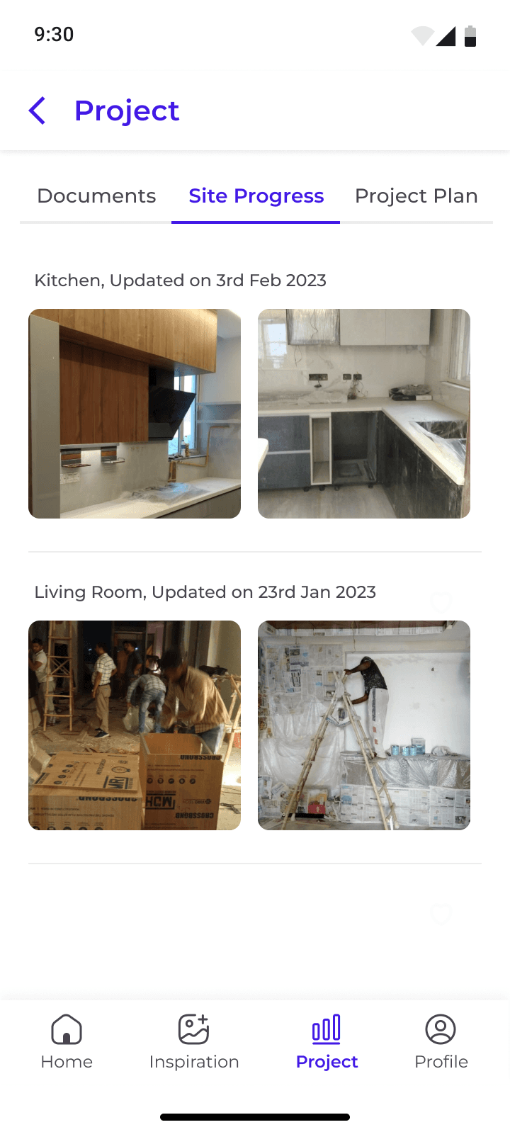
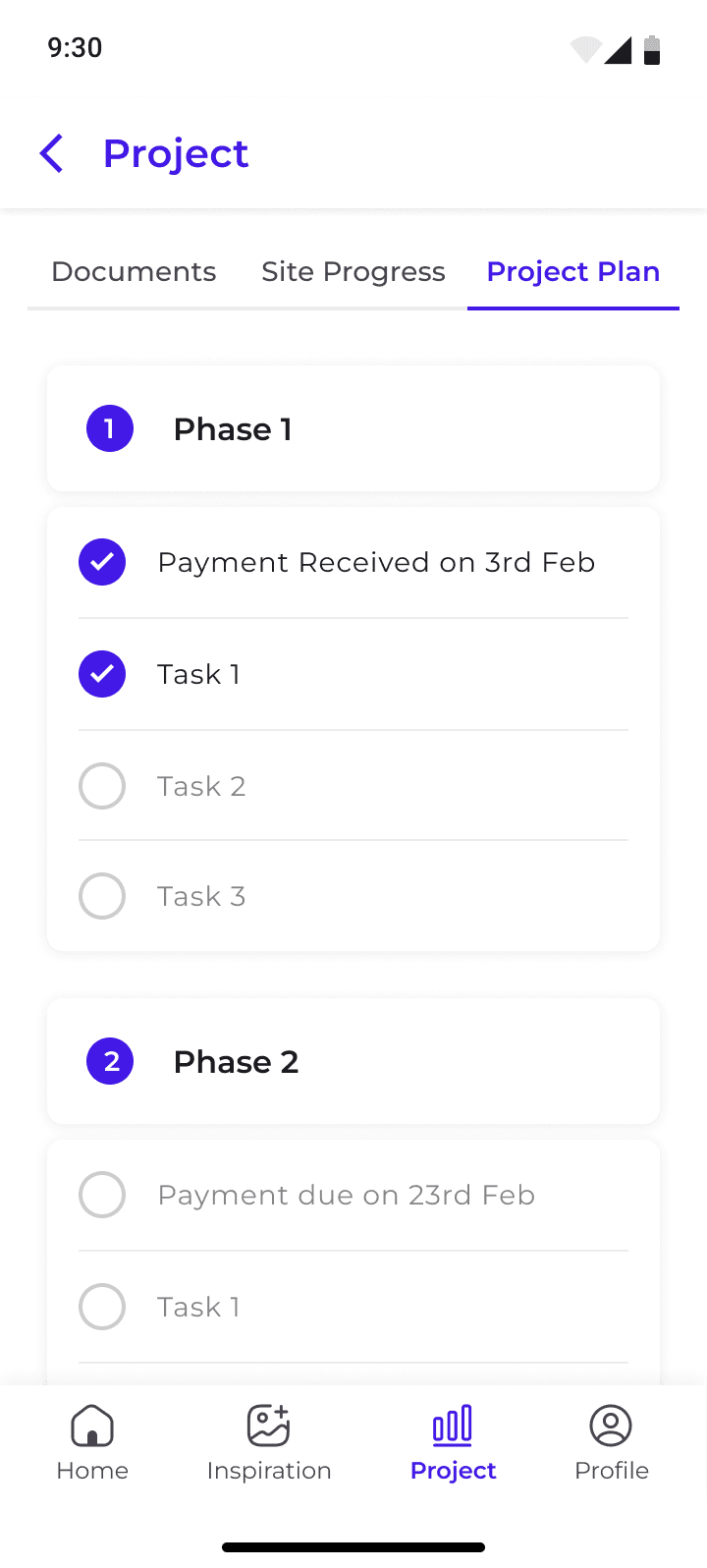
Projects: NEW
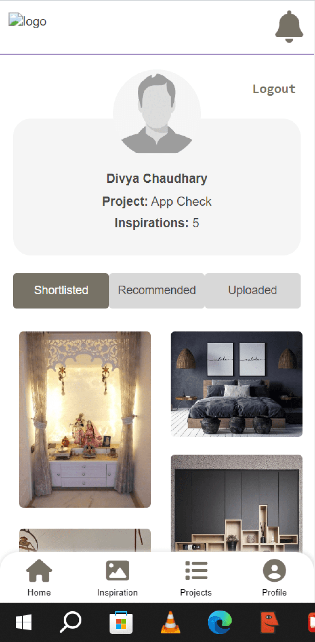
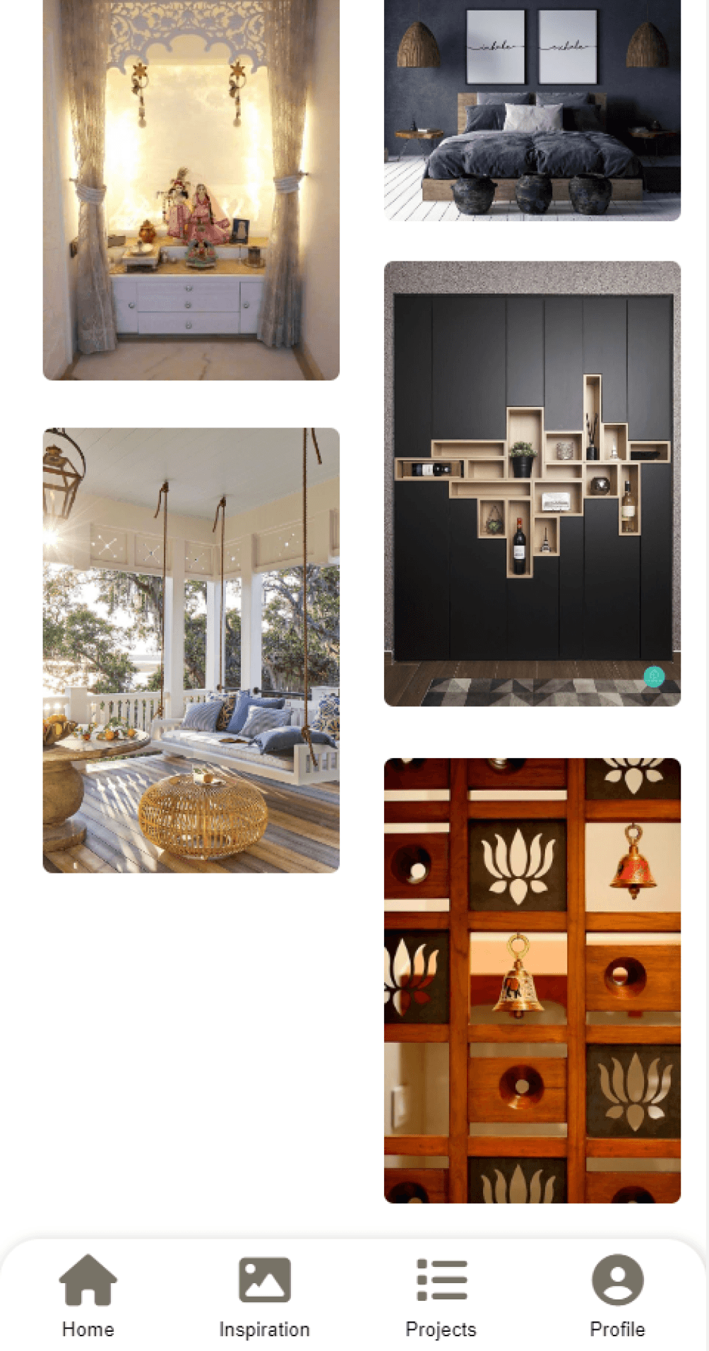
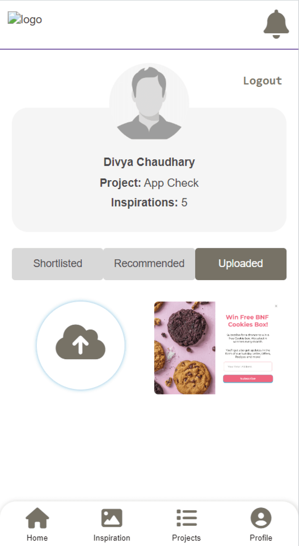
Profile: OLD
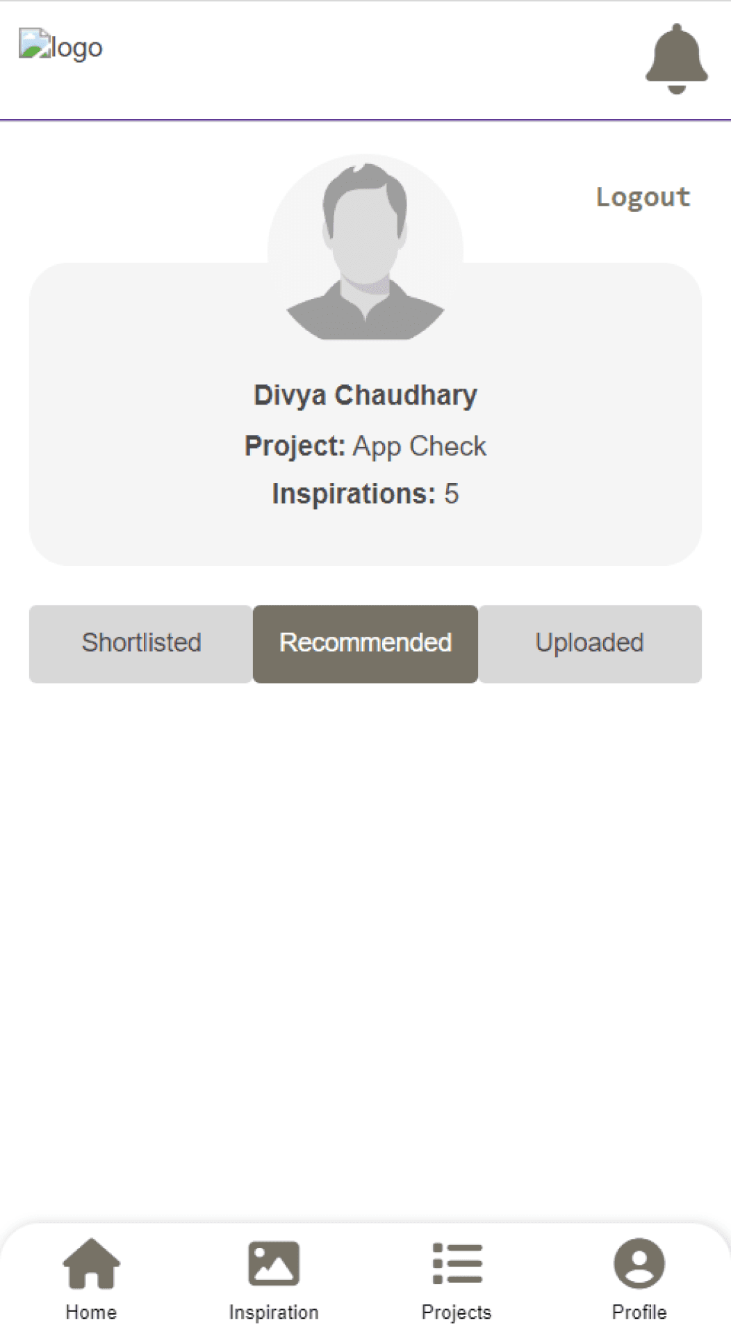
Inspirations placed at the wrong place. Doesn’t belong to the profile section
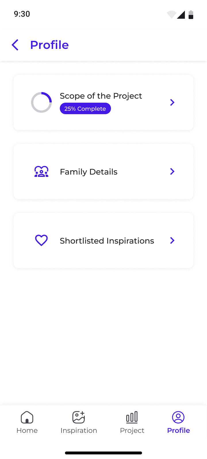
Profile: NEW
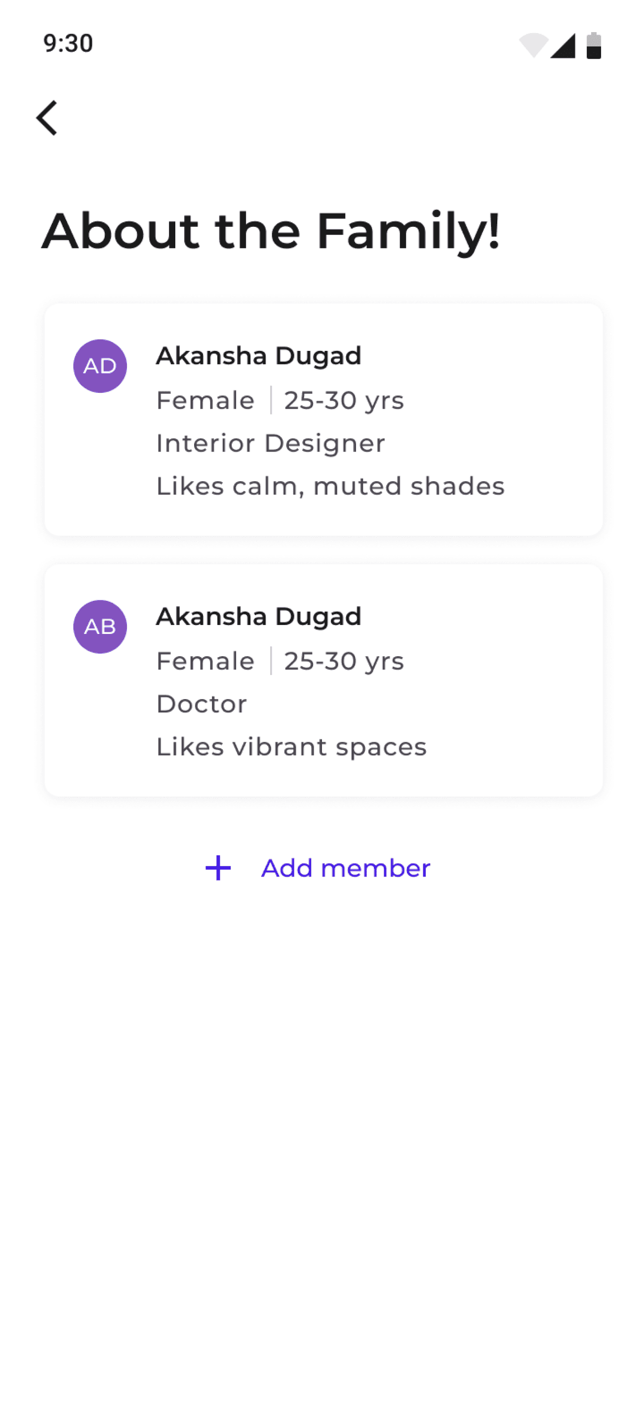
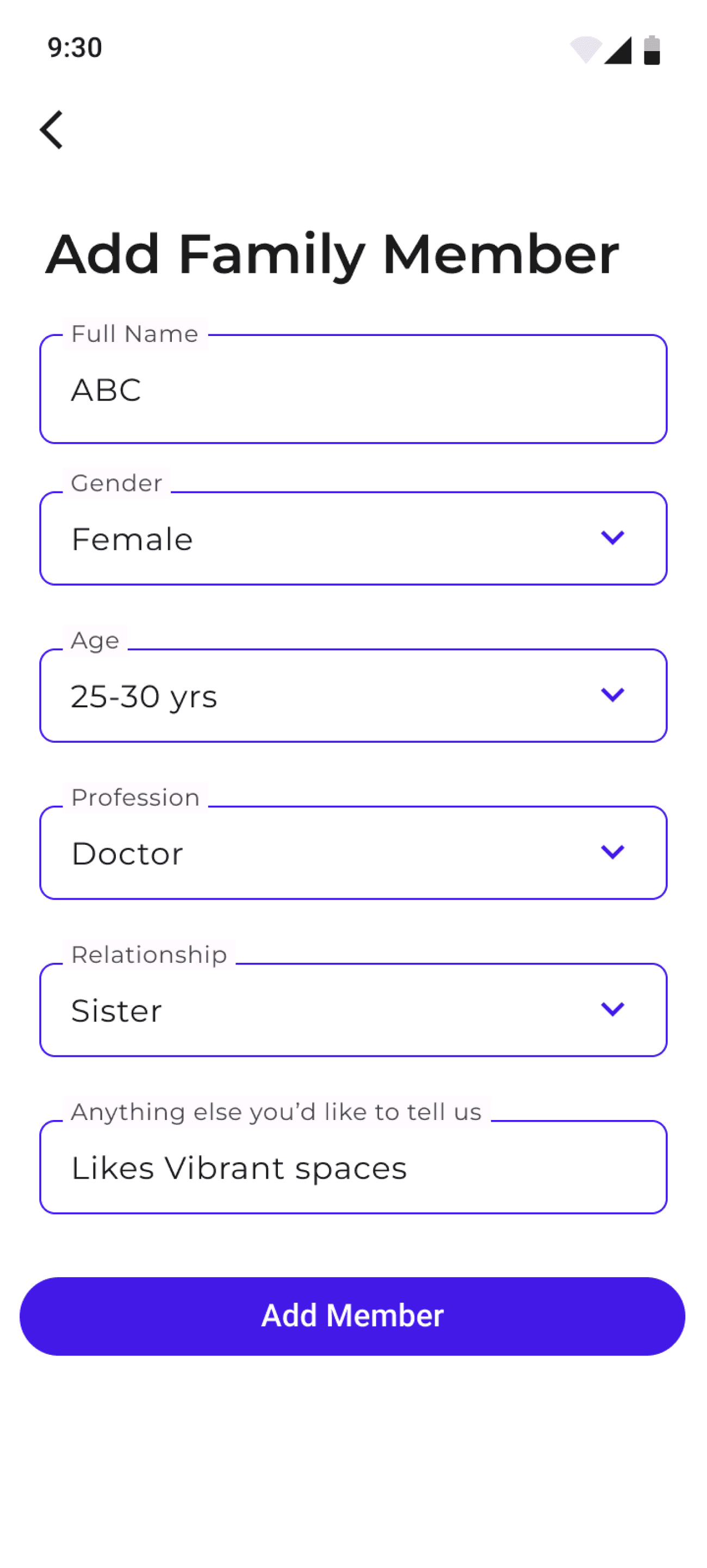
Access to the scope of project quiz, add family member details and shortlisted inspirations for quick access
Time to Restrospect and talk about learnings!
The design was made by keeping in mind that someone with basic education can also make use of the available functionalities easily, so throughout the design conveying all the information but also keeping it simple was a necessity.
Dzylo functions on an iterative approach, so the further changes/updates in the features will be made after collecting feedback from the users, after understanding their challenges and providing solutions for the same.
In this project, there was lots of information that was to be conveyed to the user in the limited space available and this taught me a lot about space constraints.
The focus was on presenting information visually to make it easy to understand. Researching and applying all the inputs in the design felt like a crash course in interior design. Totally enjoyed the new learnings and applying them here.